Project description
Judith Neilson’s Dangrove required integrated curatorial, conservation, research, library, workshop, administration, exhibition and performance spaces facilities. It is a world leading art storage facility with a museum standard internal environment designed to a minimum 100-year life, maximising clean energy use and minimising waste.
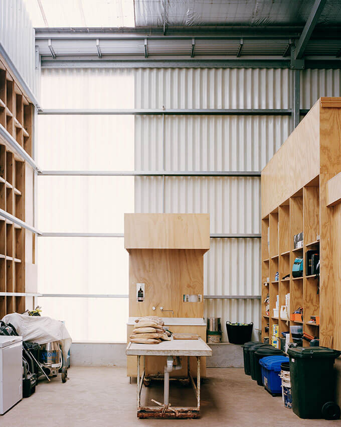
The ground floor accommodates: secure parking, pedestrian entry, a security hub, loading, plant, workshops and specialised storage areas. The upper floor accommodates: reception, administration, research, library, conservation, a sculpture courtyard, more art storage and two large art evaluation spaces.
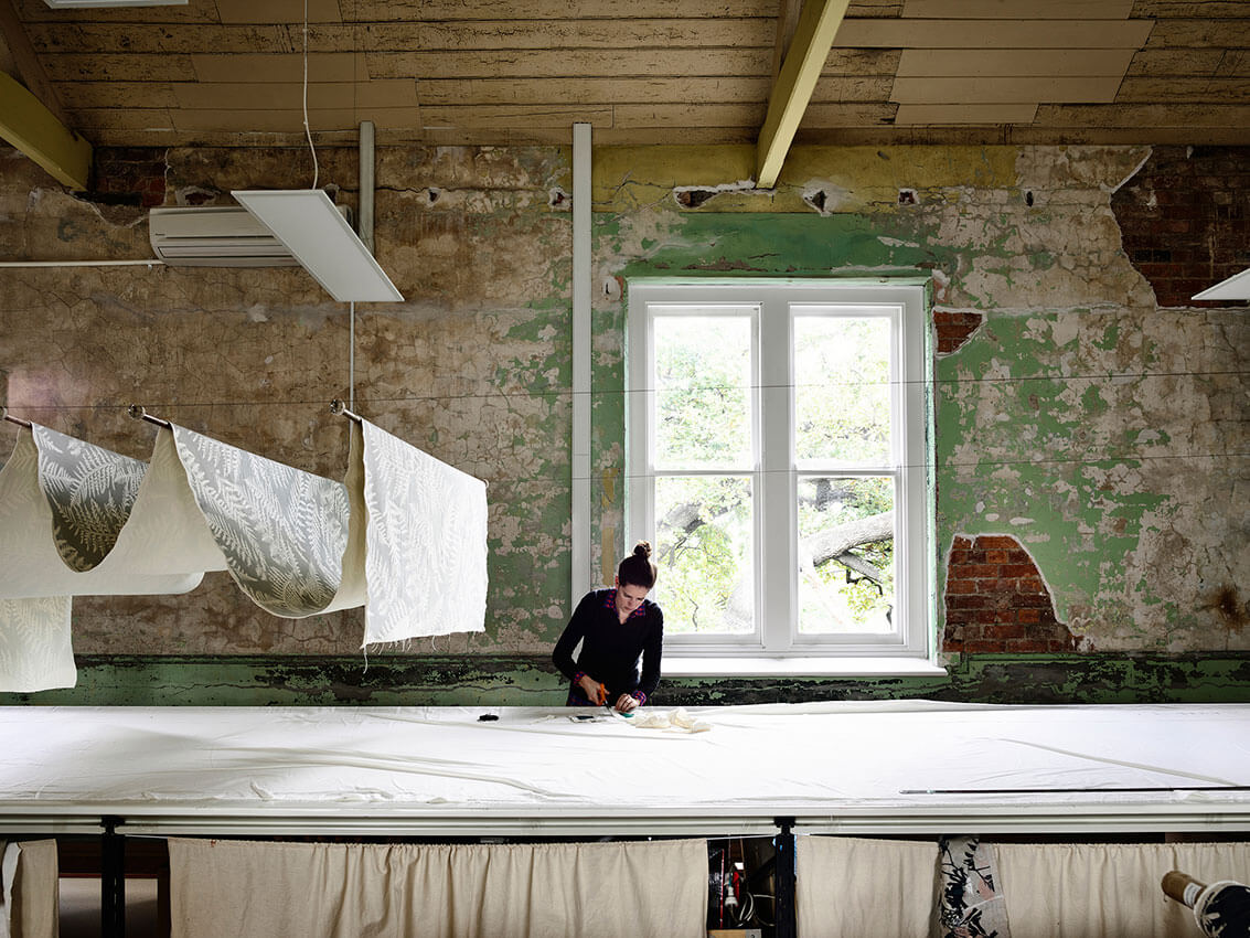
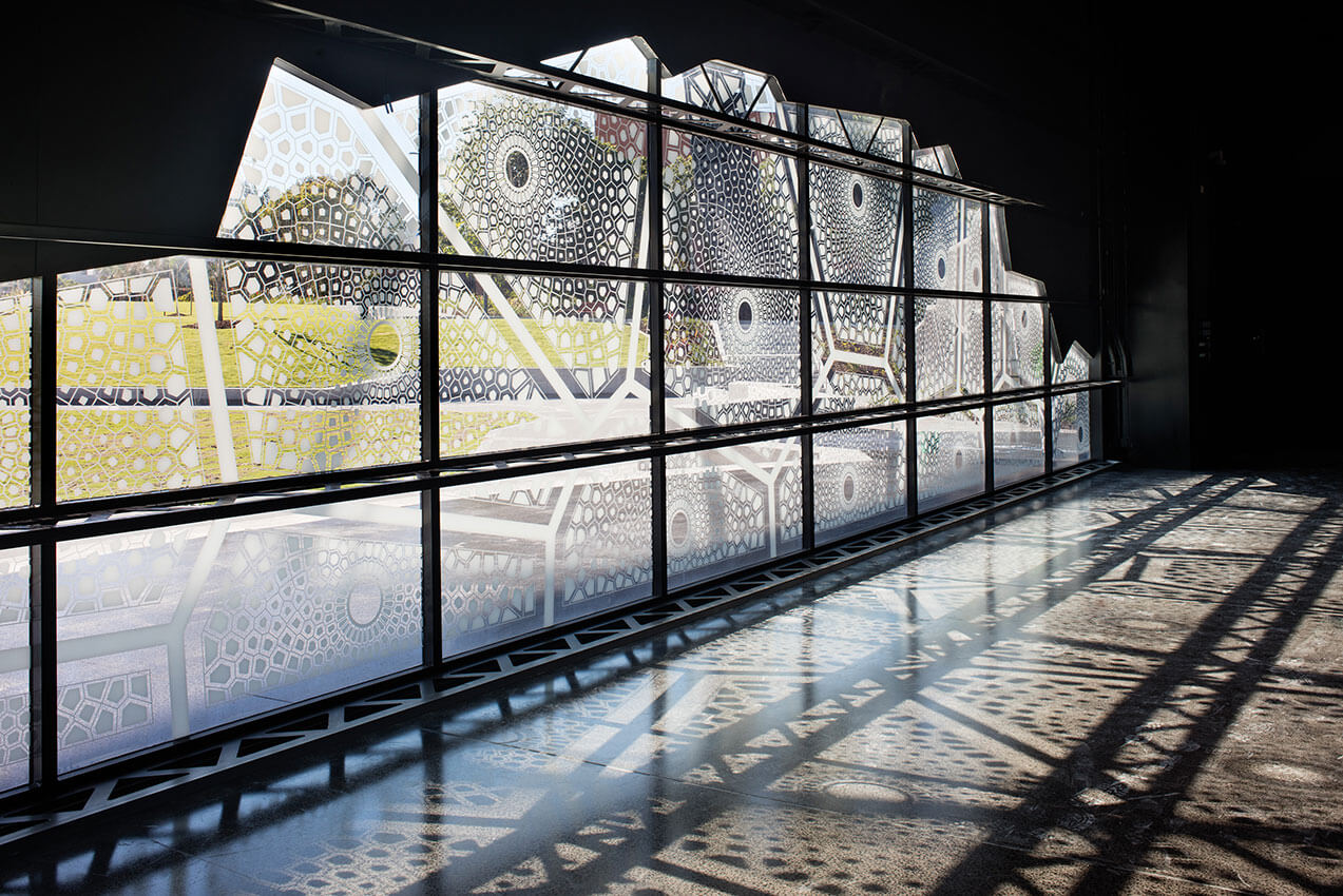
The major evaluation space is characterised by soft light entering above a datum of polished concrete. Here, temporary display and curation activities occur that support the operation of the White Rabbit Gallery as well as innovative performance events for art, music and theatre.
DANGROVE sets a new benchmark for art storage and curation reflecting the vision of the client, an important collector, philanthropist and artist.
Jury citation
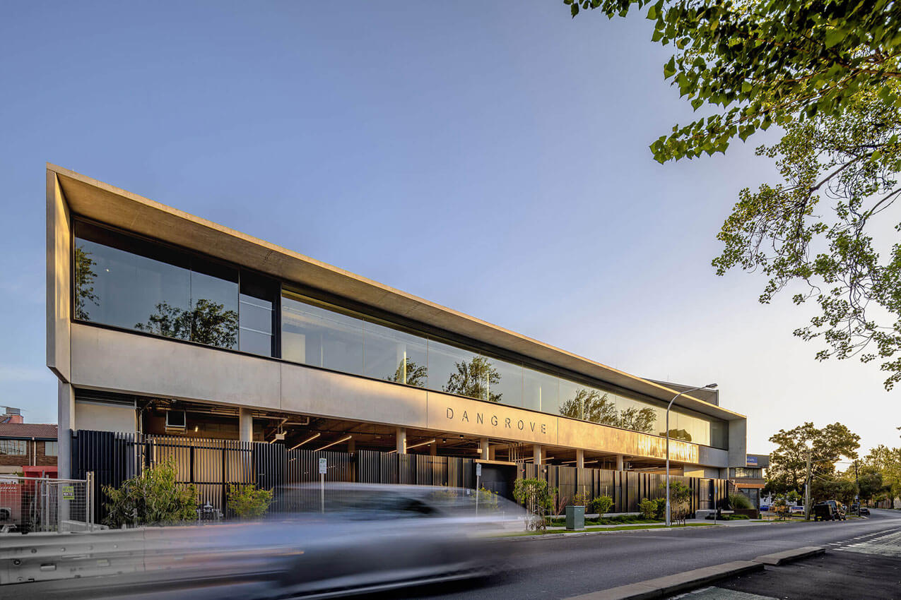
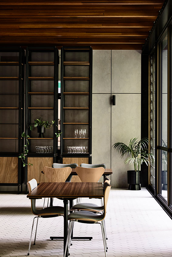
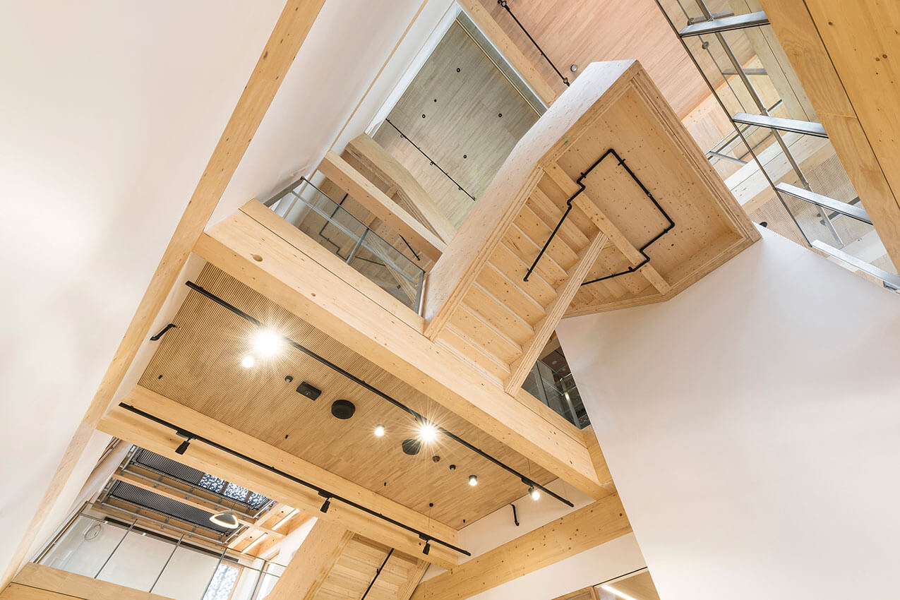
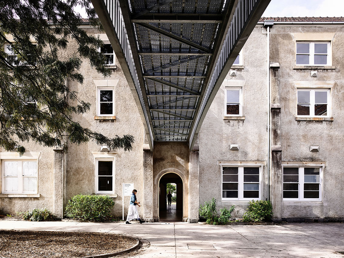
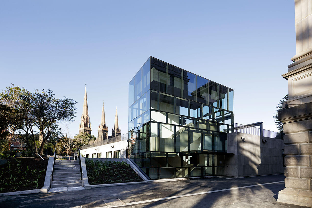
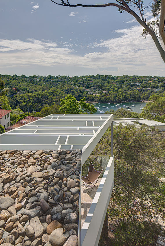
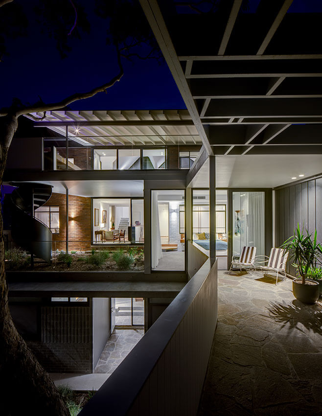
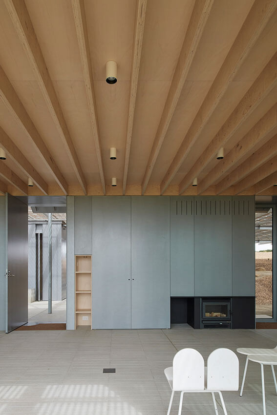
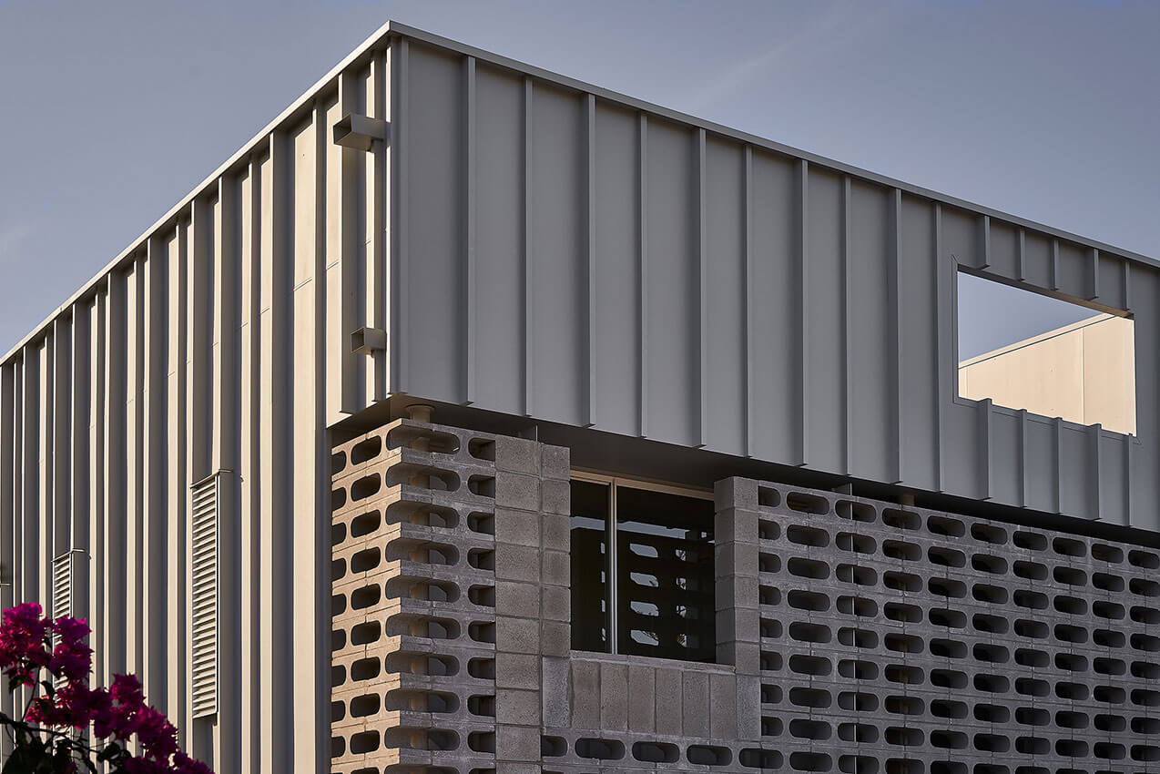
Dangrove is a two-storey private facility designed specifically for the storage, evaluation and curation of one of Australia’s largest private art collections. In this masterful project, Tzannes engages complex technical pragmatics and the sublime in equal measure.
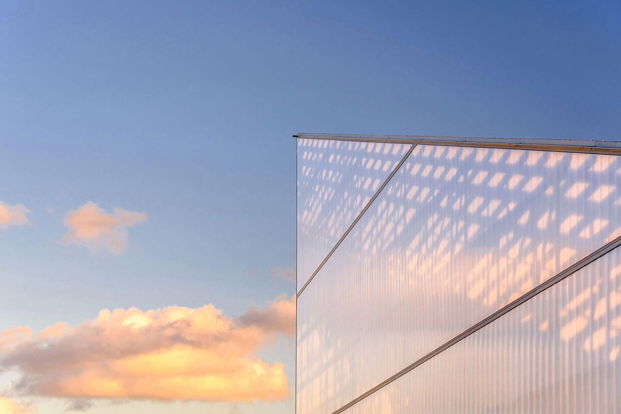
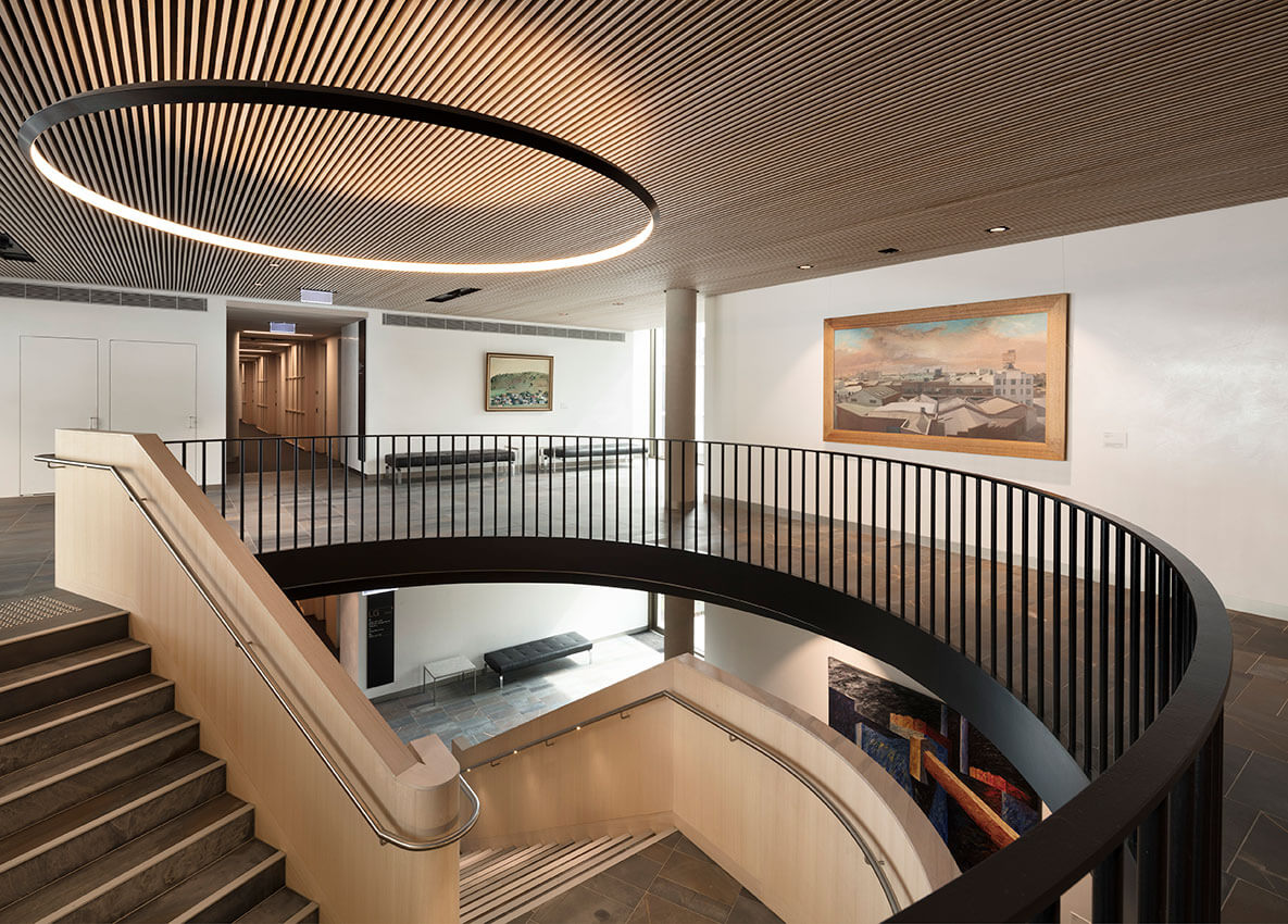
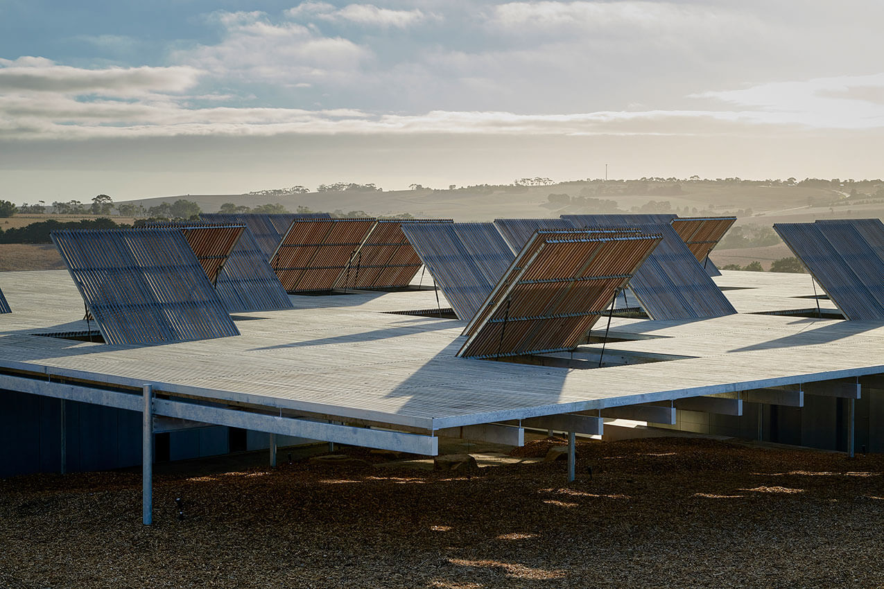
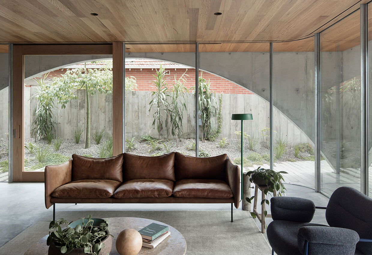
The building’s lower level provides state-of-the-art facilities for core operations: storage, restoration, curation, preparation for transportation, security station, covered delivery and parking. The upper level is organized in two parts with an adjoining sculpture garden. Intended as a front-of-house, it is primarily focused around art evaluation. The first art evaluation space is a long room that runs along the street with a scalloped concrete ceiling. The second is a wedge space of impressive scale, characterized by a wall of diffuse light above a panelled concrete datum. Known as the Great Hall, it has a deeply memorable ethereal interior quality. Its single-pitch roof carries a large array of photovoltaic cells and collects water for re-use.
Notwithstanding an intentionally unceremonial stair, these two rooms feel public in their scale and material, and do indeed host multiple uses. The first room doubles as a function space (served by a commercial kitchen at its far end), is a foyer to the Great Hall, and is sometimes used as a temporary display space or an event space for music and theatre.
Dangrove is designed for a minimum one-hundred-year life, based on a clear set of strategies developed to ensure its endurance: robust materials, floor levels secure against flooding, services that are handy for maintenance and retrofit, perimeter fire egress corridors as waterproofing backup and polycarbonate panels that are accessible for replacement.
The building is at ease in its context, with a long, elegant face to the street and a dramatic wedge form that speaks to the industrial history and character of Alexandria. At once mute and highly identifiable, this is a confident architecture that will endure
Project description
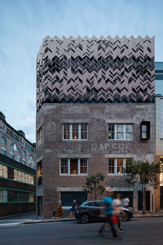
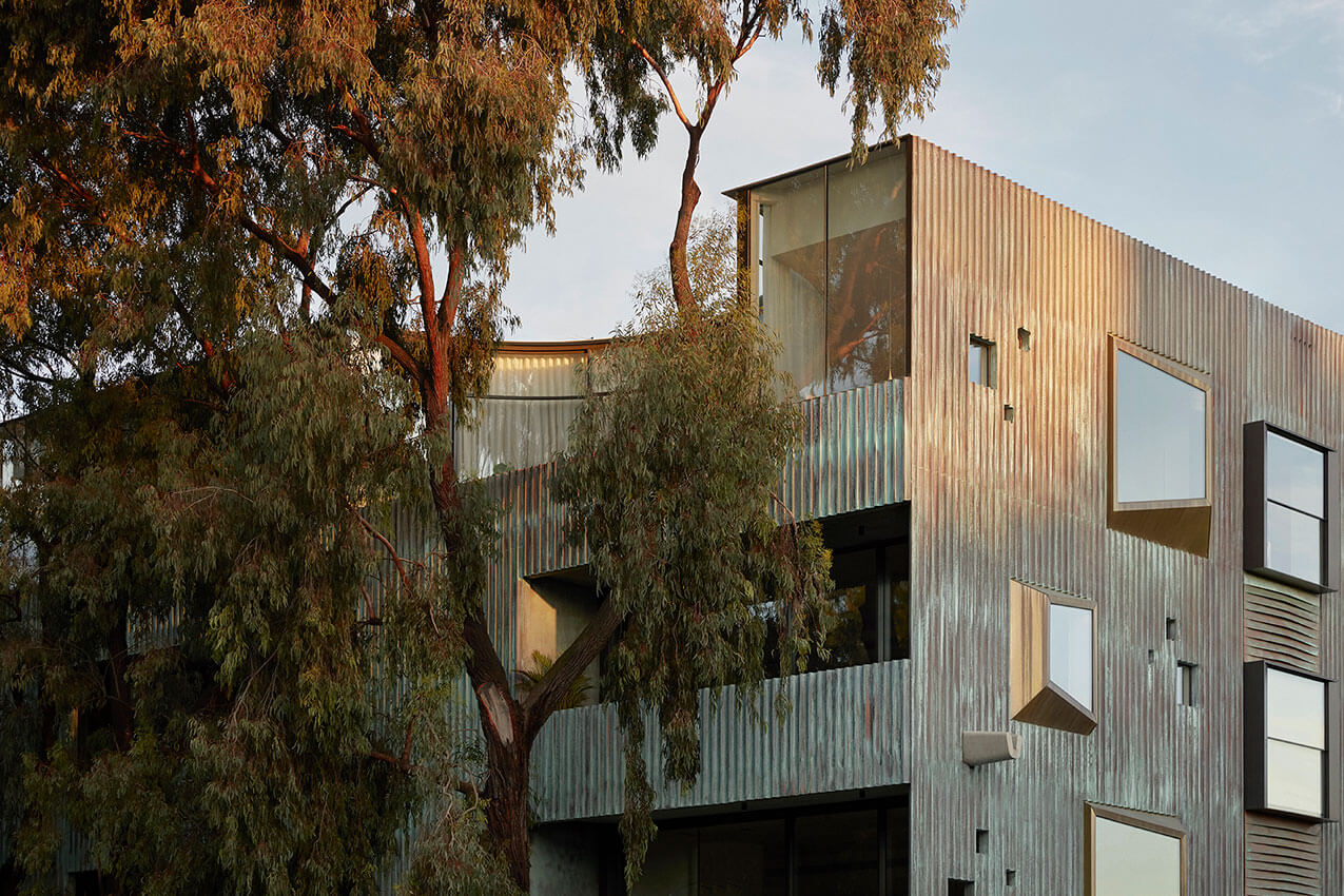
Paramount House Hotel rises out of the 80 year old warehouse that occupies the site. A copper, chevron screen crowns its brick shell and converses with the neighbouring art deco buildings of this former film precinct. The project explores the narrative between artefact and ornament, of place and of home.
Contextually responsive to its Sydney location, the hotel is truly unique. It is about expressing everything that was old and true, honest and raw, about the existing warehouse whilst capturing the spirit and excitement of the golden era of film.
There are 29 rooms at Paramount House Hotel – and like our guests, no two are the same. No matter the number of times guests stay, they will never have the same experience. Suites feel lived in and warm. Staying there, you truly feel at home.
Jury citation
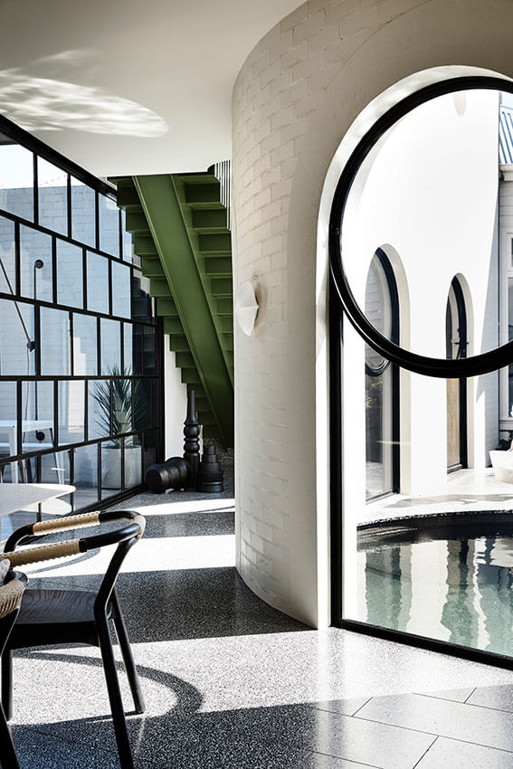
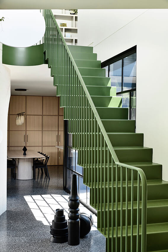
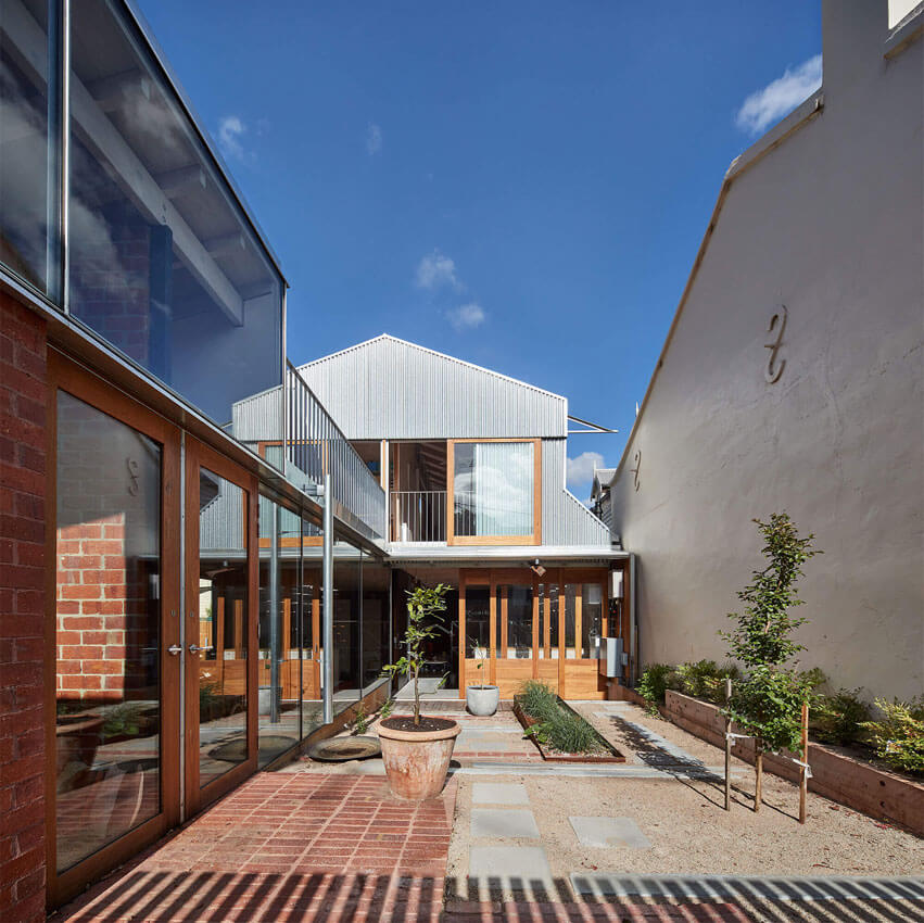
Paramount House Hotel breathes new life into a three-storey 1930s brick warehouse in Sydney’s Surry Hills. As part of the wider hospitality offering within the historic Paramount Picture Studios building, the project skilfully borrows its neighbour’s established facilities to maximize the hotel offering. Small but generous interventions at the street and in the foyer benefit the broader development.
Twenty-two hotel rooms occupy the original brick structure, while two-level loft rooms crown the top of the building behind a delicate copper veil. A bold yet sensitive addition to the heritage fabric, this chevron screen effectively mediates light to rooms and ensures privacy from neighbouring buildings.
Inside, Paramount House Hotel’s historic fabric is peeled away to reveal traces of time and function. Each room is characterfully unique, with carefully selected Australian fittings and furnishings. Materials are sourced locally for their low environmental impact and to complement the original building fabric; together, these qualities create an authentic, comfortable and inviting home away from home.
Project description
Atop its Modernist base this new garden room for a private women’s club borrows the established landscape across the lane and adds a further tectonic layer to the original building by Ellison Harvie. Celebrating its arboreal aspect from the neighbouring trees, the addition which accommodates a major function space, was conceived of as a conservatory. The design approach interweaves and overlaps new and old. The rhythm of the roof and other new elements – both structural and not – take their cue from the earlier one set by Harvie in the distinctive mullion window wall that encompasses level 1 and 2. While both architectures draw from a Modernist repertoire their alternate interior atmospheres and laneway presentation complement each other through subtle difference.
Jury citation
Kerstin Thompson Architects’ confident addition to the premises of this longstanding institution on a narrow laneway in the heart of Melbourne demonstrates a deep understanding of a complex client. The project – a new level consisting of a garden room – is testament to the agency of architecture in the evolution of our cultural organizations and supports a sustainable business model.
Discrete works to upgrade existing spaces for compliance and services are handled with a light touch that retains their essential character, which is highly valued by many of the club’s older members. The new level offers a different spatial experience, reinvigorating the club by helping to attract new and younger members, and providing revenue through its 150-person function capacity.
The design responds beautifully to specific contextual drivers – the established landscape in the neighbouring club’s garden and the architectural cadence of the existing modernist building. Opening completely to the adjacent tree canopies, the design establishes a rhythm of deep glulam timber beams. Combined with top light and finely detailed window screens, this gives a sense of being within a conservatory – and almost within the garden itself. It also establishes a dialogue with the existing building.
The tiled floor is both bold and mute, and the walls are dark and shadowy, softening the ample natural light and attenuating the room’s acoustics. This is a memorable architecture with intelligent spatial planning that will support the club well into the future.
Project description
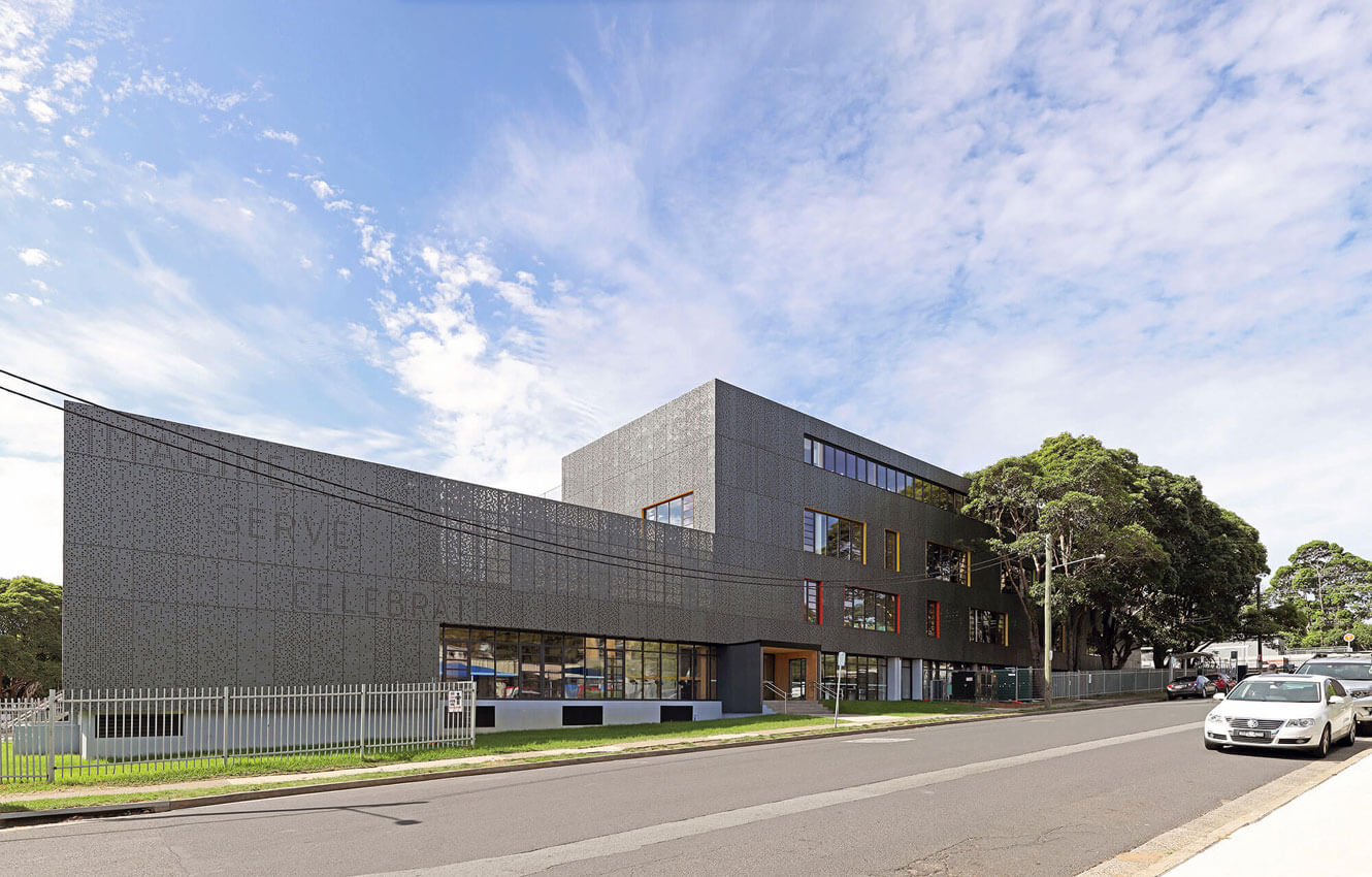
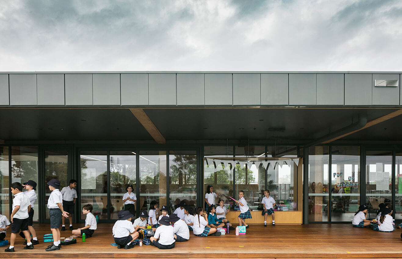
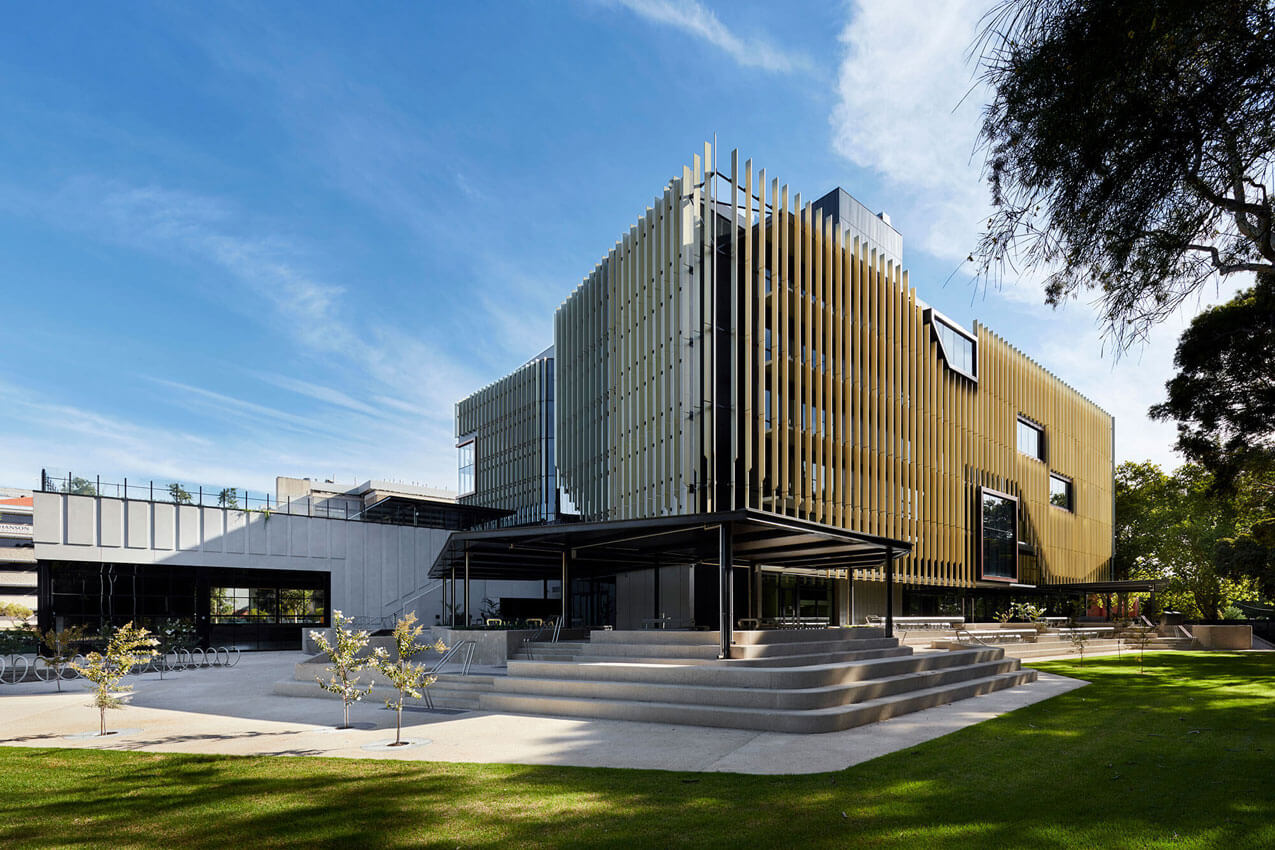
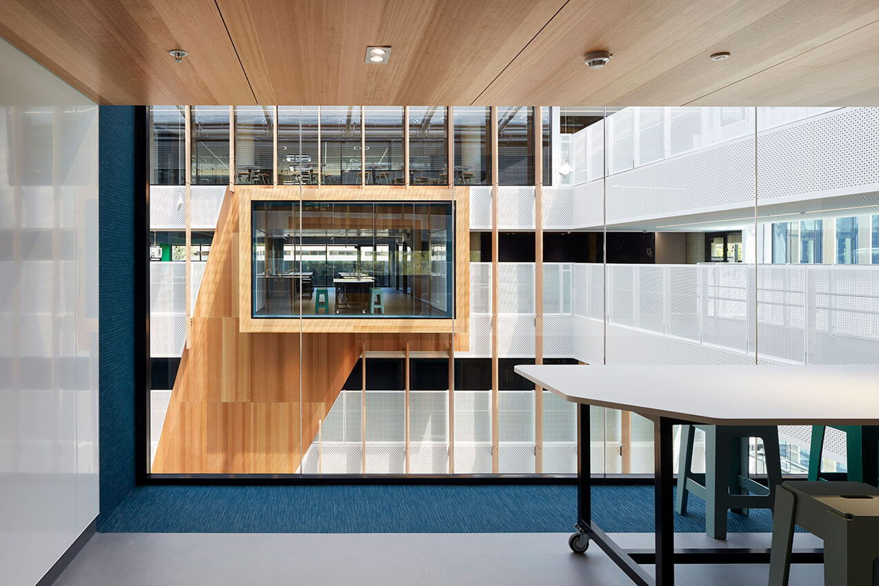
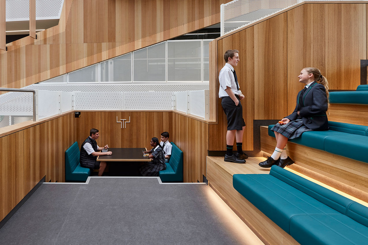
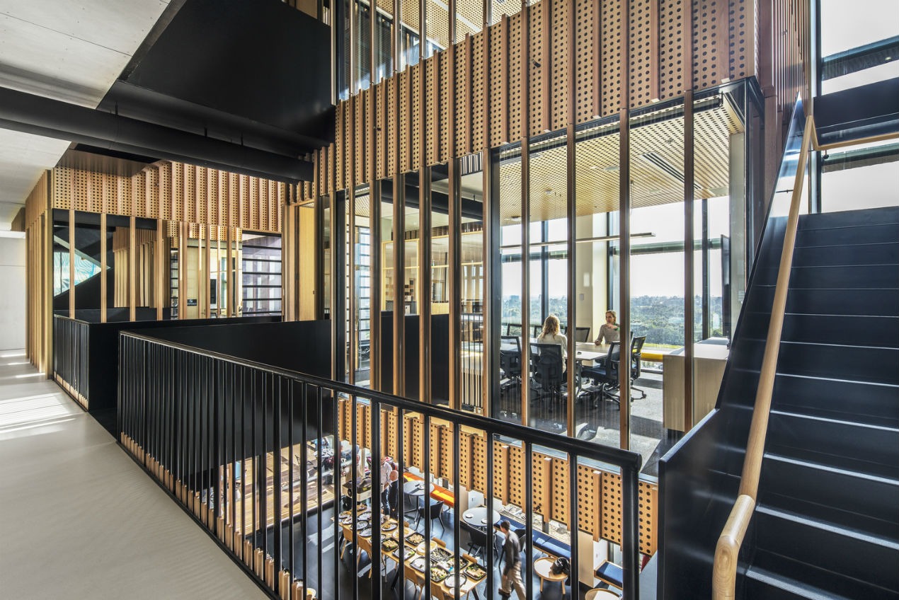
Our Lady of the Assumption Catholic Primary School is a new K-6 school for 420 students in North Strathfield. The design is a realisation of the school’s vision of creating spaces that invite imagination, innovation and support independent learning and student wellbeing. The project reuses a rundown 1970s brutalist former Telstra training centre and includes the addition of a 4-storey atrium as main entry connecting all learning areas, a new hall, arts space, balconies and roof-top playgrounds in prefabricated mass-timber construction.
Jury citation
Our Lady of the Assumption delivers a high-quality and safe learning environment for a growing and vibrant community of primary school students in Sydney’s west. The architecture, which implements a careful spatial program that facilitates a deep learning experience, is both derived from and informs the pedagogy of the school.
In this project, BVN has demonstrated through design research, genuine collaboration and a future-focused design strategy, an exemplary approach to radically transform existing buildings for new functionality. The architects have used a methodical approach to materialism and spatial crafting, and aimed for ambitious sustainability targets, in their adaptation of the 1970s Telstra training centre. The result provides innovative, uplifting and inherently flexible learning spaces that will serve the school well into the future.
Internal spatial relationships have been reconfigured through a series of vertical and horizontal circulation spaces that also serve as learning areas, places for congregation and displays, and backdrops to the energetic life of their inhabitants. A four-storey atrium links these spaces, creating flexible, open and naturally lit places for learning and support
Relentless research and development throughout the design phases demonstrated the clear benefits of the use of timber in learning spaces in terms of wellness and educational outcomes. The resultant all-timber interiors – both expressed structure and surface linings – create warm and inviting spaces. Classroom edges have welcome access to large outdoor learning and play spaces, with an emphasis on natural light and fresh air.
The use of a prefabricated cross-laminated timber floor and acoustic ceiling-panel components required a commitment from both the architects and the client that is to be commended. This exceptional project speaks to the strength of the client–architect relationship and the contribution of the entire consultant team, which enabled an openness to ideas that create spaces for a new type of learning. Our Lady of the Assumption Catholic Primary School sets a new benchmark for the emerging vertical school typology through the transformative power of great design
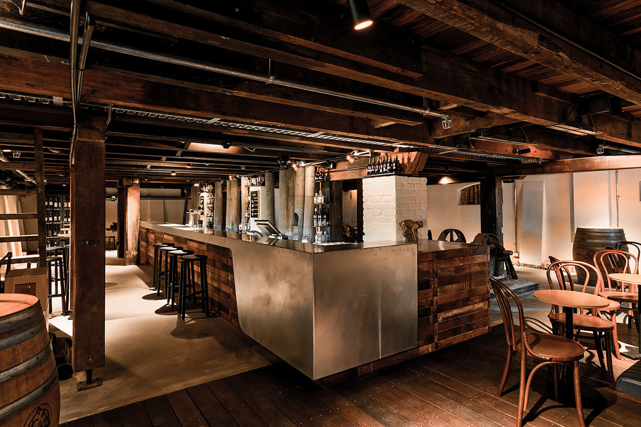
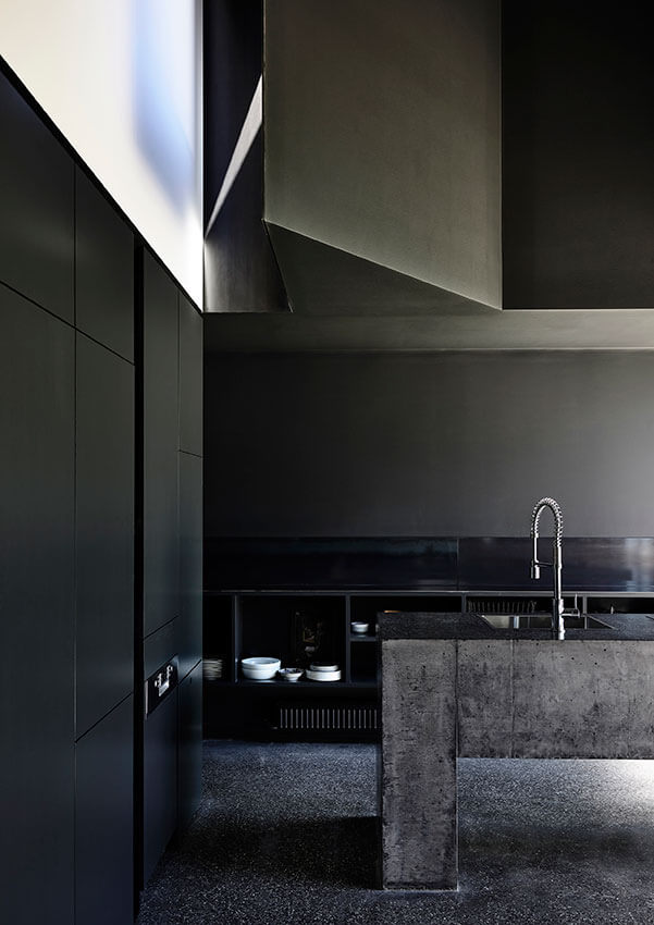
The building’s lower level provides state-of-the-art facilities for core operations: storage, restoration, curation, preparation for transportation, security station, covered delivery and parking. The upper level is organized in two parts with an adjoining sculpture garden. Intended as a front-of-house, it is primarily focused around art evaluation. The first art evaluation space is a long room that runs along the street with a scalloped concrete ceiling. The second is a wedge space of impressive scale, characterized by a wall of diffuse light above a panelled concrete datum. Known as the Great Hall, it has a deeply memorable ethereal interior quality. Its single-pitch roof carries a large array of photovoltaic cells and collects water for re-use.
Notwithstanding an intentionally unceremonial stair, these two rooms feel public in their scale and material, and do indeed host multiple uses. The first room doubles as a function space (served by a commercial kitchen at its far end), is a foyer to the Great Hall, and is sometimes used as a temporary display space or an event space for music and theatre.
Dangrove is designed for a minimum one-hundred-year life, based on a clear set of strategies developed to ensure its endurance: robust materials, floor levels secure against flooding, services that are handy for maintenance and retrofit, perimeter fire egress corridors as waterproofing backup and polycarbonate panels that are accessible for replacement.
The building is at ease in its context, with a long, elegant face to the street and a dramatic wedge form that speaks to the industrial history and character of Alexandria. At once mute and highly identifiable, this is a confident architecture that will endure.
Project description
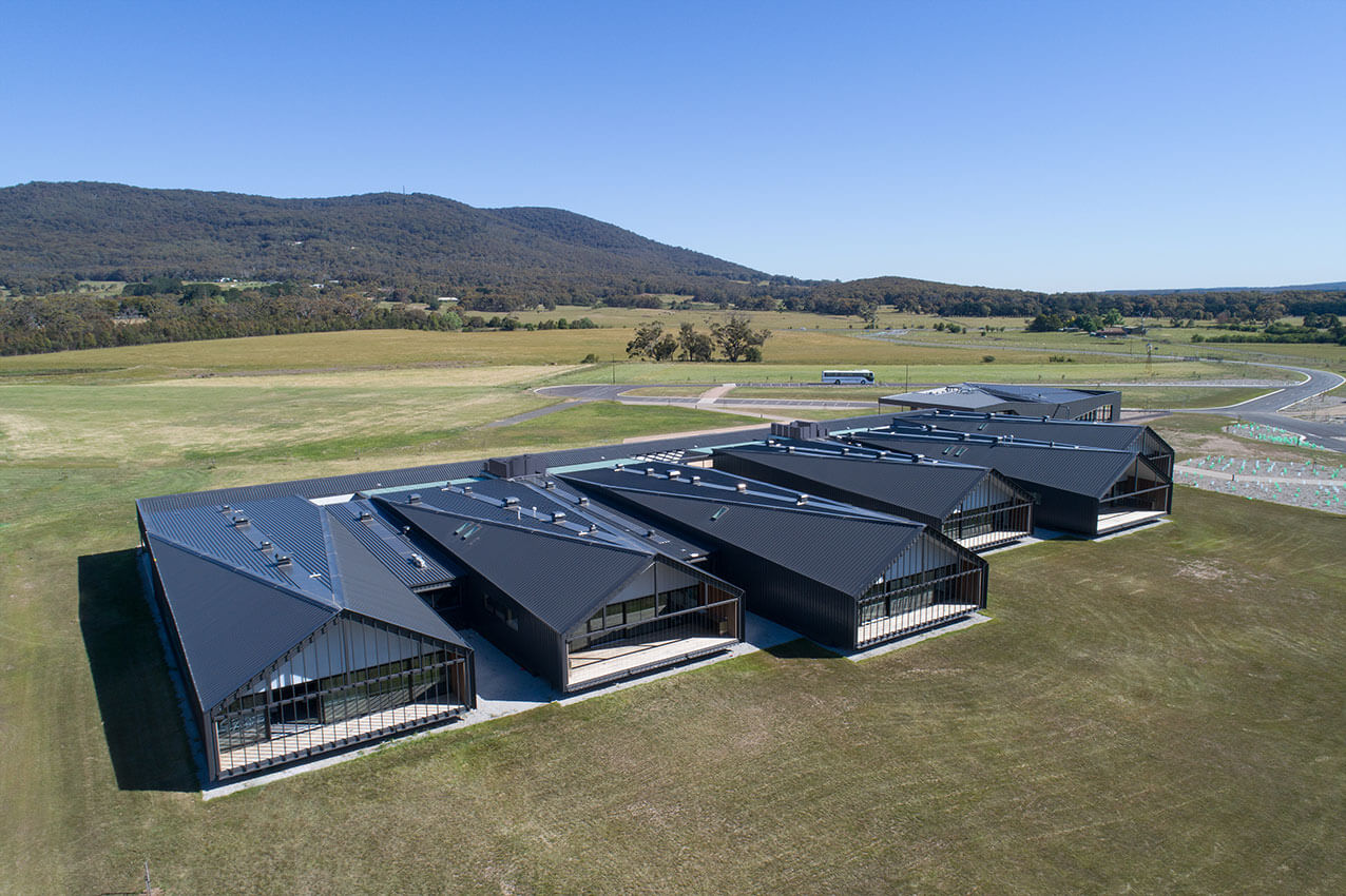
The existing campus of Braemar College, perched on the southern slopes of Mt Macedon, is an extraordinary place.
The new Woodend campus, lying in the rural plane between Mt Macedon and the ranges of Hanging Rock and Jim Jim, maintains a visual and spiritual connection to the Macedon campus but is physically contrasting.
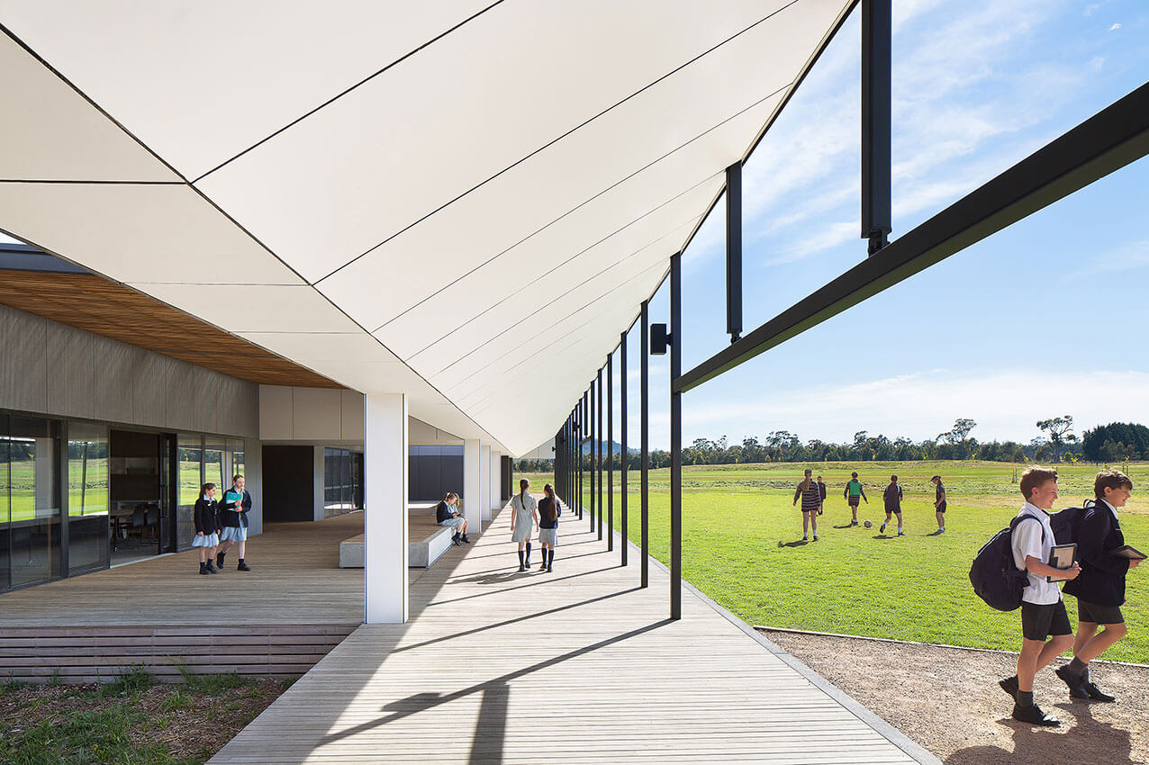
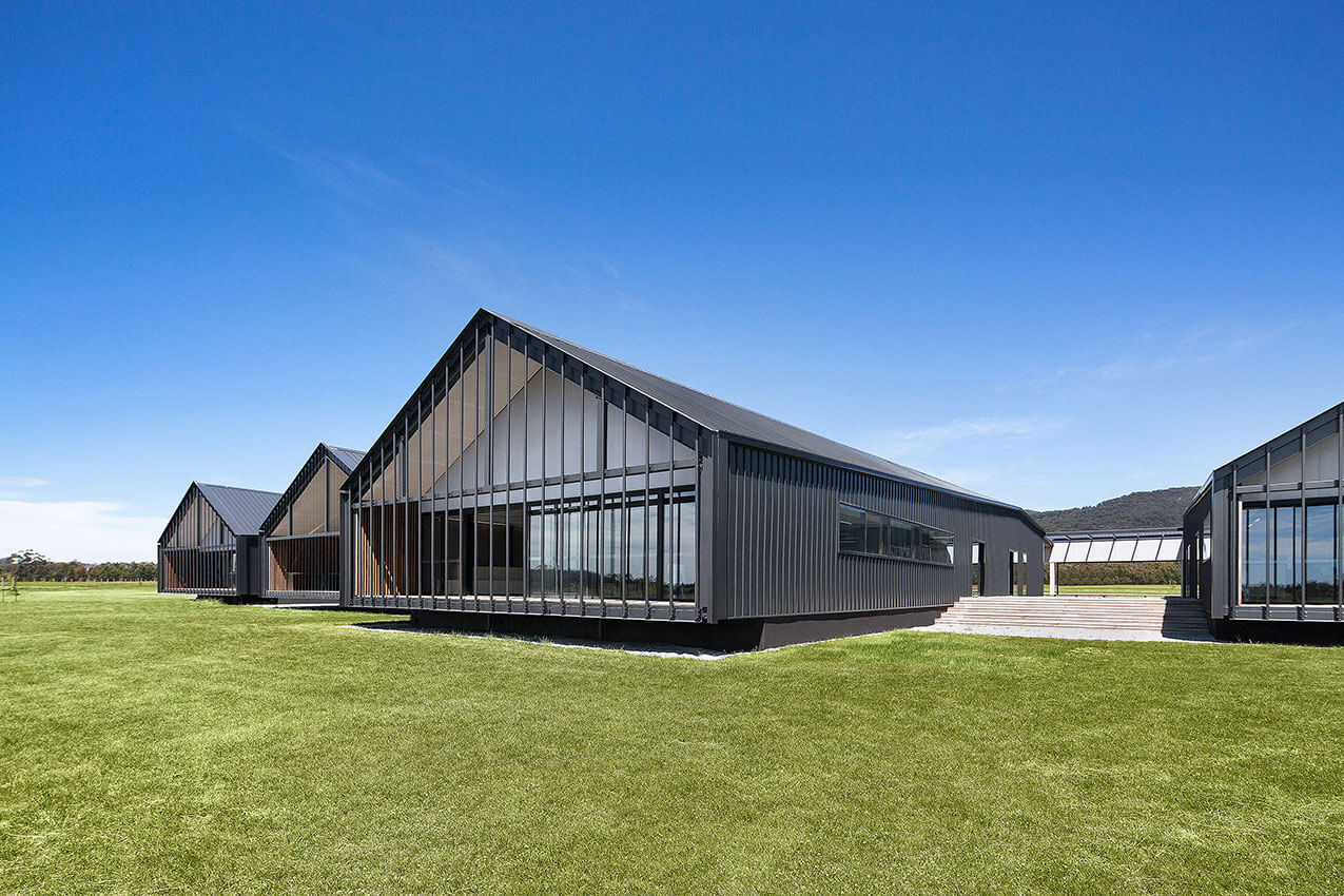
The Stage 1 Middle School is unique, a haven within a vast clearing. The architectural language is drawn from the rural vernacular, buildings sitting lightly on the elevated ground of their pastural setting, as a contemporary interpretation of the farm shed typology. Oriented in homage to the distinctive profile of Hanging Rock, the rhythmic form of the shed modules, manipulates perspective and defies scale.
The internal and external learning environments within the volumes of the shed form are generous, and flow directly out into the vast rural landscape, harvesting unique environmental learning platforms.
Jury citation
Set on (at present) a sparse and fairly featureless paddock, with a view to Hanging Rock, Braemar College is a vibrant experiment in new forms of spatial organisation, seeking to transform teaching and learning.
The current design is only part of a larger master plan and therefore sits somewhat isolated and vulnerable in the open landscape. The real dynamics and energy are confined primarily to a set of six connected linear teaching modules, each a variation on an extended form, which sets up a clear diagram for the overall sequence of classrooms, educational levels and progression.
An external, covered, linear “street” – both a connector and a series of learning venues – defines a clear edge to the east and is the referent from which the teaching modules emerge. The plans show the repetition and mirroring of the modules – their internal divisions, rooms and common areas; but in reality, the spatial play is more diverse, more differentiated. Organizational bands run parallel from the eastern external street to the west, evolving from shared, enclosed meeting rooms, workshops and service zones into communicating corridors that contain breakout and informal learning spaces and furniture before becoming more organised yet flexible teaching zones. This scheme produces a vibrant educational environment.
Project description
Botanic High locates a STEM focused and contemporary vertical school in a beautiful parkland setting, combining science and nature in a connected learning environment. The pedagogical vision that has driven the design fosters students as innovative and creative learners, providing young people with a range of experiences, ideas and perspectives.
The school is deeply integrated into an established education and cultural precinct in the north-east corner of the city, set within the parklands and adjacent to the Botanic Garden, Zoo, universities and associated buildings along Frome Road.
Botanic High has been conceived as a vertical high school with an ‘active’ atrium as the central community heart between the repurposed and new buildings. It creates a multi-disciplinary vertical learning environment that allows a high degree of visual and physical connectivity between floors. The vertical nature of the building offers opportunities for collaboration and connection not available in a traditional school setting.
Jury citation
Adelaide Botanic High School offers an optimistic and progressive approach to the expansion of science, technology, engineering and mathematics (STEM) learning for high school students in South Australia. The school’s design by Cox Architecture and DesignInc gives a new spatial and organisational structure to teaching and learning, allowing students more agency in both their educational development and their social interactions.
The building operates as a dynamic matrix of public movement and respite; dedicated workspaces and flexible classrooms; intimate, group and large teaching rooms; and an openness and airiness that exploits the vertical structure.
Project description
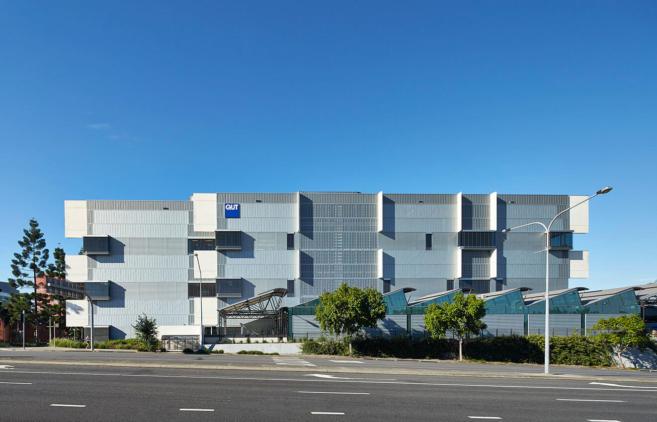
QUT Creative Industries Precinct 2 (CIP2) brings multi-disciplinary contemporary arts learning and practice to life in beautiful, high performance studio environments accessed via a vibrant informal domain where students and staff spend long hours engaging, exploring and refining their craft.
Heritage-listed buildings are re-purposed for visual arts with new buildings sensitively interlaced to retain the precinct character, creating an urban place that anchors the creative industries into a cohesive village environment.
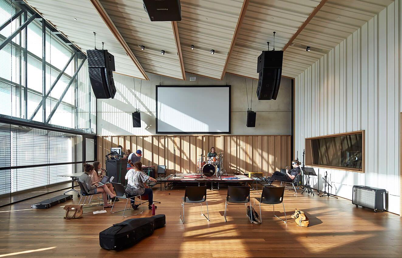
The precinct focus is a new 6 level building that ‘stacks’ 3 double-level performance arts studios with adjacent academic workplace mezzanines. The studio levels alternate teaching functions to encourage staff/student interaction.
The central atrium stair links communal hubs on each level whilst internal 2 level ‘streets’ support student and staff collaborations. The result is an intuitive narrative of unfolding spaces forming a delightful, rich, comfortable, inclusive and safe environment with rich materiality and a high level of transparency.
Jury citation
In QUT Creative Industries Precinct 2, Richard Kirk Architect and Hassell have created a new theatre of learning. Their design delivers a dynamic tertiary research and teaching environment on a demanding site. Heritage-listed military structures are carefully absorbed into the overall strategy of the project, consolidating a new creative precinct. An interdisciplinary learning approach informs the design, which uses a sectional strategy of administrative “blocks” and “verandahs” to orient the social spaces towards the east and mitigate the environmental impacts of the adjacent highway to the west. Louvred elevations modulate daylight and consolidate the formal language. Considered detailing supports the dynamic section, allowing engagement between communities of creative research, practice and learning.
Project description
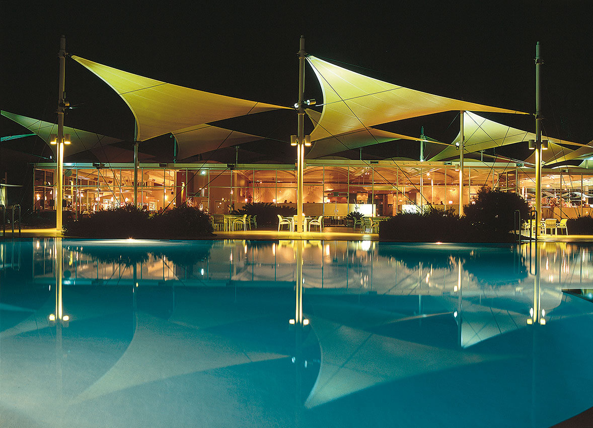
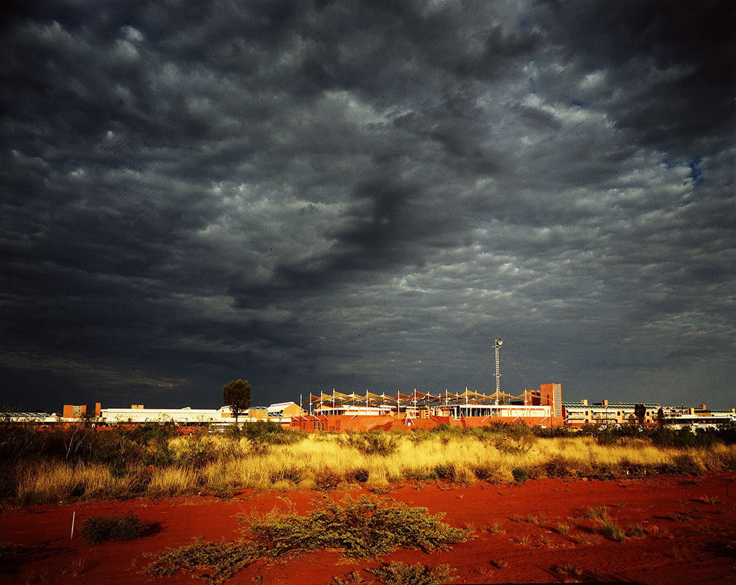
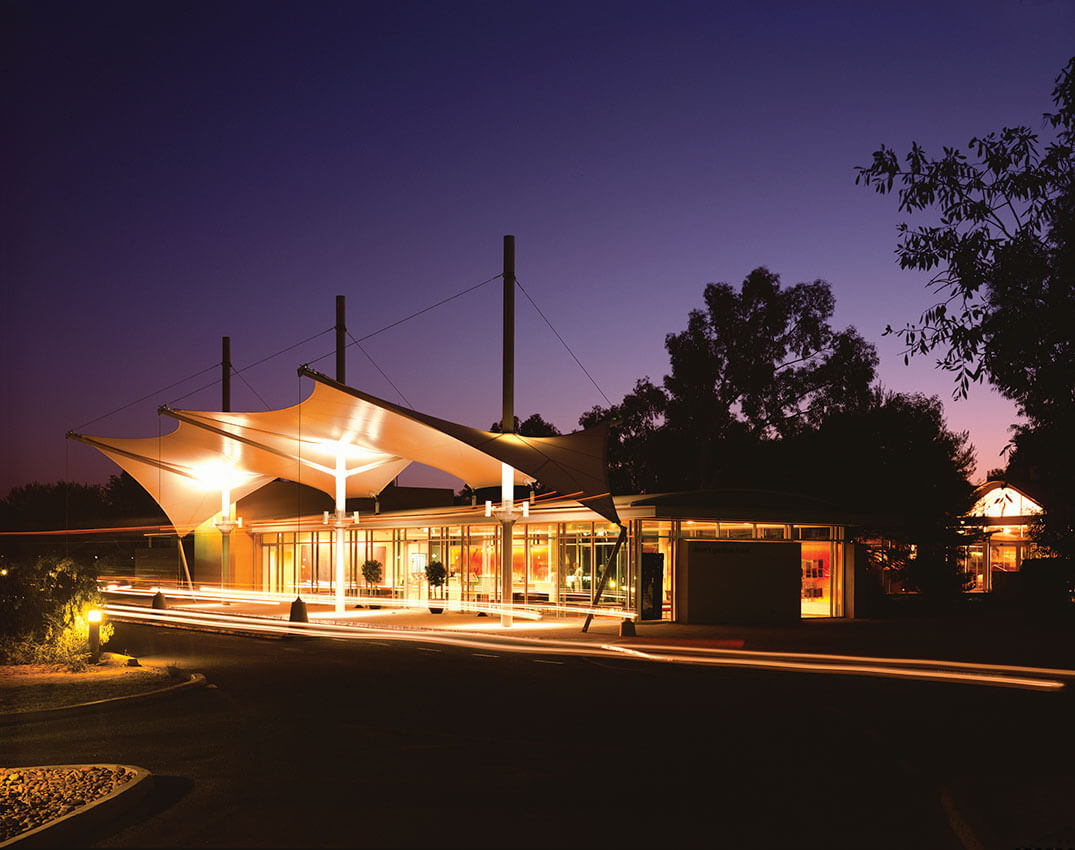
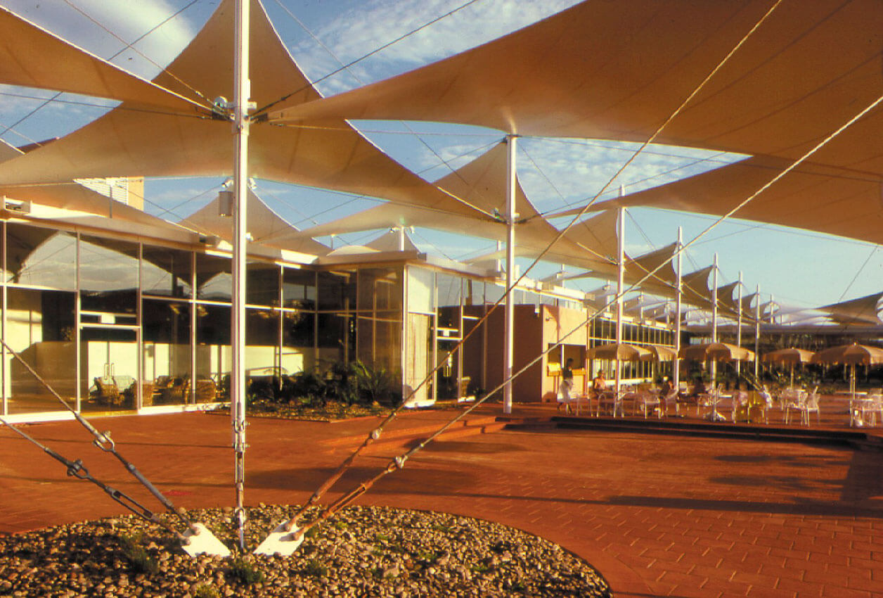
Ayers Rock Resort (nee Yulara) was developed as a cohesive township and resort to prevent degradation of the desert environment around Australia’s iconic Uluru (Ayers Rock) by haphazard tourism development. The site for the township was selected some distance away from Uluru, in a valley masking views from the rock by sand dunes.
The plan follows the serpentine shape of the valley. At each end are hotel resorts, linked by a pedestrian spine with town and visitor facilities, shops and housing distributed on either side. The architecture is mostly derived from the need for the township to be environmentally self-sufficient, much of the roofscape being covered by solar collectors.
Jury citation
Cox Architecture’s Sails in the Desert (1985) is a nationally significant project designed to develop both a cohesive township and a sustainable visitor precinct to support the growing tourism demand at Uluru. The design nestles sensitively into the desert landscape, ensuring minimal visual impact and creating a new archetype for Australian settlement.
Located along a raised circulation spine that follows the natural contour of the site, a range of accommodation was developed. The original plan located staff residences at the centre, between two hotels. As the demand for accommodation evolved and increased, these residences were converted to short-stay apartments and new staff dwellings were designed to sit at the end of the township.
In addition to accommodation, the project included the creation of infrastructure to support an entire community, including school buildings, retail and service stations. Housing for workers, both permanent and temporary, was also part of the brief, which, given its scale and complexity, demanded an architectural practice working at the height of its powers. All aspects of the project were developed in deep consultation with members of the local Indigenous community, some of whom came to live and work in the facility; this was an approach that was unique at the time.
Many aspects of the architecture, from colour to materials and urban form, speak of Cox’s ambition to develop a tangible form of contemporary Australian architectural expression. As a whole, the township was designed to respond to the climate, with careful consideration given to orientation, shade and prevailing breezes. In a location where large shade trees struggle to survive, elegant and innovative shade structures were developed.
Sails in the Desert is both of its time and timeless. Its enduring appeal demonstrates its capacity to capture the essence of an Australian vernacular, responding sensitively to the cultural, climatic and social conditions of the place. It was and is an iconic settlement in the service of one of our most important cultural and spiritual sites.
Project description
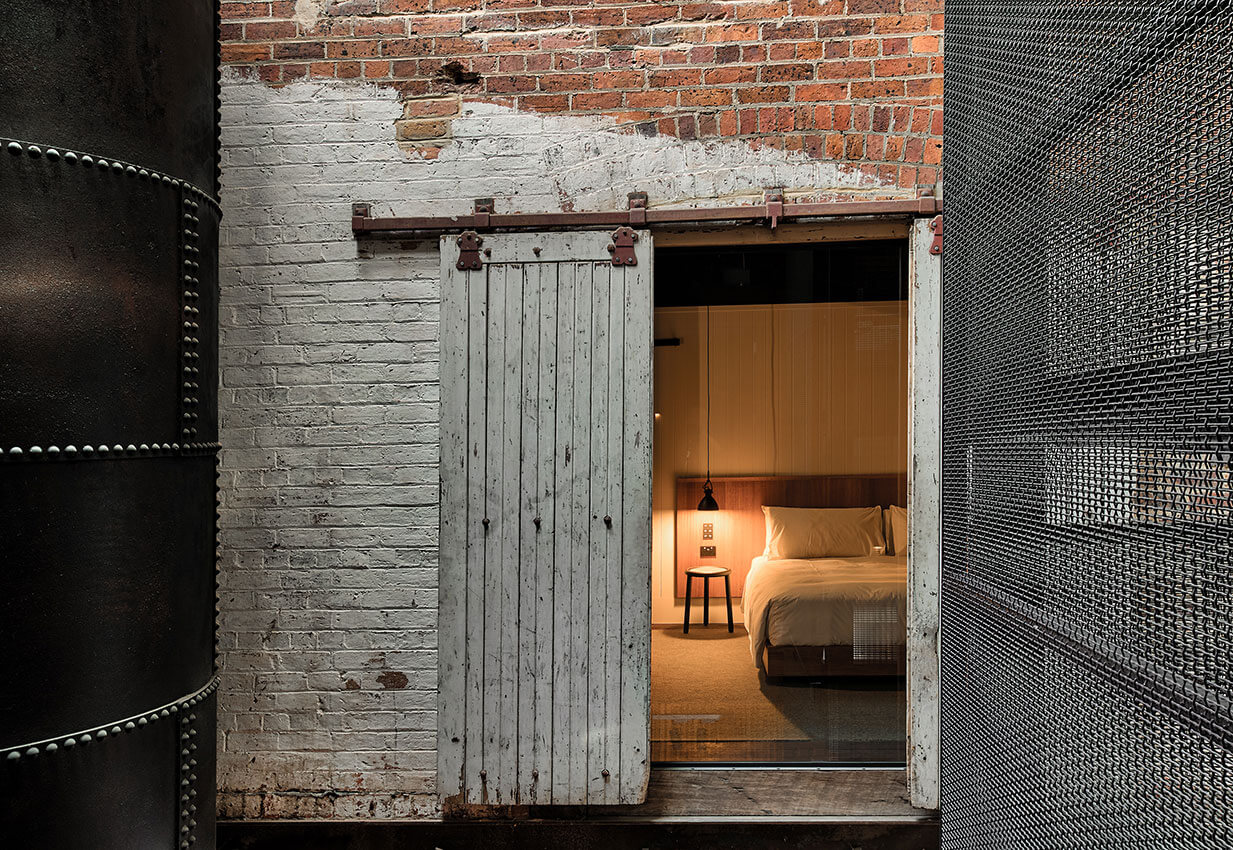
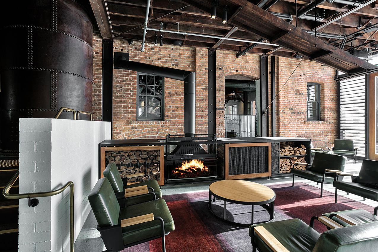
In response to our client’s bold vision for tourism in the Great Southern region we embraced the challenge of re-imagining the former flour mill as a 22-room hotel including; lobby, common areas, verandah and basement bar, retaining, exposing and expressing the original structure and industrial components throughout.
The original building was never intended for inhabitation and the challenges of inserting the new program into the old building were many faceted. New elements such as the steel framed lift and dynamic, sculptural stair weave around the original steel boiler, retained in-situ, rising through the central void forming a dramatic feature in the lobby.
The project is more than the sum of its parts, a magical story made of layers of times past and times to come, offering a new vision of the region for locals and visitors alike, with potential for ripples of social and economic benefits for the wider community.
Jury citation
Heritage awards seem to either laud historical absolutism or accept heritage fragments as a mere backdrop to the contemporary commercial requirements of a redevelopment. Displaying neither of these tendencies, Premier Mill Hotel is refreshing and revelatory in its deep integration of a plethora of heritage artefacts and spatial leftovers, textures, materials and images that don’t simply invoke a past but celebrate its ingenuity and authenticity. This is a project that exhibits sincere and respectful care without being museum-like or overtly deferential. It celebrates the past by making it visible, relevant and part of the commercial allure of the hotel.
The building is effectively a spatial and material superimposition. A sophisticated and well-designed boutique hotel has been integrated into the fabric, the volumetrics and the residual hardware and mechanics of a redundant flour mill. This was not a stripping out of the old and a re-presentation of various bits and pieces of the mill in a new context; rather, it involved a delicate merging of a significant portion of the systems, mechanisms and engineering of the original mill. Simultaneously, it also provided bespoke details and hospitality features that give the hotel a one-of-a-kind confluence – a contemporary heritage.
Briefed to resurrect and transform an important remnant of Katanning’s agricultural/industrial past, and to position it as a hotel that celebrates and advances tourism in the Great Southern Region of Western Australia, Spaceagency architects has redefined the meaning of a heritage project. The historic hardware (machines, belts, cables, shafts and conveyors) of the flour mill remain in situ, with the hotel rooms, corridors, circulation areas and stairs inserted into the mill’s carcass in such a way as to retain an appreciation of the building’s original purpose. This is a master achievement, born of intelligence and attention.
Project description
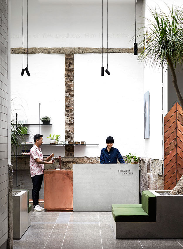
Paramount House Hotel rises out of the 80 year old warehouse that occupies the site. A copper, chevron screen crowns its brick shell and converses with the neighbouring art deco buildings of this former film precinct. The project explores the narrative between artefact and ornament, of place and of home.
Contextually responsive to its Sydney location, the hotel is truly unique. It is about expressing everything that was old and true, honest and raw, about the existing warehouse whilst capturing the spirit and excitement of the golden era of film.
There are 29 rooms at Paramount House Hotel – and like our guests, no two are the same. No matter the number of times guests stay, they will never have the same experience. Suites feel lived in and warm. Staying there, you truly feel at home.
Jury citation
Offering a bold yet sensitive approach to heritage adaptive re-use, Paramount House Hotel brings delight to this historic pocket of Sydney’s Surry Hills. Using the “artefact and ornament” approach to define old and new, the sheer alignment between the original brick building and the new copper crown responds decisively to the complex and congested urban site. Floating above the brick parapet, the delicate crown provides a permeable skin for light and ventilation to rooms and mediates privacy between buildings.
Externally, paint was removed from the facade to reveal the building’s original brickwork. Inside, historic fabric has been peeled away to reveal layers of time and function. In the glazed foyer, a light-filled atrium where heritage and new materials complement each other to celebrate then and now, your eye is drawn upwards by evidence of where a wall once stood.
Each room is unique and fitted with locally sourced fittings and fixtures. Remnant building features are characterful and celebrated throughout to create an authentic, comfortable and inviting home away from home.


Project description
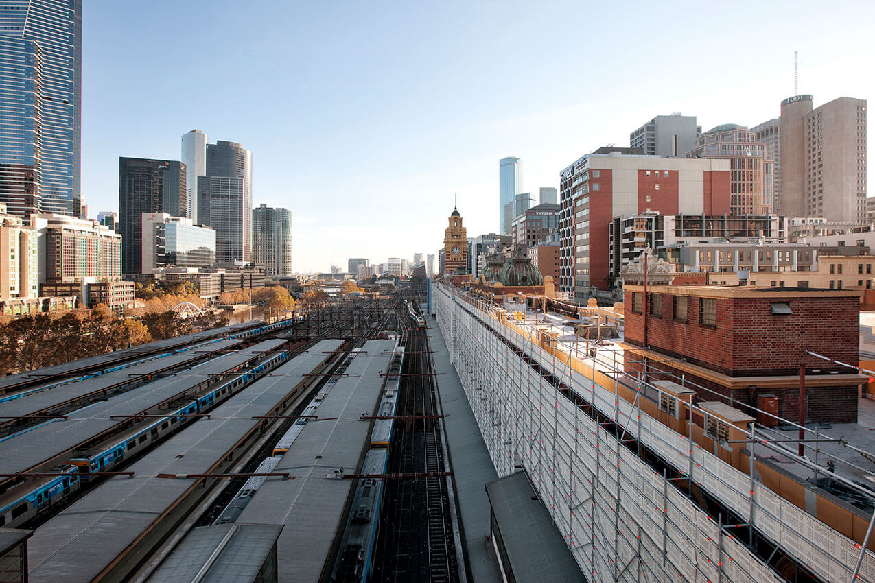
Flinders Street Station is one of Melbourne’s most recognisable landmarks and has always played an important part in the city’s history. It was completed in 1910 and remains critical to the functioning of the public transportation network and our social/cultural life. In recognition of its importance, Development Victoria initiated a revitalisation project, funded by the State Government: the first major refurbishment works here since the 1980s. In 2018, we completed the first phase, using best practice in conservation. The huge station complex, on an exceedingly challenging site, remained fully operational throughout. Working with engineer Bonacci Group, we addressed the immediate need to make the station watertight, improve its structural stability and prevent further deterioration of significant fabric. Key conservation outcomes: the achievement of a level of seismic safety, installation of a new roof drainage system with minimal intervention, management of legacy hazardous materials, and restoration of the original colour scheme.
Jury citation
At Melbourne’s Flinders Street Station, Lovell Chen has undertaken a forensic process to repair water-damaged original fabric, increase structural and seismic stability, and introduce new structure and servicing into an iconic civic asset. Every millimetre of the extant fabric has been carefully assessed, and a rigorous program of restoration and retention implemented, with all works adhering to the Burra Charter and undertaken while the critical transport infrastructure remained fully operational. An immense task of painstaking assessment, preservation and restoration, this vital exterior work sets a quality precedent for the future adaptation of the building’s interiors.
Project description
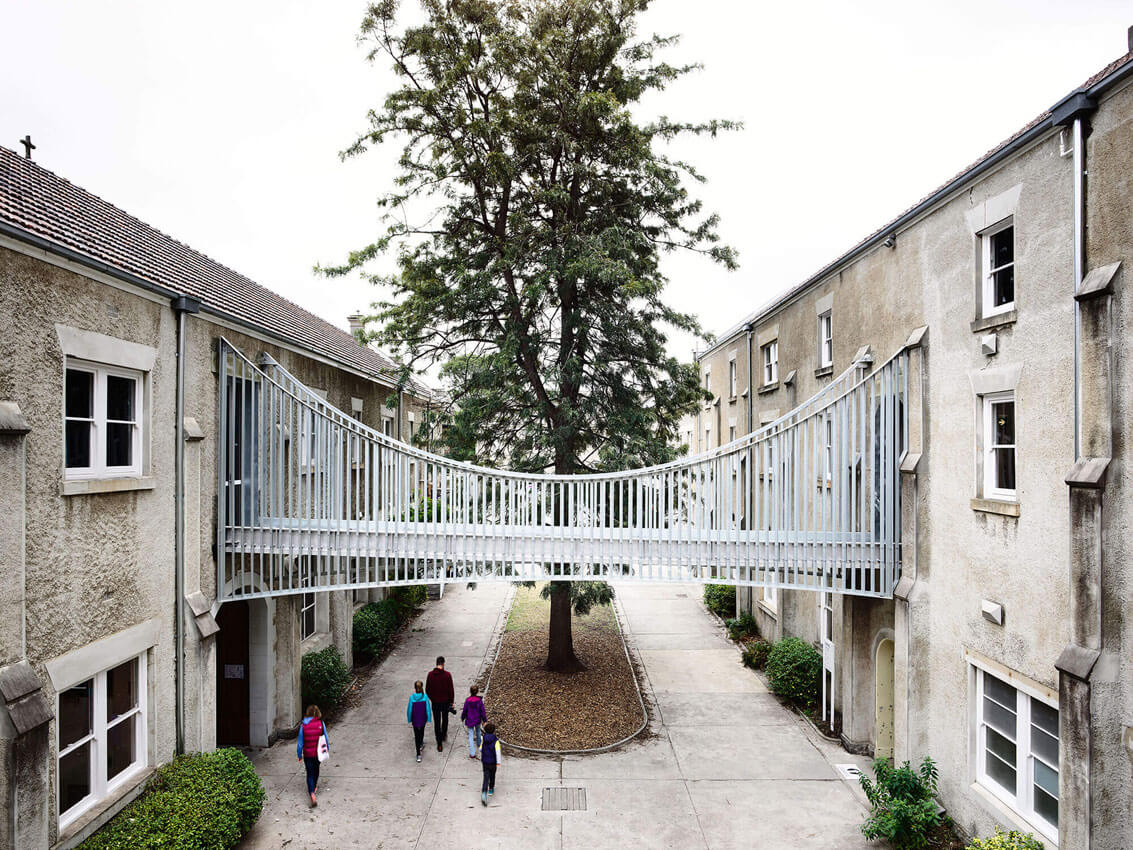
Sacred Heart is a key element within Abbotsford Convent and arguably its symbolic heart. A courtyard building it served as a secure home and workplace facility for “fallen and wayward women.” Recent works by KTA enable the use of what were virtually abandoned buildings for a mix of creative business, workshops and learning spaces as well as venues for cultural events and artisan-type retail. The key challenge was to achieve regulatory compliance with a degree of delight and respect for the highly variegated and listed heritage fabric. Resisting the urge to unify the variety of spaces, the broader result is a veritable palimpsest indexing the many histories and uses of the convent. The Bridge is the most visible sign of the otherwise subtle changes that have taken place largely within the adjacent interiors, the bare minimum to support new uses and opportunities.
Jury citation
Melbourne’s Abbotsford Convent is on Australia’s National Heritage List as the largest intact example of an institution dedicated to the care of “fallen and wayward women.” Works by Kerstin Thompson Architects to accommodate a vibrant multi-arts community within the Sacred Heart Building are bold and brave. An articulated philosophy of “leave well enough alone” has guided every design decision so that the existing fabric is respected but reworked where necessary to support the building’s new uses. The result is an architecture that intrigues and enlightens. New elements – most visibly, a bridge connecting one part of the building to another – are distinctive and united through material (almost exclusively galvanized steel and light-filtering mesh). The project serves as an admirable precedent for further works at Abbotsford Convent and for the broader approach to heritage fabric.
Project description
After 35 years, we outgrew our studio at 49 Exhibition Street, Melbourne. Spread over five small floors, we needed a new contemporary workspace with high connectivity, high flexibility, and good daylight and amenity. Level 19 in the IM Pei classic modernist tower at Collins Place, allowed us to consolidate onto a single floor.
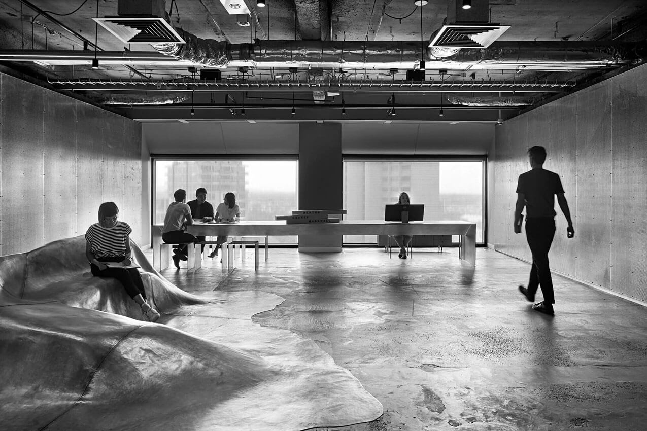
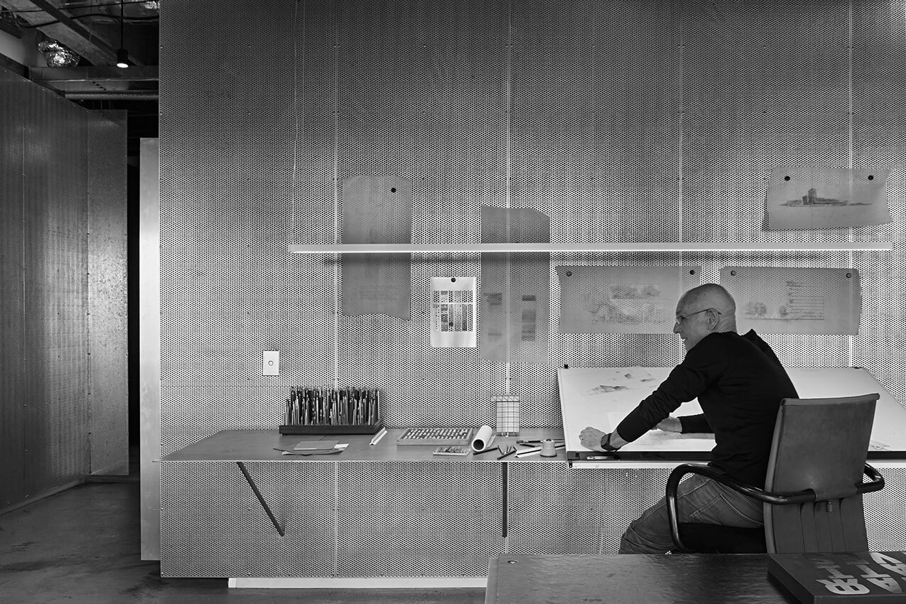
Our overall approach is raw, stripped back, ultra-minimalist, rejecting current fashionable trends of warm, timber lined, faux-luxury. We have worked hard to make this into something that reflects our design ethic and culture. We have avoided excess embellishment, through absolute rigour of stripping away and minimising clutter and distraction, and by adopting a hard-working, function-first approach to maximising utility and amenity.
The reception seat is the stand-out insertion, truly marking the studio as something distinctive and memorable. It is not an object of place on the floor; it is the floor itself – swollen and split.
Jury citation
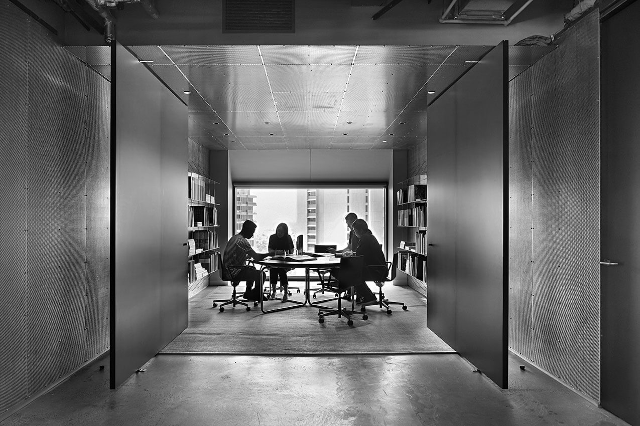
Rarely has an interior work been so singular, so “on message”, as the interior design and fit-out of Denton Corker Marshall’s new offices in Melbourne. A design and execution of profound consistency, every metre of the office floor seems to re-affirm the attitudes and sensibilities of the practice. Such an unrelentingly limited palette and resolution of details could easily become overwhelming; however, by DCM, it has produced a very provocative, very non-commercial interior architecture. As a branding exercise – which undoubtedly it is not – it serves to make it quite clear that DCM does not stand for all things – only some very considered things. No client entering the minimalist lobby/foyer would believe that this is a practice where anything goes, or where all client demands will be satisfied. It is a powerful message.
Having vacated a multi-floored office in favour of one large floor plate, the firm chose Collins Place, designed by I. M. Pei and Bates Smart in 1981. The building’s distinct, large, non-mullioned windows create panoramas with a downward view-line, offering spectacular views, aligned off-grid, to Melbourne’s CBD.
Into this modernist relic, DCM has brought tones of grey, silver and black to unite disparate meeting rooms, work stations, presentation spaces, and various distinct offices and back-of-house areas. This consistency is never monotonous. Instead, it produces both a well-recognized sensibility and a background against which people and new work come to the fore. It is sombre without being severe.
Perforated metal panels line most walls, giving a singular skin to the office; the same material is used for pin-up (or magnet-up), storage, product literature shelves, and doors to toilets and the workshop. Large pivot panels close off or open up meeting and presentation spaces, with few areas closed by doors or thresholds. This is an anti-corporate corporate identity with subtlety but without any ambiguity as to where the practice stands.
Project description
Judith Neilson’s Dangrove required integrated curatorial, conservation, research, library, workshop, administration, exhibition and performance spaces facilities. It is a world leading art storage facility with a museum standard internal environment designed to a minimum 100-year life, maximising clean energy use and minimising waste.
The ground floor accommodates: secure parking, pedestrian entry, a security hub, loading, plant, workshops and specialised storage areas. The upper floor accommodates: reception, administration, research, library, conservation, a sculpture courtyard, more art storage and two large art evaluation spaces.
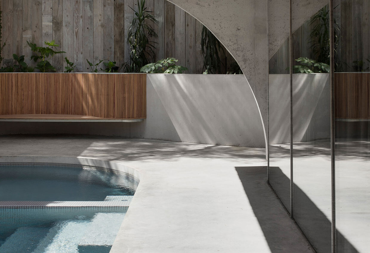
The major evaluation space is characterised by soft light entering above a datum of polished concrete. Here, temporary display and curation activities occur that support the operation of the White Rabbit Gallery as well as innovative performance events for art, music and theatre.
DANGROVE sets a new benchmark for art storage and curation reflecting the vision of the client, an important collector, philanthropist and artist.
Jury citation
A private art storage facility in inner-city Sydney, Dangrove constitutes a masterful arrangement of sublime spatial sequences. This exquisitely robust space is industrious and functional at the ground level and transitions to a series of connected curation and evaluation spaces on the upper level. The arrival and procession through the building is an experience of immense theatre.
Designed to house an expanding and internationally significant contemporary Chinese art collection, the interior of this state-of-the-art facility is formed through the combination of muscular and controlled formalism, and a calm and ordered material palette. It deftly and expertly blends pragmatic storage, technical facilities, and exhibition and event spaces.
A hierarchy of experiences has been created by these spaces, their interrelationships and the dramatic use of filtered natural light. Every aspect of the interior has been considered as a space of beauty, regardless of its role. Details are extraordinarily precise, creating a space that is technically and functionally flexible.
This is an interior that is designed to serve its current use explicitly; however, it will easily adapt for public use should the opportunity arise in the future.

Project description
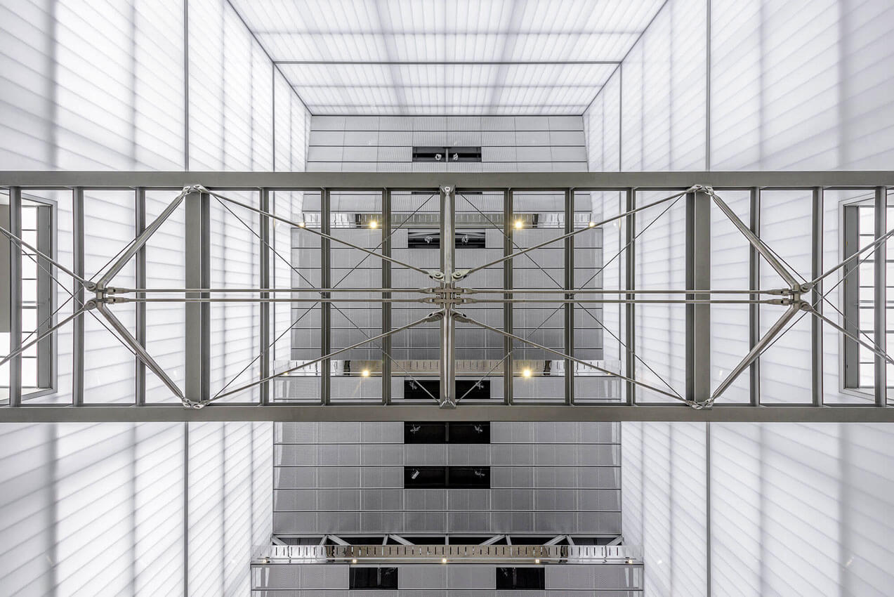
The University of South Australia’s Cancer Research Institute, based in Adelaide ‘BioMed City’ and designed in collaboration by architects Swanbury Penglase and BVN, is home to a number of research and technology focussed organisations including the globally recognised Centre for Cancer Biology and the University’s School of Pharmacy and Medical Sciences, located across several floors of research and teaching laboratory space.
The University’s new business incubator hub: the Innovation Collaboration Centre and ‘MOD.’, an exciting new future-focussed public gallery and museum are both located around the atrium and lower levels. MOD.’s aim is to facilitate accessible scientific engagement with the public, particularly school students, with permanent and changing exhibitions.
The intent of the overall development is to create a connected and engaged community of inquiry within the building itself, outward to the health sciences BioMed City precinct and just as importantly, to the broader community of Adelaide and beyond.
Jury citation
The University of South Australia Cancer Research Institute interiors are both refined and restrained, working to strengthen a clear architectural parti and distinguishing between work spaces, meeting places and circulation areas.
A beautiful building section organizes research communities vertically, with meeting spaces, social spaces and terraces surrounding a northern atrium. Despite being centred around highly controlled work environments (laboratories), this building program enables remarkable workplace flexibility, openness and interaction, supporting the institute as a genuinely contemporary research hub.
Impressive in a building of this scale and typology, the presence of natural light is felt throughout the interior, from the public areas to the lift lobbies and meeting spaces. Even within the work areas, the careful design enables every workspace to sense a connection to daylight.
The material palette is consistent – natural timber, concrete, dark-coloured floors, dark-painted steel – with subtle shifts between zones according to use. Light-filled white laboratory spaces and completely blackened public exhibition spaces are the exceptions. A discrete use of mirror, colour and brass reveals a skilled sensibility. The high quality and consistency of approach to detailing throughout this large building is particularly noteworthy.
Project description
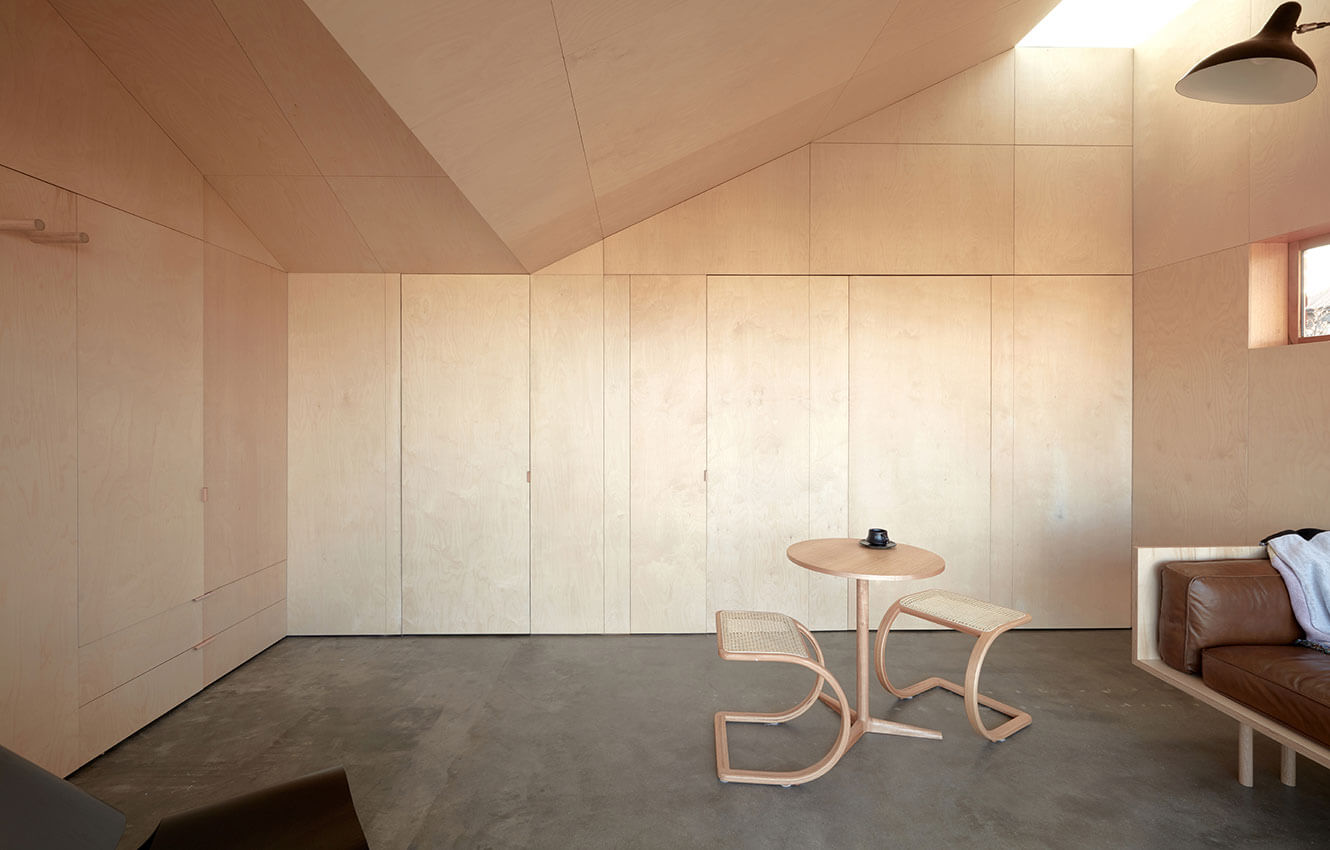
#TheBaeTAS tests the limits of small space living and reinvigorates an unloved 70’s bedsit apartment. The core design approach focused on generosity, investigating if, and how a 26m2 apartment could feel generous and even spacious? How could all of the functions of a home be included without impacting on the valuable floor area?
TheBaeTAS is adaptable, flexible and engaging and despite its tiny footprint can accomodate a couple or host a party of 10. The project contributes to a broader public conversation on small space living and demonstrates that delight can be achieved through careful and crafted alterations to “one size fits all” apartments which continue to dominate the typology.
Located in Sandy Bay, the heartland of Hobart’s federation architecture, #TheBaeTAS is surrounded by pitched hips, turrets and dormers. #TheBaeTAS inverts its surroundings establishing a physical dialogue that folds in the context to generate a new spatial condition.
Jury citation
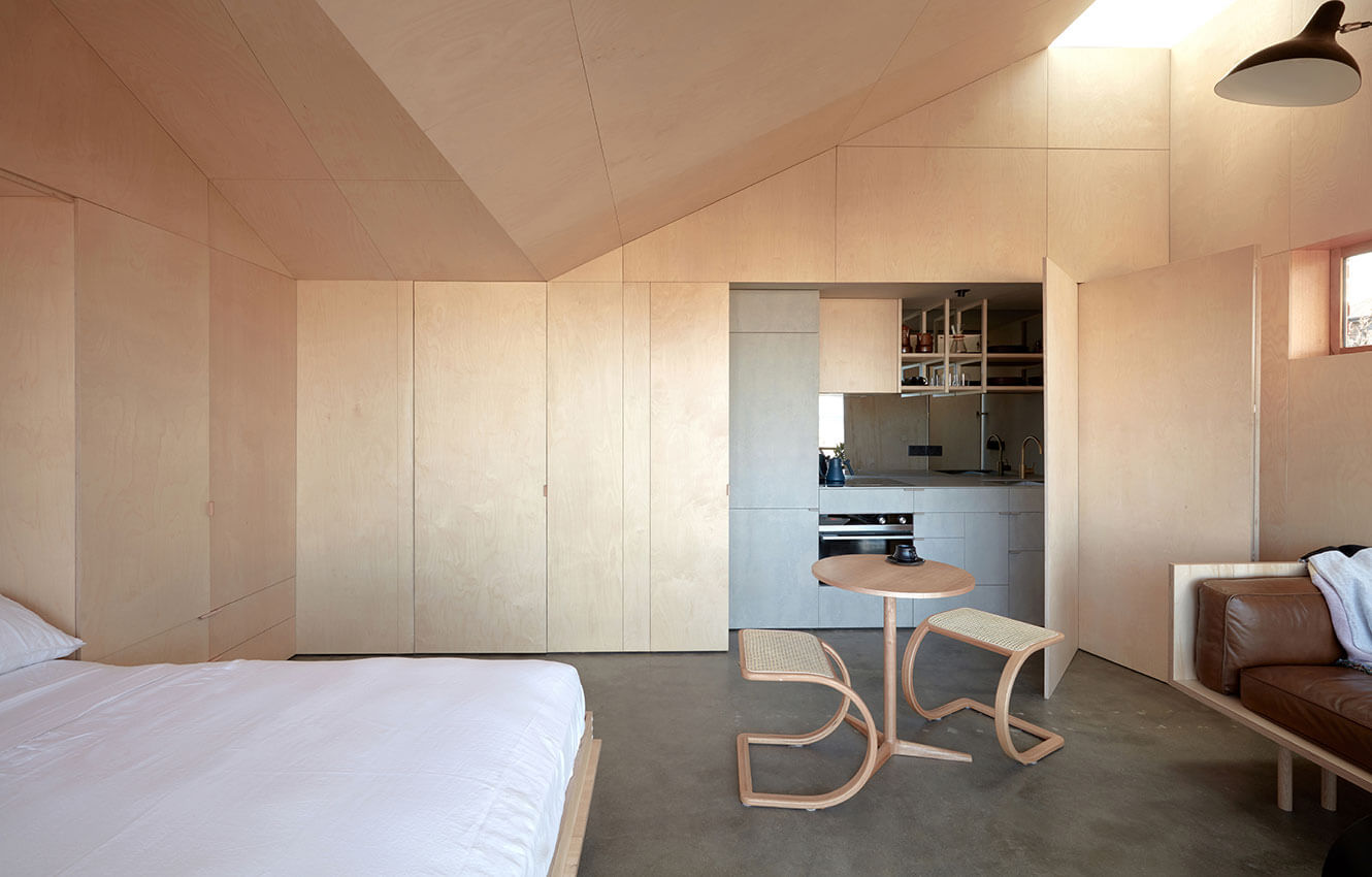
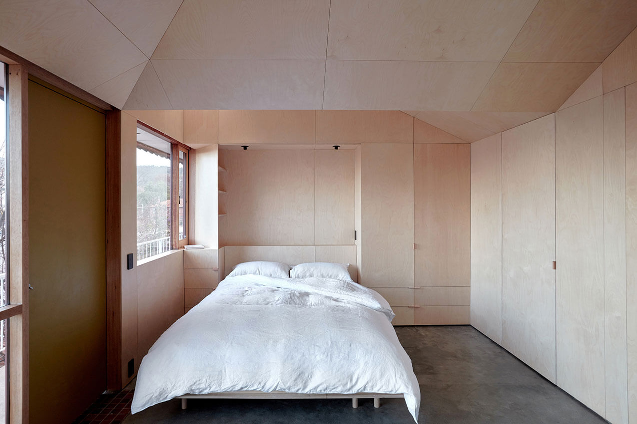
In #TheBaeTAS, an apartment with a tiny square-metre footprint located on the top floor of a 1970s walk-up block, workbylizandalex has created a spatial richness and a remarkable interior.
Original walls have been removed to create a single larger living space, with all the necessary accessories of domestic life – bed, kitchen, bathroom and storage – completely concealed. The architects have found additional volume by making use of the existing roof space. Pitched ceiling planes lit by skylight add a new scale dimension, fundamentally changing the experience of the space. The ceiling and walls are lined entirely in birch plywood and sit lightly upon a mute concrete floor plane. The singularity of material and balance of natural light imbue a strong sense of calm. The space transforms with the opening up of the bed and kitchen. The bathroom is other-worldly – deeply interior, a phenomenal top-lit space of maroon gloss tile.
A close collaboration between the architect and the joiner is evident in the meticulous jointing of the plywood panels, the precision of the tile set-out and the inventive door and joinery hardware. The Bae Tas provides a delightful and spatially diverse interior within a micro living environment.
Project description
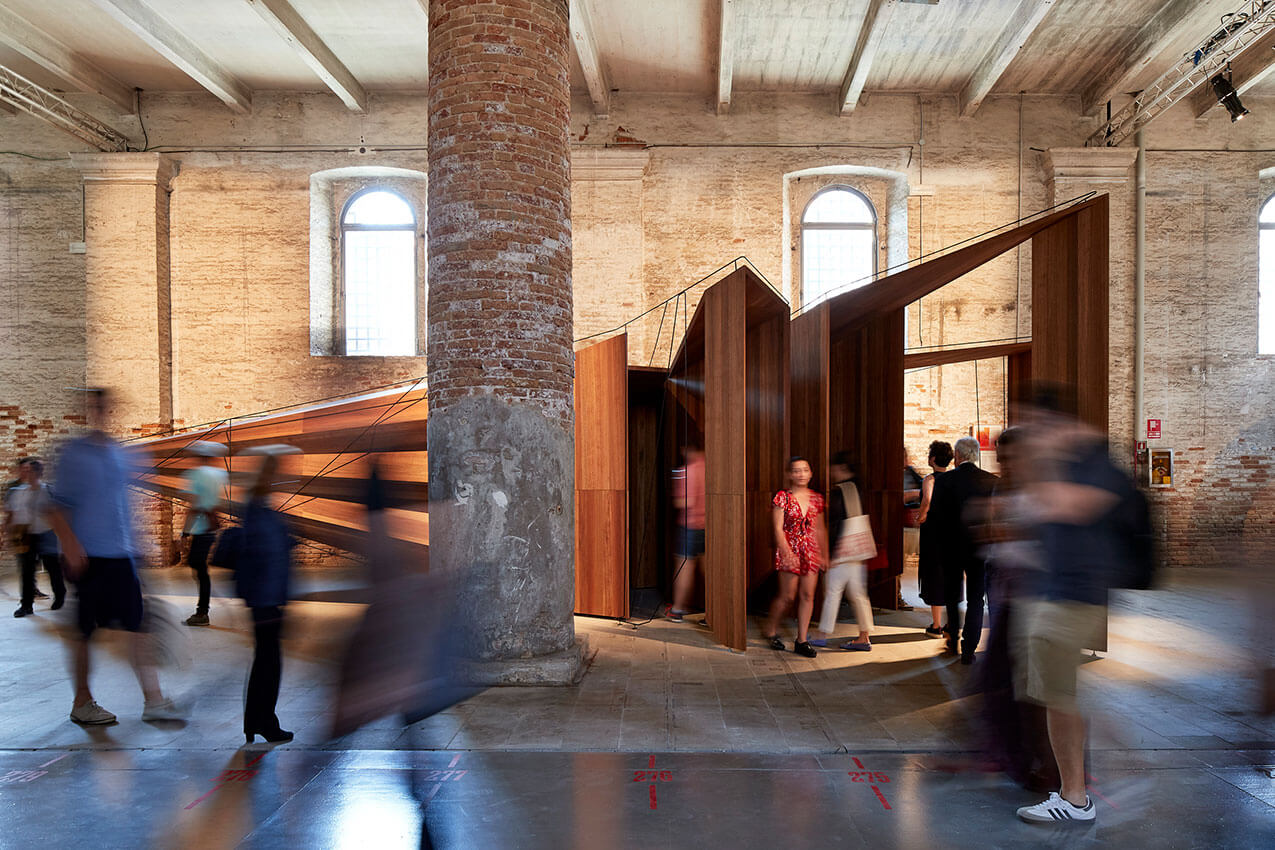
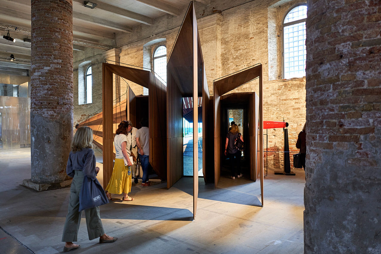
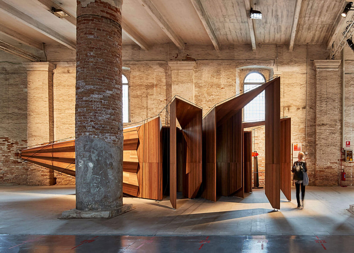
‘Somewhere Other’ is an original work that is a multi-sensory, multi-disciplinary, multi-layered exploration of architecture designed to transport the visitor beyond its boundaries. Somewhere Other is a response to the invitation by curators Yvonne Farrell and Shelley McNamara to be part of Freespace, the 16th International Architecture Exhibition – La Biennale di Venezia 2018.
On first sight a concertina structure of timber, overlaid with delicate steelwork, draws visitors in to explore spaces in between mysterious passageways. Five different ‘portals’ invite closer inspection and transport the viewer ‘somewhere other’. The installation becomes an instrument for seeing, extending beyond the confines of its place, to connect the viewer with Australia.
Somewhere Other celebrates the craft of making through detail; it engages with history; it invents an internal logic of design and it playfully creates a theatre of inhabitation. These, and many other traits, are embedded in the installation for visitors to discover.
Jury citation
Somewhere Other is an installation, a piece of furniture, a series of frames, a “camera” and an experience – as well as a meditation on the architecture of memory and place.
Produced for the 16th Venice Architecture Biennale, titled Freespace, this multi-faceted object-instrument is an intricate multimedia/multi-spatial environment displaying sophisticated architectural, cinematic and carpentry skills and sensibilities. Designed and developed by John Wardle Architects, it includes commissioned work of filmmakers Coco and Maximilian, and installation artist and filmmaker Natasha Johns-Messenger, and was constructed by joiners/fabricators Jacaranda Industries.
In the context of its original site, Venice, Somewhere Other connects and overlays multiple sensory experiences through apertures, viewing frames, refracted and mirrored images and filmic sequences. All the while, it links Italy to Australia, Venice to Geelong, with memories and fantasies overlaying all possible interpretations.
Entirely an architecture of discovery and exploration, and on a relatively compact footprint, space, time and materiality are joined through meticulous craftsmanship and execution. The device invites its audience to venture through portals and frames; to gaze into and through its various screens, surfaces and mirrors; and to calibrate and calculate where one space ends and another begins, where one memory ends and a fantasy unfolds.
Somewhere Other is a decidedly sensual object. The polished Australian timbers induce visitors to a slow touch at a portal, to run fingers along the corrugated snout, or to make a close inspection of the meticulous joinery. Beyond the conceptual play with perspective, constructed view lines, framing and the history of optics and mirrors, the work is also a dis-locator, being of and for Venice, but always demonstrating the interests and proclivities of John Wardle Architects. The filmic collage of Coco and Maximilian plays a loop of conjoined Wardle projects, situating this optical instrument as an “in camera” viewing room for a particularly Australian architect.

Project description
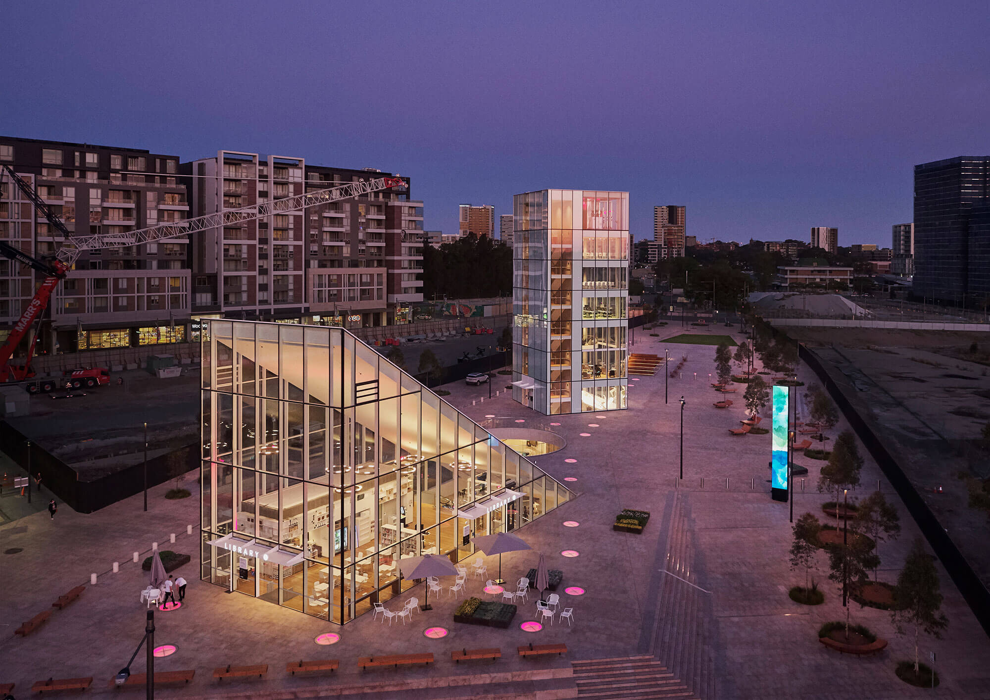
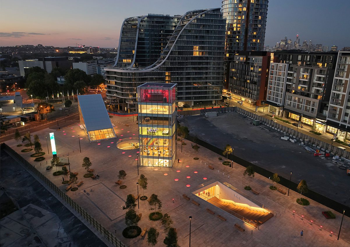
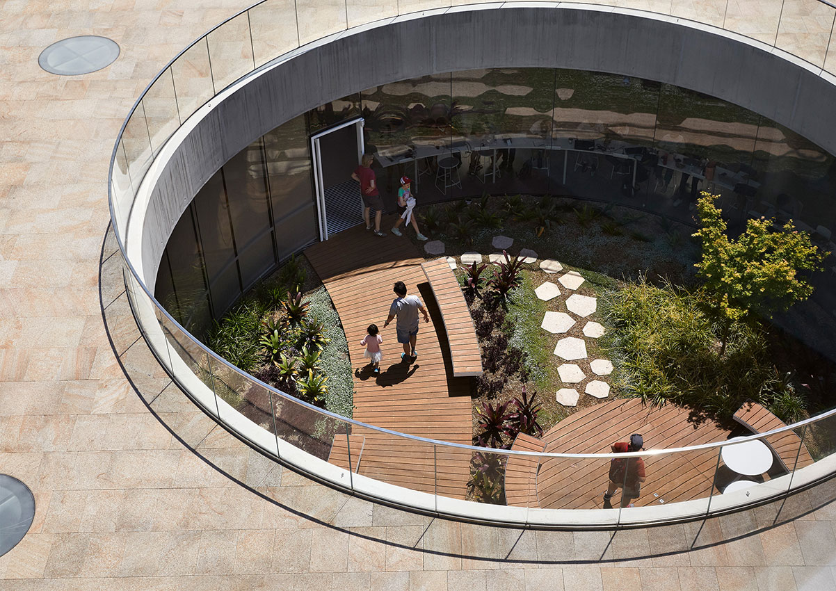
The Green Square Library and Plaza, design by Studio Hollenstein in association with Stewart Architecture and delivered for the City of Sydney Council opened in September 2018. Won through an anonymous global design competition, the design was unanimously selected by a jury including Pritzker Prize-winning architect Glenn Murcutt. The brief called for two distinct components – a public plaza and a library. By placing the library underground and freeing the ground plane for public activities, the design fuses these requirements together into one cohesive architectural experience.
The form of the library emerges from the ground plane as a series of legible forms – an entry triangle, circular garden, rectangular tower and trapezoidal amphitheatre – which animate the plaza and generate unique spaces for indoor and outdoor community activities. The design is informal and flexible to accommodate the evolving role of the library and demands of a growing population well into the future.
Jury citation
Green Square Library and Plaza ambitiously responds to its context of the ever-increasing residential density of the Green Square town centre, which will become home to 61,000 people by 2030, according to the City of Sydney. Inherent to the project’s design strategy is the protection and preservation of an 8,000-square-metre public plaza; this is achieved by submerging much of the building program beneath it. The design privileges the plaza as urban “breathing space”, which it recognizes as a diminishing commodity that will become increasingly valuable as the area continues to densify.
Across the plaza, the elemental geometries of a triangle, circle, square and trapezium are strategically placed, hinting at building access and use. Their relative transparency creates beacons of light and activity, and allows views to and from the library and associated community spaces. In essence, this project is a kind of public living room with generous and vital areas that can be shared between adults, adolescents and children. It is a living heart and a place to exhale.
The stacking of community-programmed spaces within the mini-tower allows the building to be used day and night for a range of activities, from group meetings to quiet reading or music practice.
The design builds upon a clear understanding of the changing nature of public libraries. The library spaces are inherently flexible, being able to expand, contract, adapt and evolve as required. In contrast to the silence and reverence of a traditional library, the Green Square Library’s large rooms can accommodate a wide variety of dynamic pursuits. Large glazing cut-outs and skylights create a porous interface between the library and the plaza, ensuring constant connection with the outdoor environment and a crossover of activities.
Awarded through an international design competition, this project demonstrates what is possible when architects are encouraged and supported to tackle the challenges of our growing cities. By thinking creatively, Studio Hollenstein in association with Stewart Architecture has created a truly wonderful “third place”, an inviting and optimistic space for community engagement and civic life.
Project description
The new annexe building provides much-needed office accommodation for 102 members of parliament and their support staff. After a century and a half of makeshift and inadequate member’s offices and numerous failed schemes to extend Parliament House, the new building finally solves a long standing accommodation problem. The annexe has been constructed as a separate free-standing building within the eastern gardens of the Parliamentary precinct but is linked back into Parliament House via a bridge, tunnel and laneway connections. The new annexe has been conceived as a companion building set in a garden where one hundred percent of the footprint has been replaced with landscape on the roof and within a large central courtyard. The office annexe has been planned as a perimeter courtyard scheme of four unequal wings that have been partly sunken into the ground to protect views and integrate it topographically within the eastern garden.
Jury citation
In one sense, the Parliament of Victoria Members’ Annexe is a “recessive” work, buried in the landscape and deferring to its context. This reticence and restraint deliver a certain timelessness and remarkable serenity to the offices of the state’s elected officials. In a space where favour and hierarchy formerly dominated, the architecture produces egalitarian and equitable offices and facilities.
The project exploits, or ‘relies’ on the landscape and the sensitive horticulture to give a dignity to the annexe. It exploits the existing garden to create a refreshing sense of relaxation and quietude that is particularly welcome in the context of a political epicentre. Although not open to the public, this is a project of the public and for the public good. One can’t help but hope that its architecture affects political discourse over time.
It would be remiss not to comment on the fact that this immensely successful project was achieved by eschewing the pressure for public projects to be procured and delivered by novation and design and construct methods, or externally project-managed. It is clear that quality has been the primary driver here, and the close working relationship between the client and the architect is fully evident – to the long-term benefit of all.
Project description
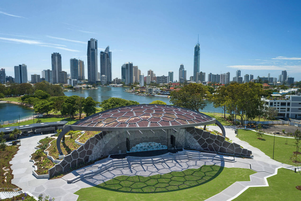
HOTA Outdoor Stage is a highly versatile performance venue: a black-box theatre that opens onto an amphitheatre with seating and lawn space for 5000. It’s the first realised element of ARM Architecture and TOPOTEK1’s 2013 masterplan for a new arts and cultural precinct. Like the whole HOTA precinct, it features the distinctive design motif of the Voronoi web.
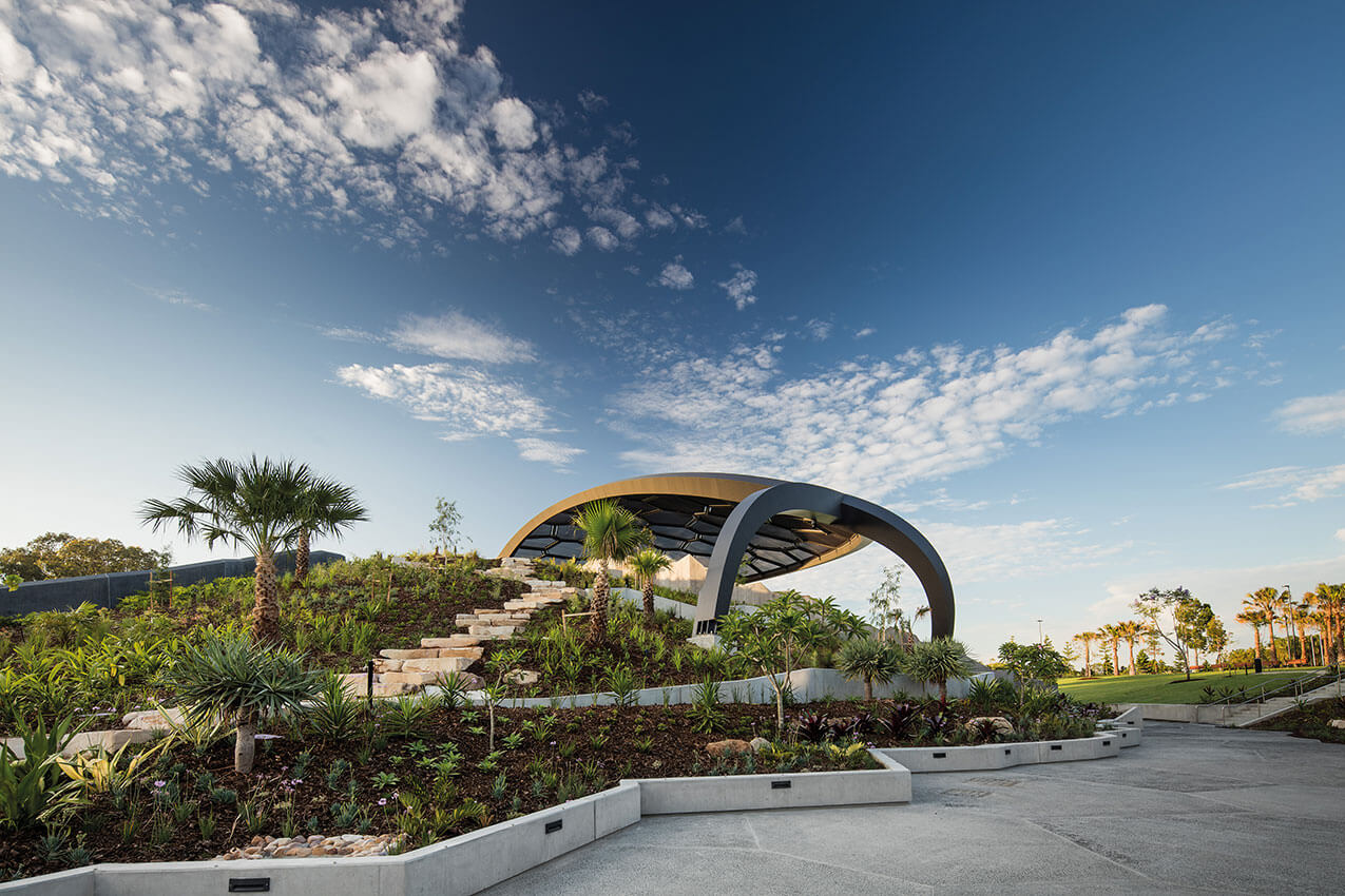
The building is quarter-spherical and covered by a garden mound that merges it with the surrounding landscape. The landscape is set up for temporary facilities including food trucks, merchandise kiosks and portable toilets.
The Outdoor Stage welcomes people 24/7. When there’s no programmed activity, the stage and steps are still open for buskers, for children’s role plays, for impromptu shows. The garden roof is for adventure and discovery to be climbed on, explored, sat on, picnicked on.
The venue’s cultural variety and landscape will ensure its popularity for decades to come.
Jury citation
A generative project for a new cultural precinct on the Gold Coast, the HOTA Outdoor Stage is the first project to be delivered as part of a vast riverside masterplan by ARM. Rather than an object-based approach, the master plan uses an ingenious relational strategy, inspired by a Voronoi diagram, that accommodates and scales as the plan is delivered. The motif of the tessellated form knits a continuous narrative through the work, informing the planning and detail resolution of the architecture.
Conceived as a traditional black box theatre, a giant openable front allows the stage to be almost endlessly reconfigured, depending on the scale of the audience and the nature of the performance. The stage is conceived entirely in-the-round. The backstage is carefully accommodated under a vast concrete “cliff” above which a publicly accessible roof garden is densely landscaped with flowering native plants and brimming with birdlife.
This project clearly represents an enrichment of the original brief. The design’s mounded form not only animates the typology of the public amphitheatre, it also reinvents the landscape experience of the Nerang River.
Project description
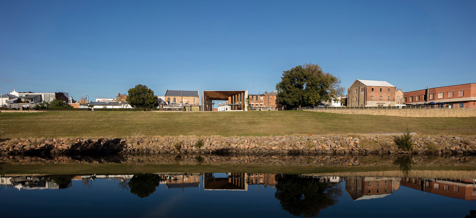
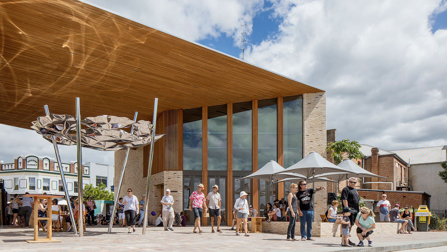
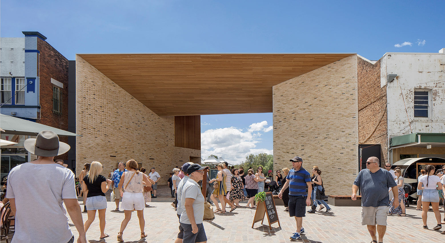
Maitland Riverlink is a public project that crystallises new value for the regional centre Maitland, both in terms of its identity and its assets. The project will support a revitalisation of the central business precinct, extending it beyond the main street to the river. The space acts as a kind of ‘public living room’ for the community, reactivating an unused part of town and drawing locals back to the river that is a fundamental part of Maitland’s heritage, whilst bringing tourists and visitors to the town.
Jury citation
Maitland Riverlink is an exacting work, civically generous and courageous. Beyond the realization of an appropriate form for communal amenity, the design revitalizes and fortifies the communal consciousness.
The project offers the people of Maitland a public place that is both carefully scaled to the grain of its urban context and highly transformational. It is a public living room, an outdoor cinema, an urban stage, a covered plaza, a forecourt to a restaurant and cafe, a gallery for urban art and a threshold to a new riverside promenade.
The reintroduction of the Hunter River to the context of the main street has turned an economic and cultural tide. Shops and businesses are extending their frontages and reorienting to an expansive riverside network of public walkways and promenades.
Maitland Riverlink elevates a prosaic brief into a larger vision for the public good. The materiality of the project is uncompromising, with a robustness and hand-finished quality that bespeaks a deeper attitude of civic pride and care.
Project description
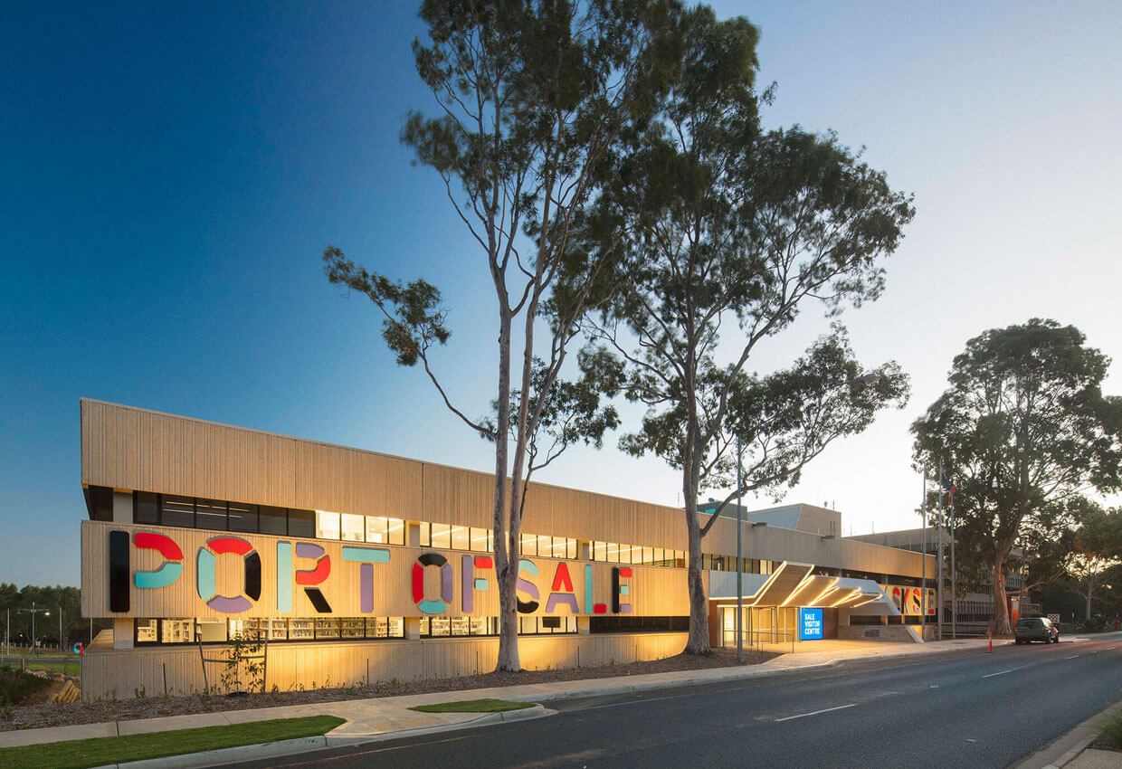
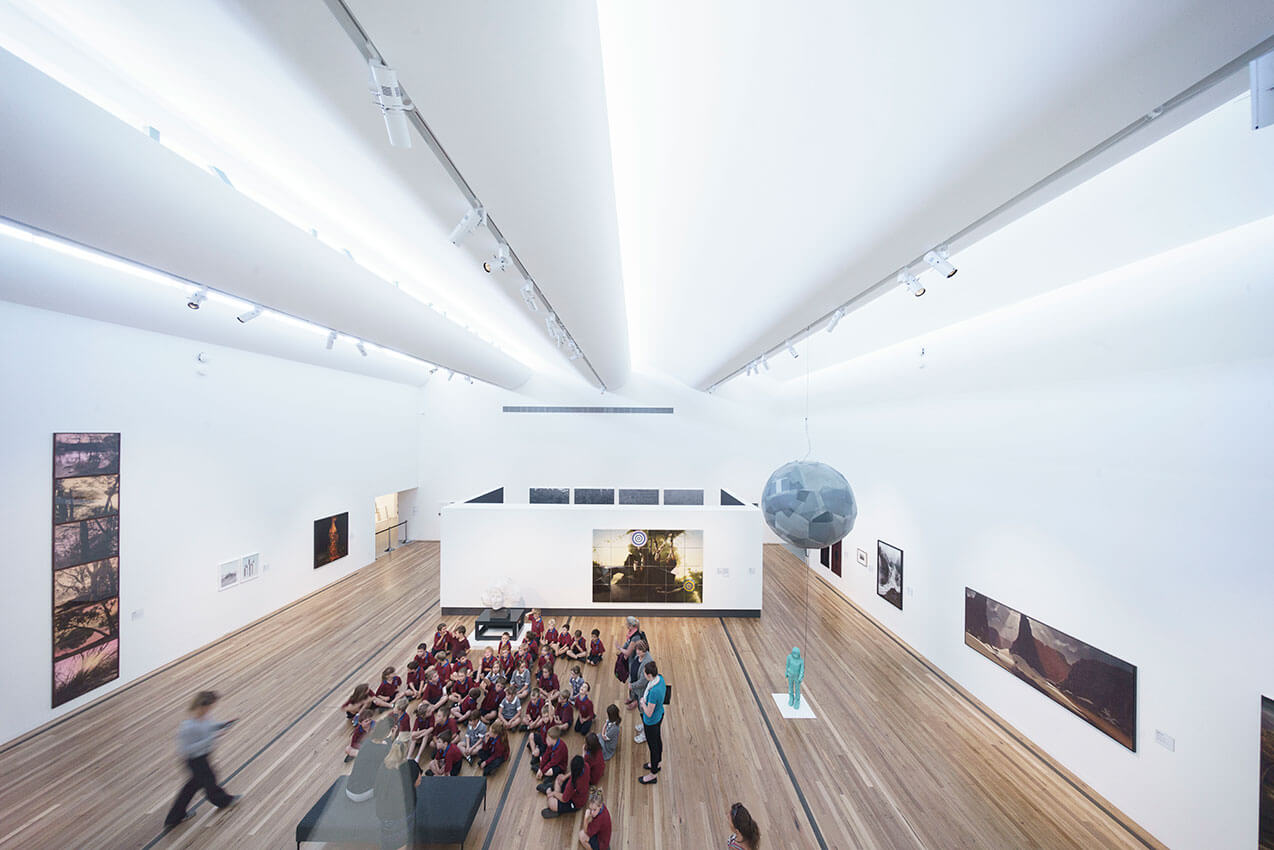
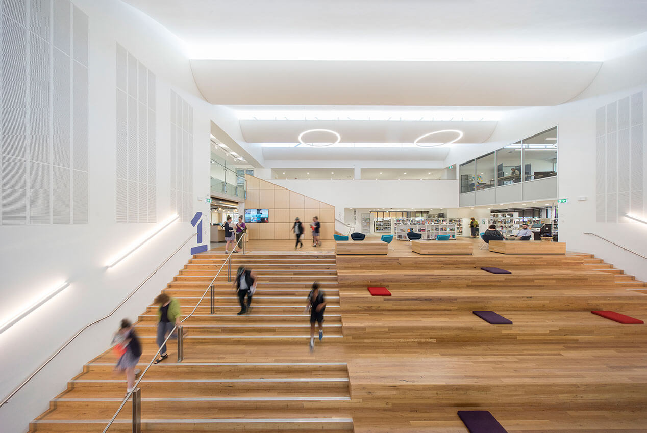
Wellington Shire Council engaged fjmt to revitalise the historic precinct known as the Port of Sale into a multi-use cultural hub. The project encompassed the additions and refurbishment of the existing Shire offices and Gallery building, originally designed as an office building in the late-modern brutalist style, to accommodate civic, tourist and cultural community facilities. The redevelopment of the Port of Sale precinct provides shared space and revitalised links to the local Port, in a country town that previously lacked both a civic and cultural focus.
Consultation enabled the design team to understand patterns of use of the existing civic and cultural facilities, and to use the design to encourage broader shared use of library, gallery, meeting places and shared space.
The result is a community fully engaged in the project, where membership of the library and gallery have increased and new community groups are using the spaces.
Jury citation
Port of Sale is an important project that supports both community life and tourism in the small Victorian regional city of Sale. The architecture breathes life and lightness into an existing brutalist building, combining regional art gallery, library, council chambers, community meeting spaces, information centre and cafe within a single facility. The transformation of two existing courtyards into significant public rooms as the basis of the project’s organization is effective and resourceful. The integration of new services throughout is deft, and interventions to balance light with view, open the interiors to the broader context and realize strategic civic connections to the Sale waterfront are skillfully executed.
Project description
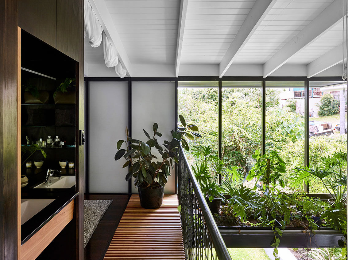
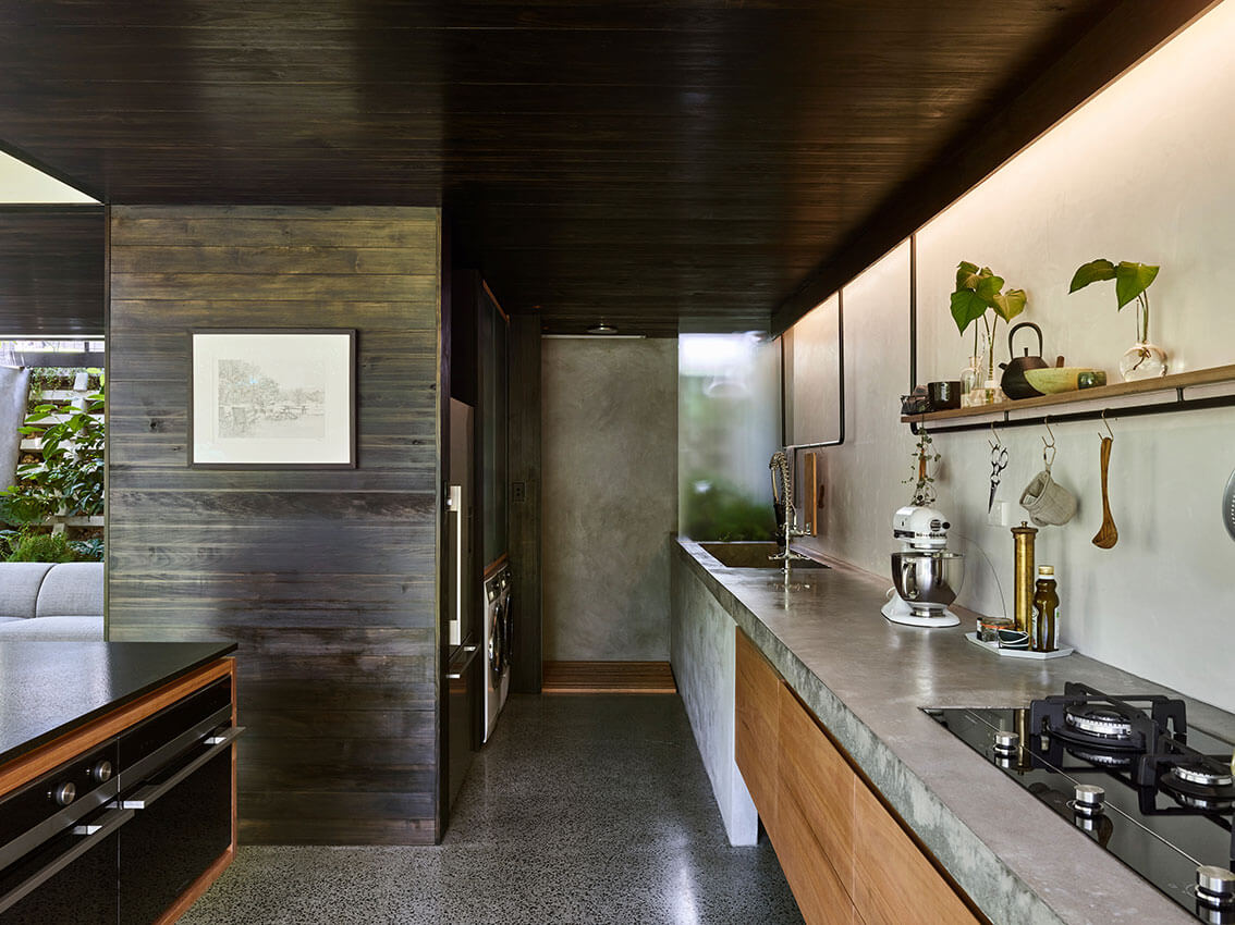
A home created by bringing together layers of memories from the owners’ childhoods and travels. It began as an exercise in pragmatics, managing site conditions and a 100-year-old cottage crumbling into a backyard jungle.
Entering into a private world through a vine-covered screen, the front verandah now contains protected external stairs. A lush, plant-filled void draws you downstairs.
The lower level is detailed to retain the feeling of the former under-croft. Dark ceilings create compression. Doors disappear making the edges ambiguous. This is a space sitting in shadow, allowing retreat from the intense Queensland light.
Private rooms sit above. Bedrooms open wide onto a hallway space, making a room for play. Sliding panels close for privacy, separation and retreat. The bathroom and main bedroom sit adjacent a large void. Connecting the levels enables chatter, activity and increases the perceived size of a small home.
Jury citation
In Terrarium House, John Ellway has completely transformed a former single-bedroom timber cottage into a rich and delightful home with space for guests. A surprising spatial diversity is achieved through a series of simple but radical strategic moves.
On a site in inner Brisbane that slopes steeply away to the north, the original cottage was built with its verandah opening directly onto a narrow street. The architect has carefully repaired the cottage and retained its cellular rooms as bedrooms. New kitchen, dining and living spaces have been introduced within the former open undercroft at garden level. Upper and lower levels are united through a large internal void that both creates a feeling of spaciousness and draws sunlight into the plan.
The front verandah floor has been removed in an ingenious strategy that unlocks the original plan, allowing light, air and access between levels via a covered garden stair. Camouflaged by a dense vine, the trellised verandah appears almost untouched from the outside; only a slightly projecting bridge and handrail hint at the transformed habitation within. This project shifts the definition of “verandah” from a familiar element of public–private interface to a space of intrigue. The house maintains privacy while being porous and connected to the street.
The result of the architect’s moves is a highly sensorial interior that connects strongly to the garden. Every detail displays judicious effort and a well-pitched restraint. While the cottage is predominantly white, a dark ceiling, concrete floor and oiled timber joinery downstairs deliberately recall the shadowy quality of the original undercroft. Disappearing sliding doors make ambiguous the edge between house and garden, and the scent of the earth is present inside. There is a sophisticated handling of natural light using both clear and translucent glass as well as solid panels. Slatted floor surfaces and vegetation also filter the light. Terrarium House is an impressively clever and memorable project.
Project description
The owners of Powell Street House, an architecture and design writer and his partner, wished to convert their two storey 1930’s duplex into a cohesive single residence.
The existing house had a quiet interior and muted light, and the new works were conceived in response to this, with a deliberate quietness, respect for the existing fabric, and a desire to keep structural alterations to a minimum.
An addition was created to the rear of the site, featuring a new steel framed window wall which delivers an intriguing quality of light to the interior of the newly created space. Openings were created in the existing fabric to create a strong visual connection between this new addition and existing parts of the house.
The addition, and the new architectural elements generally, were conceived to read as sympathetic insertions within the existing fabric and connect enigmatically with the materiality of the original.
Jury citation
Powell Street House is a seductive, enticing gem of subtle transformations and judicious respect for existing features. The project is a critical collaboration between an architecturally literate client and an architectural practice whose palette is broad yet exacting and precise. The conjoining of two residences into one is achieved with finesse by moves that never overpower the original fabric or diminish the spatial scale of the existing structure.
A tactic of “lift and shift” has enabled delicate interventions that reject the conventional belief in light for light’s sake and focus instead on deep interiors with emerging luminosity. Being inside is rather like inhabiting a late Rothko painting, where the eyes adjust to participate in a slow reveal of dark tonalities and subdued textures. This alteration is neither minimal nor monochromatic; it is deeply considered and reflects the clients’ approach to fashion, architectural effects, daily life and a much-loved cat.
Powell Street House does not seek to maximize resale expectations. It is an exploration of the shifting balance between retention, deletion and addition. Its bold and somewhat quirky gestures play off restrained and period backdrops both powerfully and subtly.

Project description
This project is an alteration and addition to a weatherboard Edwardian house in inner Melbourne. The rear of the house faces south, where there is a generous garden. We restored and re-imagined the existing house and added a pavilion which is separated from the original building by an internal courtyard containing a swimming pool. This rather conventional approach is enlivened by displacing expectations of the back-yard extension.
This was done through a whimsical formal approach, a balanced relationship between garden and interior space and a detailed and nuanced approach to texture, colour and pattern.
Jury citation
Full of eccentricities, Caroline House is a careful proposition designed to meet the specific needs of the client’s young family. A series of courtyards introduce sunlight into the new areas of the house and act as distinct outdoor rooms, setting a pattern of unfolding light that is extended in the palette and interior finishes. Exterior surfaces are continued internally to articulate the open structure of the room-making; this is particularly evident in the continuation of terrazzo floors from poolside to circulation, kitchen and living areas.
The deep, green, circular pool forms a hinge in the plan, activating the dappled quality of the light that is reflected back into the new living and sleeping spaces. Externally, formal references tie into the original Edwardian fabric of the house without being sentimental or referential.
This project, somehow both familiar and remarkably new, has a unique appeal. The playful planning belies Kennedy Nolan’s rigorous intention. Spatial motifs are employed to evoke a sense of togetherness and the thoughtful design gathers the young family into a soft, seasonal light.

Project description
Canberra is home to some of the best examples of post-war and modernist architecture in Australia. Empire house is located in a culturally significant area of the city, on a ring-road that forms part of Burley Griffin’s masterplan. As architects we felt a sense of responsibility to stop demolishing. Here was important built heritage we felt the need to protect, preserve and contribute to.
The owners of Empire house owned a modest, inter-war style bungalow and wanted it to become their permanent base. They asked for “a long-term family home that catches the sun.” The aim was to retain as much of the existing character as possible. The result was two added pavilions, sympathetic to the existing house, but distinctly contemporary in detail.
Empire house is a relatively small, hand-crafted home, unapologetic in its architectural detail and craftsmanship, as this is what the area deserves.
Jury citation
Empire is a deftly executed project that balances fine craft and detail with an intelligent response to the larger issues of suburban living. Initial design decisions and confident planning approaches have energized the existing post-war home by creating clear sight lines through a logical and curated sequence of interconnected spaces. Via the considered placement of two modestly sized pavilions, the relationship of the house to its site has been liberated and refigured, framing views and extending the experience of the interior into the garden. Empire creates a conversation between old and new that can be appreciated at every level.
Project description
The Teneriffe House is a complex undertaking involving the rehabilitation, conservation and extension to an historic house built in 1909 and designed by prominent Brisbane architect AB Wilson.
The original house had suffered a substantial degree of abuse and disfiguration during its immediate prior occupation. Consequently its original relationship to its setting, beauty and elegance were almost illegible.
Not protected by heritage-place listing and at threat of demolition under any other investor, the new owners (our clients) recognised its inherent cultural value and their custodianship for a significant piece of city fabric.
Each city presents a project type or architectural problem that belongs uniquely to that city. In this instance we approached the classic ‘Raise and Build-Under (plus extension)’ with three specific strategies; Composition: ‘A house on stumps’; Re-Occupying the Plan: Engaging with the historic narrative of occupation, and; Stair Room: A generous room connecting all levels
Jury citation
With the original house – a 1909 Queenslander – almost lost to years of insensitive adaptation, this project tells a story of repair. Vokes and Peters emptied the plan by removing all interventions and recalibrating the structure into a variety of spaces that both honour the home’s heritage and meet the practicalities of modern life. A concrete plinth and cloister ground the new communal family spaces and link the original interior with the garden, reclaiming the ground and the sky. A work of rich composition, Teneriffe House bespeaks a mature narrative of domesticity and city-making.
Project description
Perched on a headland in Middle Harbour, Five Gardens House establishes the landscape as a form and spatial generator. Arched ceilings float above a projecting concrete entry roof as if the volume of the rock outcrops in the adjacent bushland have permeated into the building form. Horizontal projections over 3 levels reach out into the landscape and wrap around a spectacular eucalypt in the rear yard.
New work is joyously stitched into the existing building fabric to enhance the modernist aesthetic and create omnipresent connections on all levels to gardens, 3 existing, 1 new rooftop garden and aspect up to the 5th garden, The Knoll.
Internal and external stairs create a spiral circulation system connecting all levels and gardens. Subtle shifts in geometry yield to the prevailing aspect over Sailors Bay. Raw, robust materials and expressionistic structure invite an emotive response and embed the building into the landscape setting.
Jury citation
This delightful and whimsical project effortlessly stitches a new and vibrant addition to a modest 1950s house to take full advantage of its setting. David Boyle Architect’s reinterpretation of the typical post-war house plan, and skilful blending of spaces, has created a contemporary family home rich in possibility and habitable opportunity.
The delicately woven collection of spaces has been formed through an expertly handled manipulation of volume. The section creates a complex interplay of light that shifts throughout the day to maintain a warm interior. The architecture frames views into unique landscape settings, including five different gardens, initiating generous connections between inside and out.

Project description
Big enough and protected enough for the landscape to flourish, inside.
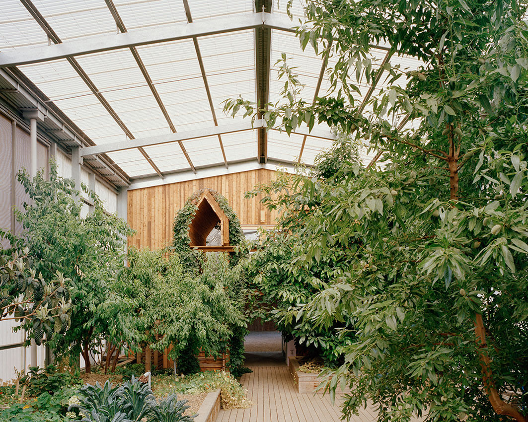
The Longhouse reconciles the desire of its owners to establish a boutique farm, cooking school, reception venue and home with an existing property holding in Daylesford, Victoria. Initial site investigations revealed a local population of grazing fauna, hostile weather conditions, sporadic rainfall and shallow planting depths.
The farm’s various agricultural and hospitality activities are consolidated in a single 110m long mannered shed.
Prosaic building materials and local construction practices are exploited to provide a maximum possible interior volume and roof area. The internalized productive landscape is afforded protection from the locale’s hostility, rainfall is harvested and stored to ensure regular supply.
The Longhouse’s interior volume, sequenced by miniature timber and brick insertions, veiled, ripe and overgrown, verges on fantasy: a grand hall, a secret garden, the setting for guests, ceremony and memorable occasions.
Jury citation
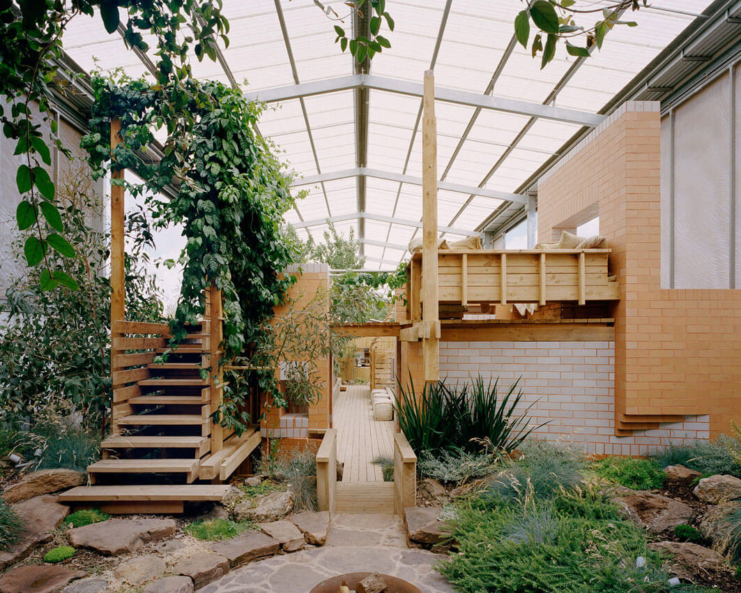
Daylesford Longhouse is utterly extraordinary – challenging in its questioning, enchanted in its outcome. Situated in rural Victoria, the house aims to nourish and sustain. The strategic starting point was a roof large enough to collect water to support a small number of people, some animals and a produce garden on a remote and exposed site. The core activity to be sustained by the architecture was food production, preparation and sharing.
The roof – roughly 12 metres by 130 metres – marks out a linear territory that, together with walls of sheet metal, translucent polycarbonate and agricultural mesh, preserve the interior (which includes the verdant garden) as a discrete climatic zone. The translucent skin, punctuated only by carefully curated picture windows, protects the garden from predators and exposure. Akin to a long shed or conservatory, the structure includes an operational barn at one end and an intimate residence at the other.
Internally, aedicules, arbours and eyries accommodate the domestic functions of kitchen, dining, sleeping and bathing. These spatial “follies” reference other times and places, and form the settings for continuously unfolding theatre. The sense of living within the garden is profoundly delivered.
Partners Hill has scaled up this design to the rural landscape to avoid being diminished by it. The site is a microcosm of the broader setting; “wild” grass mounds that reflect the mounded landforms in the distance are used to signify the building entry and the cultivated production garden extends into the house.
Inside, alongside the flourishing plant life, is a surprising richness of refined architectural detail – raw timber, terracotta and white-glazed brick, all composed harmoniously in a magical and constantly changing light. One is drawn from places nestled in the garden to places of survey in the canopy, in what is a deeply memorable experience of a house.

Project description
Simple steel framed haysheds, roofed but open on all sides, are dotted across the Australian countryside and their evocative silhouettes offer a romantic rationale for this Arcadian myth- house. Notions of the frontier; of survival in a never-ending battle with Nature are close to the bone for many Australians. In the outback any constructed shelter can mean the difference between life and death – shade from the intense heat, height above the flooding river so that these simple, often weather-ravaged structures assume a more profound meaning. We therefore chose galvanised steel as an at once pragmatic and poetic material – the only one capable of allowing us to achieve our ambition for this building.
Jury citation
House in the Hills initially presents as an abstract intervention in the rural Victorian landscape, challenging our perception of rural domesticity. A hovering parasol, inspired by steel-framed hay sheds, performs as place-maker, defining the habitation precinct within the rolling 25-hectare site. Restrained and expansive, it establishes a datum line within the landscape, emphasizing changes in the typography.
Beneath this parasol, a new landscape is established, with two pavilions and the reshaped ground plane surrounding an inner courtyard. Above, the parasol’s operable louvres permit varying degrees of light and shade, depending on the time of year and day, and protect the house from pummelling south-westerly winds.
In contrast to the unashamedly rigorous metallic exterior, the house’s plywood interior is warm and inviting. Inside, the vast landscape views and broad extent of the parasol enlarge the perception of the modestly scaled rooms.
House on the Hills’ evocative silhouette is precise and immaculately detailed. This is an ambitious family home on a beautiful yet unrelenting site.

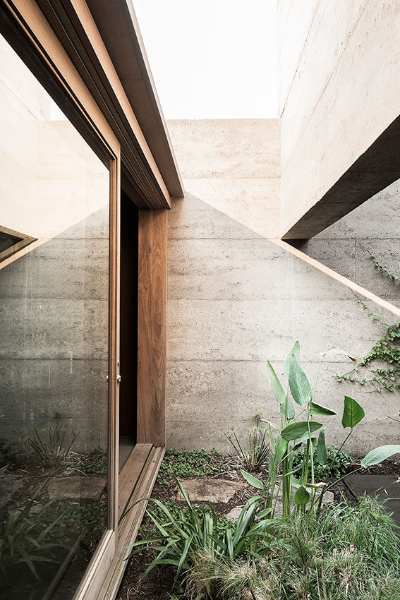
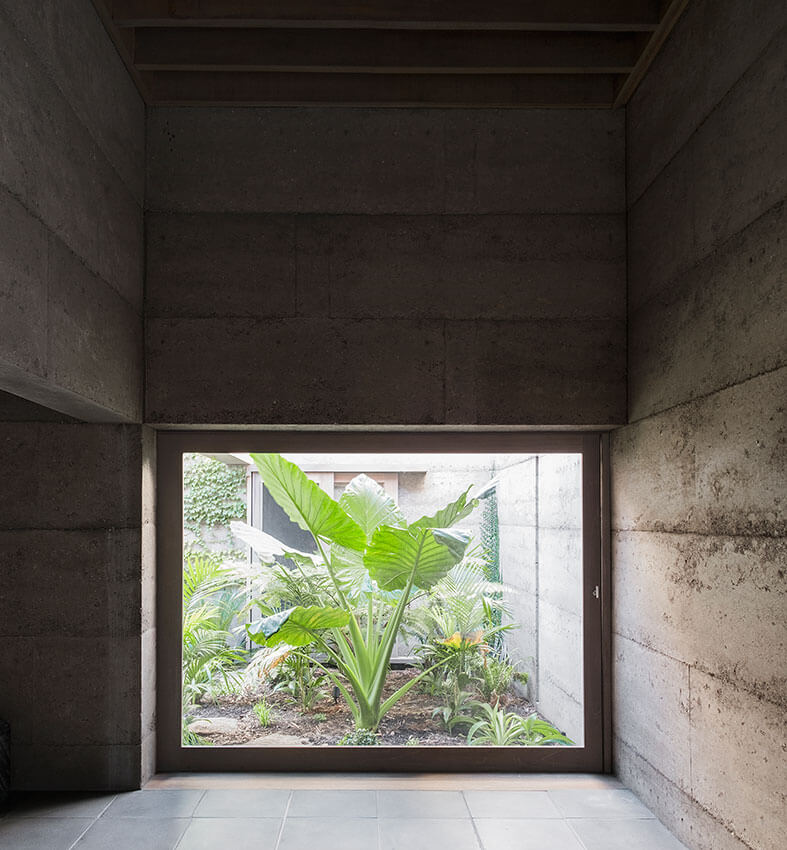
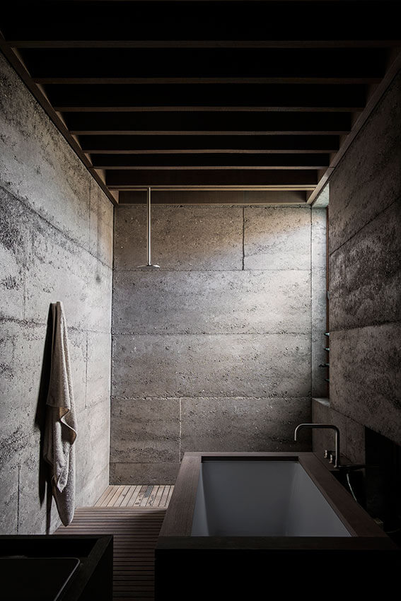
Project description
The house is conceived as a solid enclosure ordered around a central void. The daily life of a couple unfolds around the vegetated courtyard which offers openness to the surrounding spaces that are in turn removed from their suburban context. A sense of enclosure is expressed through the materiality of the house, which is entirely constructed of rammed recycled concrete.
Jury citation
The experience of this house lingers in the mind. Situated on a bustling and unremarkable arterial road in suburban Perth, the strength of its exterior belies a quality of neighbourliness. There are no fences and the pervious paving and garden is shared with the street.
Entry is through a deep threshold created by the mass of a recycled rammed-concrete wall. An eidetic move of enclosure and void establishes the primary parti of the plan. The house is zoned to accommodate compact living but readily expands for guests and family, with subtle differentiation by deep concrete ceiling beams that partition the main volume. The interiors are enveloping and harbouring.
Externally, a series of deep rammed-concrete surfaces softly redirects natural light into the depth of the plan, reducing glare and focusing the interior towards the verdant green of the courtyard, which is dominated by an enormous Colocasia.
The quality of the house stems from the deliberate and accomplished pursuit of a subtle monolithic materiality. Atmospherically, it recalls the traditional Moroccan riad and is similarly attuned to its locality, where the sun can be harsh. The resolution and economy of detail and unadorned surface is rigorous and poetic, creating a quality of complete embodiment and immersion.

Project description
The Hawthorn House is defined by a pair of large concrete shrouds, each with its own proportion and personality. The arched concrete shells evolved as a method of structurally supporting the house with its own skin, which simultaneously provides the framework for how the spaces within the home relate to each other and to the external environment. From the first-floor bathing and sleeping spaces the context appears denied, however they are pulled away from the solid outer skin, allowing each to look out onto their own private courtyards full of plants, sky and tree canopy. At ground floor within the living spaces the concrete shells provide clear connectivity with the entire landscape and a sense of unexpected lightness, while carefully concealing the neighbouring context. In defiance of its strong formal language, the spatial relationships and experiences of the home arise from a sensitivity to site and the human condition.
Jury citation
Hawthorn House is an abstraction made material. It is a provocative spatial diagram transformed into a powerful experience of refined details and a restrained but luxurious palette of wood, curved glass and concrete.
Cubic, concrete masses, punctured by semicircular apertures, rest on delicate, residual supports, highlighting a constant interplay between heavy and light, solid and open, screening overhangs and curved floor-to-ceiling glazing. This vessel-like glazing defines two radiused, rectangular ground plans that are captured and bounded by thin-shelled concrete cubes. The glazing sets up an interiority that appears to expand outwards. The seamless continuity of the wood ceiling from inside to outside completes the soffit of the concrete shell as an extended membrane; it reinforces a sense of materials acting as singular skins, contributing to the house’s diagrammatic architecture.
The ground floor is a panorama at once open and blinkered. The controlled palette of materials expands only slightly as one moves from the ground-floor living, dining and kitchen areas to the upper-level bedrooms, where the two cubic masses differentiate the children’s and adults’ domains. Walled gardens visually release the internalized upper levels skywards.

Project description
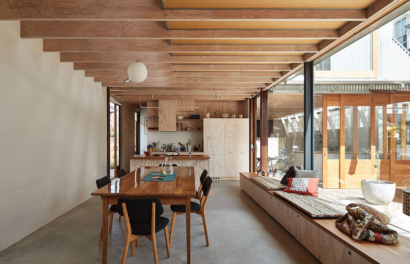
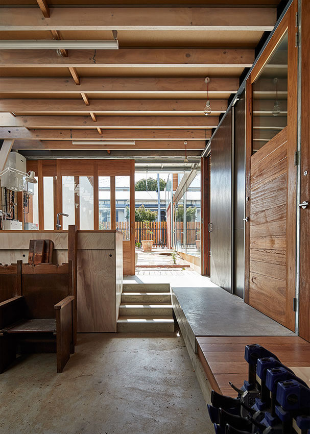
The owners of this site also own the adjacent block containing an intact 19th-century double-fronted cottage, making an L-shaped double property. Together, the two dwellings, one old and one new, are conceived as a ‘share-house for ageing-in’. Two kitchens are separated by small courtyards allowing for either two independent households to share open spaces or four smaller sub-households (such as individual sub-tenants or an elderly couple) to live semi-independently with use of the double site. The two kitchens combine, at the same floor level, with exposed laundry and workshop/garage to provide a walk-through house, connecting the three available address points of front boulevard, side street and laneway. The three water points of existing kitchen, new kitchen and new laundry form the social and operational spine of the complex.
Jury citation
North Melbourne House is a project that speaks to the future and, more specifically, to the important issue of ageing in place. Its social program drives a spatial inventiveness that is truly adaptable, allowing for multiple unprescribed modes of occupation. The architecture invites nesting. Considered detailing relies on neither material richness nor asceticism but is a sophisticated accumulation of the prosaic. Representing a clever assembly on the site and within its urban context, this house is modest and fundamentally sustainable..
Project description
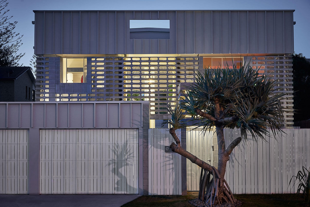
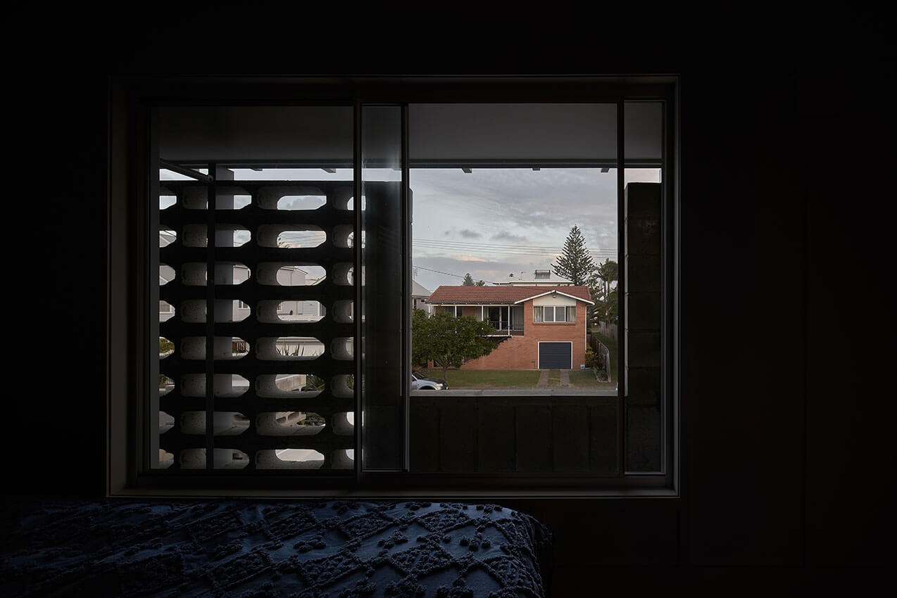
Mermaid Multihouse is a demonstration project. It proves that multiple occupation of a typical suburban house site can facilitate multiple lifestyles. Parts of families or households can live next door to each. With various rooms having access via external arcades (rather than internal corridors) combinations of guest rooms, living spaces, studios and offices can be facilitated in a way more like an urban model of inner city lanes than a suburban model of isolated houses. All this for the price of a ‘normal’ home. In this case blockwork has been used to fashion the façade since breezeblock is a fondly remembered Gold Coast idiom. The plan type would lend itself to being reused in other settings with appropriate modelled facades.
Jury citation
It was the determination of the jury to shift the Mermaid Multihouse from its State Award category of “Residential Architecture – Houses (New)” to the National Award category of “Residential Architecture – Multiple Housing.” As its name suggests, the project is something other than a single-family residence. If anything, it is a prototype for residential design that confronts the boundaries classifying housing based on conventional social groupings; this is housing beyond the nuclear family.
Mermaid Multihouse is an experimental dwelling(s) that subverts and plays against type. “Close-habiting” rather than cohabiting, a mother and her middle-aged son share this bi-generational arrangement. The house hides behind a broad, bounded facade that offers few clues to the duplicity of the interior planning. But the entry, through a full-height breeze-block screen, provides the first confounding of expectations: two extremely elongated, double-height symmetrical doors give access to separate but equal “arcades” topped by semicircular slatted ceilings that provide filtered light to the party-wall corridors.
Instead of the usual blankness belonging to a party-wall or terrace-block back, the light and airiness of these corridors is a defining element of the design. There is a grandeur to these spaces that belies the compactness of the two residences. The overall footprint of Mermaid Multihouse retains the scale and density of most of the neighbouring residential plots (some have doubled their spatial density for a single family), yet produces two distinct homes. The bedrooms, the kitchen and the living spaces of both residences are modest, if not elemental, but they are not mirror images; each residence has its own individual spatial order and material exploration. Even the gardens at the end of the corridors display distinct expression.
Offering individuation within a duopoly, Mermaid Multihouse is a rewarding prototype.

Project description
Whitlam Place is conceived as a solid form resting atop a podium of light-filled transparency; balancing material weight against structural lightness, presence against permeability. Inspired by the classical proportions of the nearby Fitzroy Town Hall, Whitlam Place offers a dynamic interpretation of its interpretation of its fluted Corinthian columns and rich architectural detail. A copper oxide finish applied to the concrete exterior creates depth and compelling colour variation, as green and bronze tones subdue the material’s solidity, aided by the textures of layered vertical greenery.
Each of the eleven apartments has a different personality, suiting the needs of the variety of occupants. With the majority of the owner-occupiers being downsizers looking for a lifestyle of convenience, floor plans have been modified to suit favourite furniture pieces, including a baby grand piano.
Jury citation
Abutting a pocket park in Fitzroy, Whitlam Place is a refreshingly joyful addition to Melbourne’s maturing multiple-housing typology. Confidently negotiating the neighbourhood context between urban condition and park, it offers a model for ambitious infill architecture much needed to densify our suburbs. Subtle references abound. The development’s expressive facade of copper-infused concrete and framed window projections respectfully acknowledge its place.
In contrast to the typical offering, ceiling heights are consciously lifted, providing generous light and space. Expansive terraces celebrate the southern aspect and soft light through the mature park trees to the suburb beyond. On the ground-floor terraces, operable chainmail curtains permit views to the park while maintaining privacy for occupants.
Playful gestures continue inside. Fluted walls with neon lighting and in-situ terrazzo floors elevate the lobby experience. The interiors are light and generous with well-appointed kitchens at their centre. Together with their ambitious client, Freadman White in collaboration with Anon Studio have delivered a model housing project that brings great delight to both its occupants and the neighbourhood community.
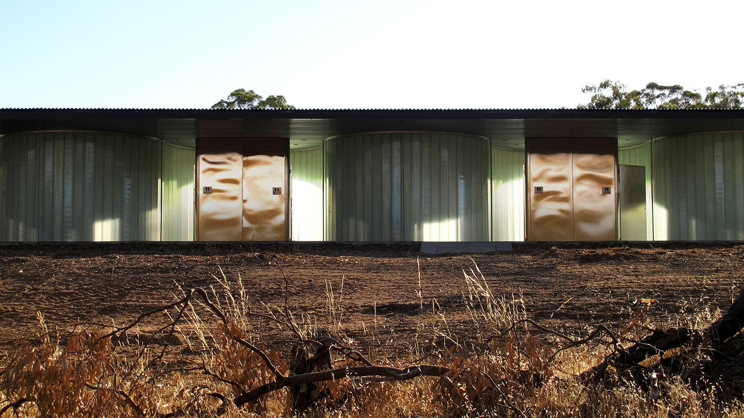
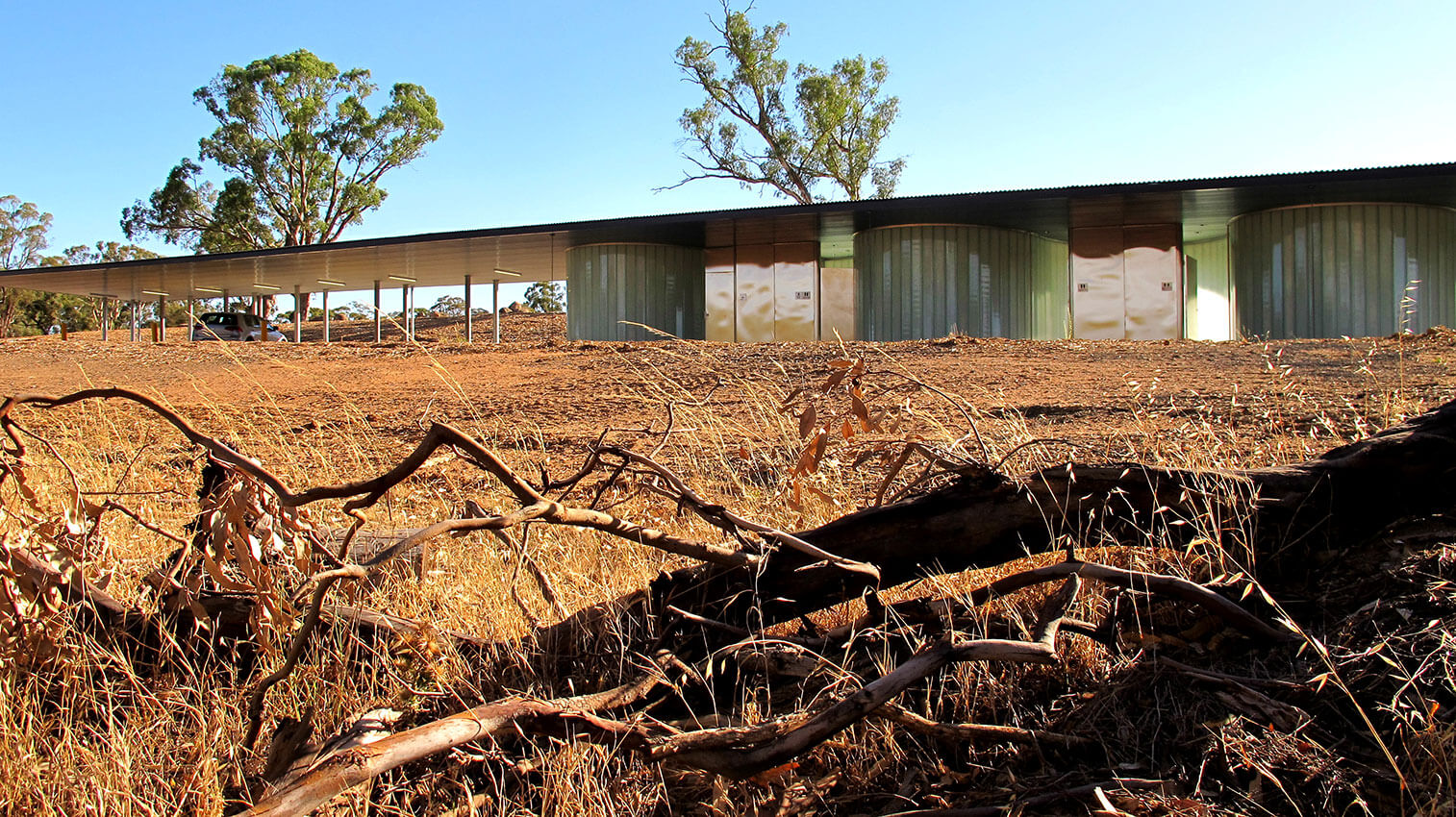
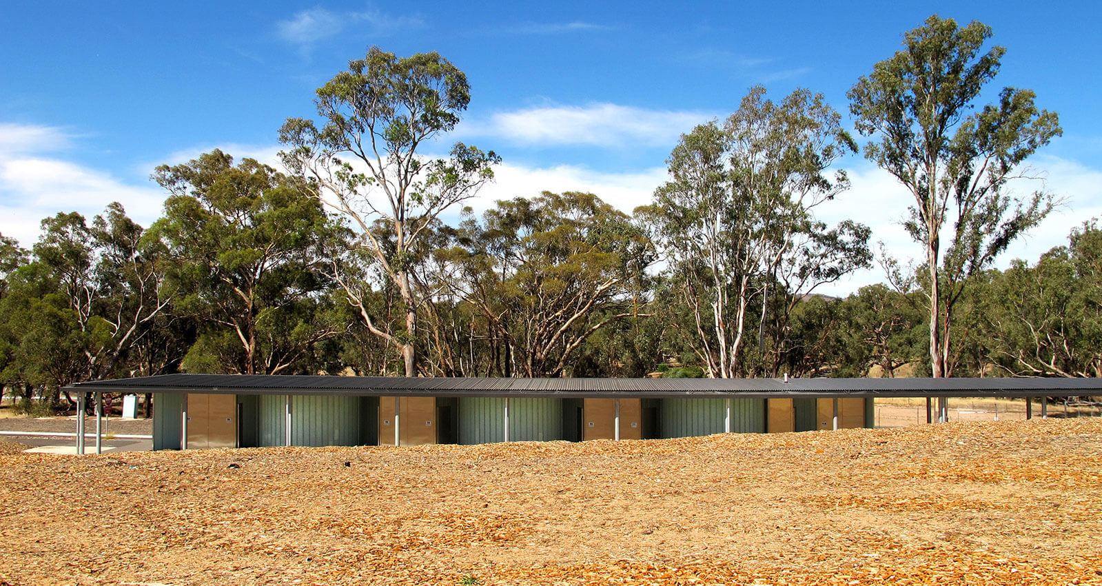
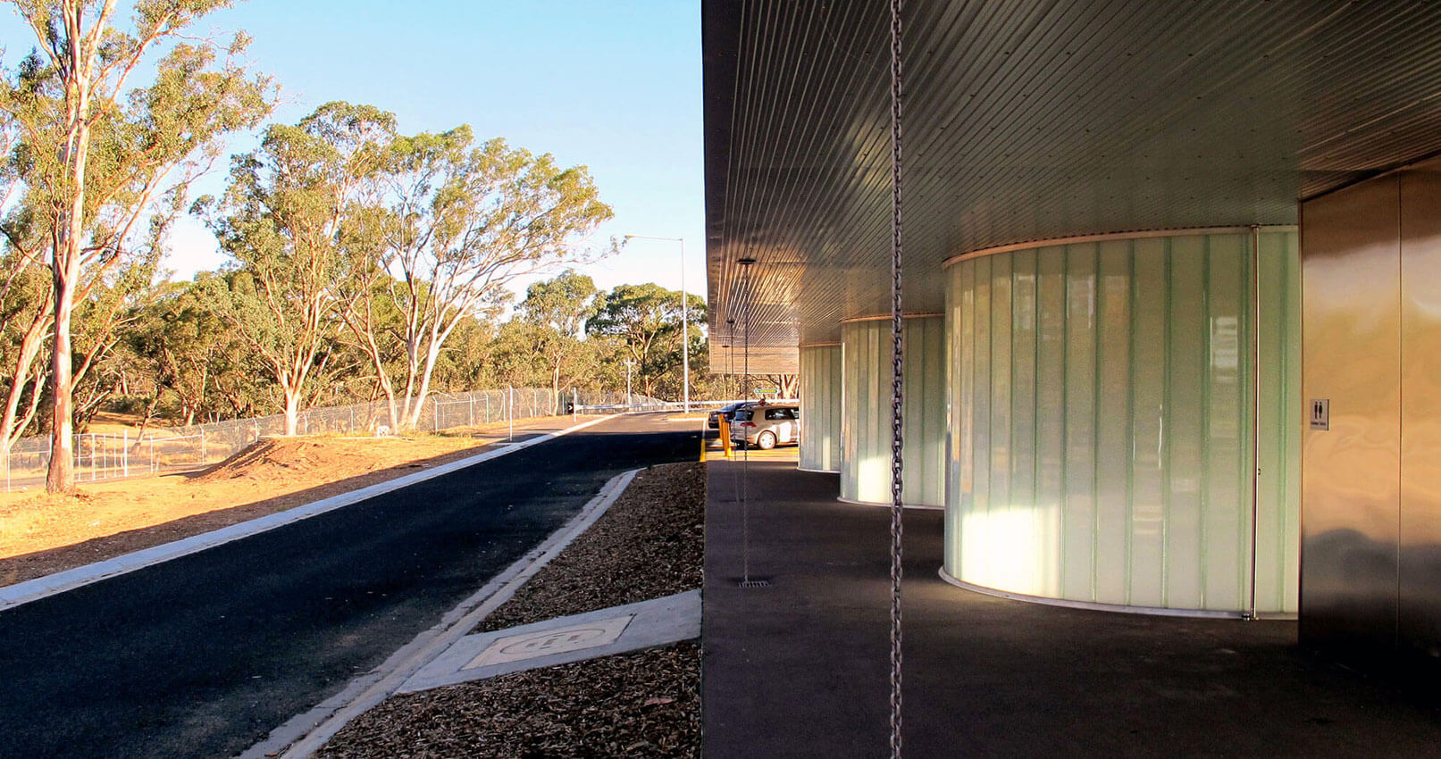
Project description
Jock Comini Reserve Amenities bring delight and appreciation of landscape to the rest stop experience. An inclusive design approach caters for diverse cultural and gender preferences and prioritises personal safety. Light filled, airy and pleasant are the qualities on offer for users of the rest stop in contrast to the typically dark and dank public toilet experience. Glazed and stainless-steel walls reflect and transmit the colours of the surrounding bush. The curved layout and the low-lying roof form a distinctive intervention in the Ravenswood landscape.
Jury citation
Located adjacent to Victoria’s busy Calder Highway south of Bendigo, Jock Comini Reserve Amenities are a welcome rest stop that appear crystalline during the day and radiate a welcome glow at night. Commissioned by VicRoads at a strategic location for travellers, the low-lying roof forms a distinctive intervention between the highway and the landscape.
As part of a building typology that prioritizes hygiene and safety, the project deploys a resilient material strategy to ensure durability, ease of maintenance and graffiti removal. Simultaneously, it offers a light-filled experience of beauty and delight. Composed of a minimal palette of glass and stainless-steel, the walls shift in plan to reflect the surrounding bushland – an unexpected discovery for the visitor. A concealed structure supports an expansive cantilevered roof that generously extends to shelter cubicles as well as circulation and car spaces. Rainwater harvested from the roof is stored onsite and re-used for handwashing and toilet flushing.
Repeat elements of translucent U-channel glass snake under the singular roof, framing secure, private amenity units. Mindful of the social and cultural sensitivities of such spaces, the geometry equalizes the normally gendered spatial order of roadside public facilities. The glazed, undulating wall establishes a safety margin of light around the perimeter circulation path, eliminating blind corners to prioritize personal safety. Stainless-steel T-wall units ingeniously divide zones and contain the operable elements and fittings for each cubicle.
The repetition and rhythm of the building’s elements permit various configurations of this small, rigorous design for future sites. Jock Comini Reserve Amenities is an exemplar for public facilities that bring delight and appreciation of the landscape to the rest-stop experience.
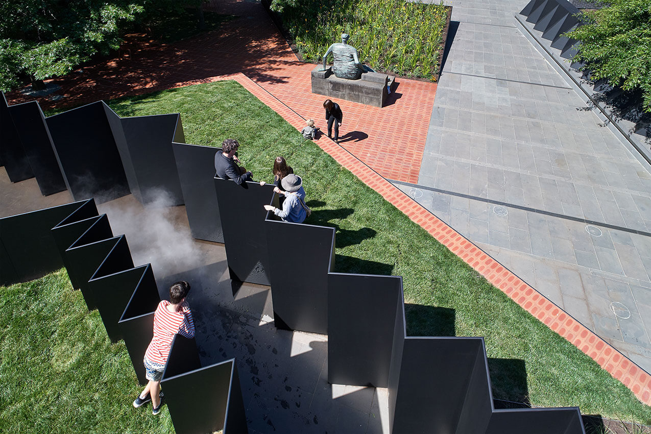
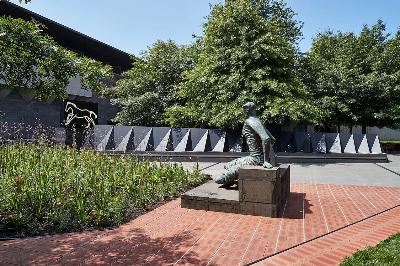
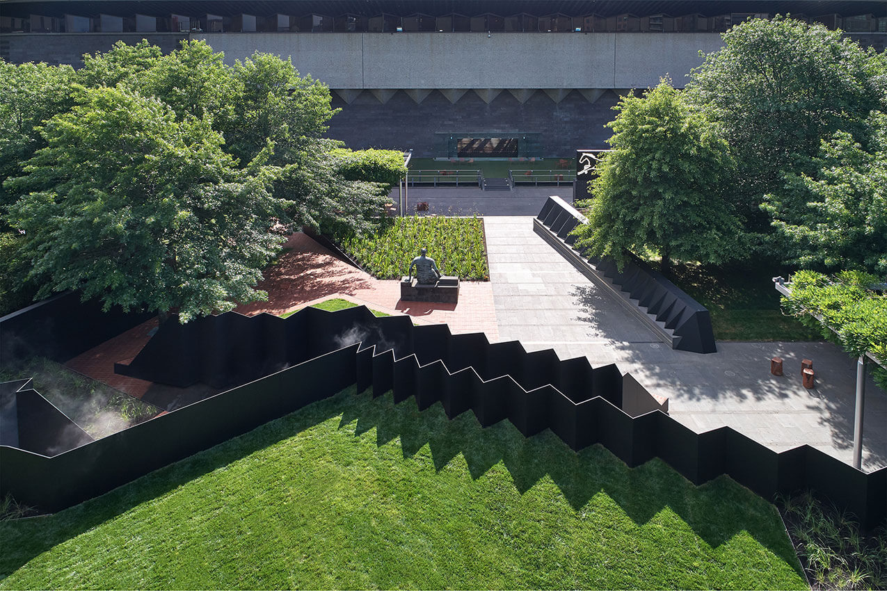
Project description
The 2018 NGV Architecture Commission ‘Doubleground’ provides an intervention that challenges the role of the garden.
The project uses collage as a tool for stitching together a formal memory and a constructed memory of the original NGV building designed by Roy Grounds.
Providing an embedded condition, the commission defines landscape as interior and by burying, reveals a new architecture, a new memory, a new experience.
The commission provides the opportunity to engage with what the NGV Grollo Equiset Garden is and can be.
It becomes an opportunity for embedding within an existing condition celebrating the garden for its formal qualities while bringing a familiar language defining a new spatial memory imbued with that of the architectural language of Roy Grounds.
Spaces for the body: Room, Corridor and Field. Each wall accompanied by a fold in the topography of the garden that creates a double ground.
Jury citation
Doubleground exemplifies the opportunity for the creation of powerful spatial and temporal experiences through the amalgamation of landscape and architecture. In this project, Muir and Openwork have worked together to create memorable spatial sequences through a complex and skilful overlay of theory and practice. Rather than an object in the landscape, Doubleground becomes the landscape.
The expressive combination of curated “memories” and formal motifs that exist in the building and landscape at the National Gallery of Victoria have been reconfigured into a single meandering work that sensitively occupies the original courtyard. The project gives us an opportunity to see a familiar public space with fresh eyes and brings Roy Grounds’ original intentions to the surface. It is at once an homage to Grounds’ 1968 design and a creation genuinely of the moment.
Doubleground comfortably occupies the gallery courtyard and establishes a new foreground and background to the existing sculpture garden. Edges are often implied rather than rigidly formed as ground planes shift from floor to topography, inviting inhabitation and discovery, and opening a dialogue between memory and context. The depth, clarity and sensitivity of Doubleground is conceptually remarkable and experientially rich.
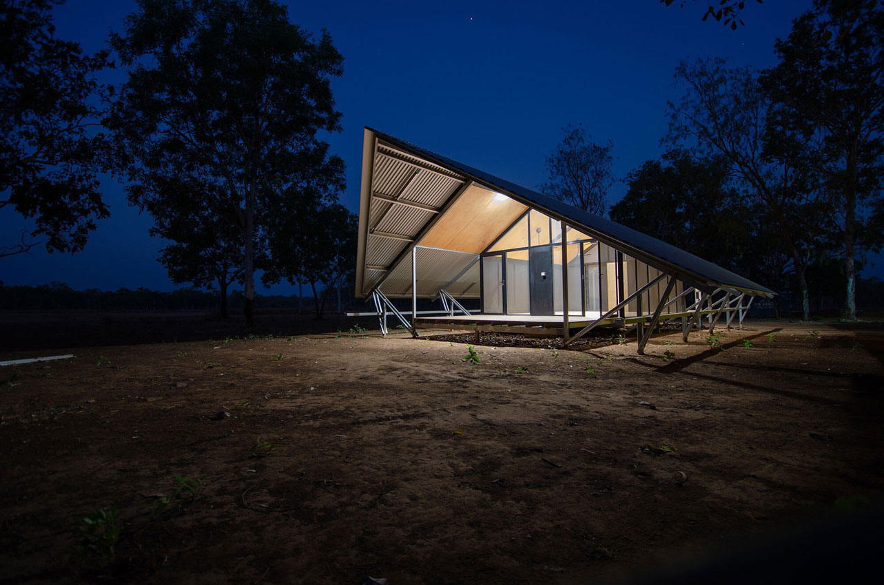
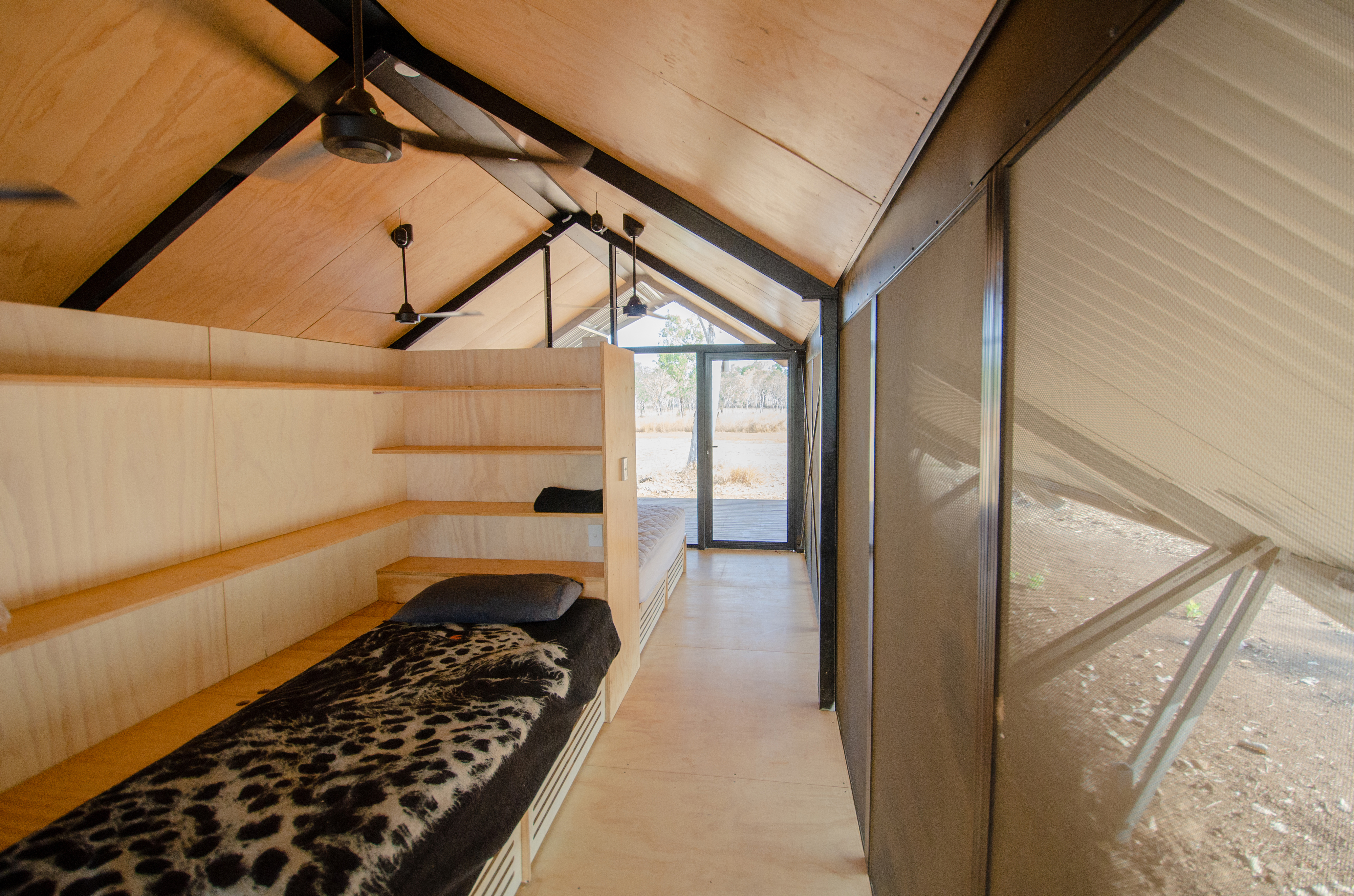
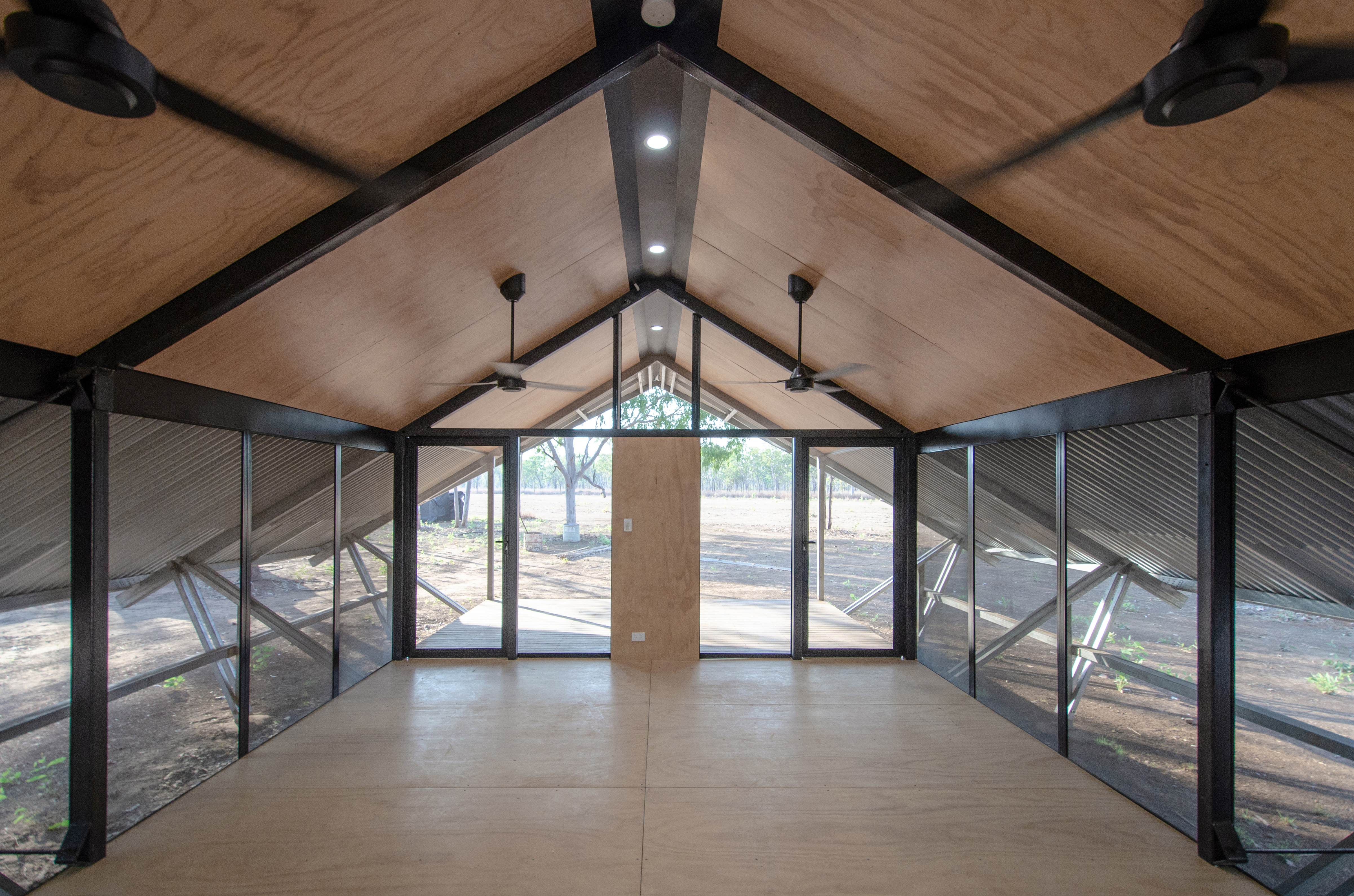
Project description
A major challenge for the upgrading of the Fish River Aboriginal ranger accommodation was to provide a more durable, low maintenance, cost effective and better insulated roofing protection compared to the pre-existing fabric tent roofing. The design strategy for achieving this was to use BlueScope steel Spanform roofing supplied by Fielders SA with a zincalume finish to provide a high level of solar reflection. The structural elements selected for supporting and separating the roofing skin and plywood ceiling linings were BlueScope steel Z100 purlins which had the advantage of being lightweight on a remote site where there were no cranes, which could be transported in relatively short 6m lengths but achieve the required structural continuity over long spans, and could be pre-punched for rapid bolting assembly. The uninterupted longitudinal space between purlins achieved by rigid screw fixing to RHS rafters allowed effective roof venting well suited to hot tropical climates.
Jury citation
The Fish River Ranger Accommodation project was undertaken by the University of South Australia’s Design Construct program for the Indigenous Land and Sea Corporation. Students and rangers collaborated to adapt existing steel-framed tent structures to improve the comfort, amenity and privacy for users in the remote location. The project provided a valuable learning opportunity for students and the result is a model that delivers excellent accommodation for rangers and a viable tropical Indigenous housing alternative..
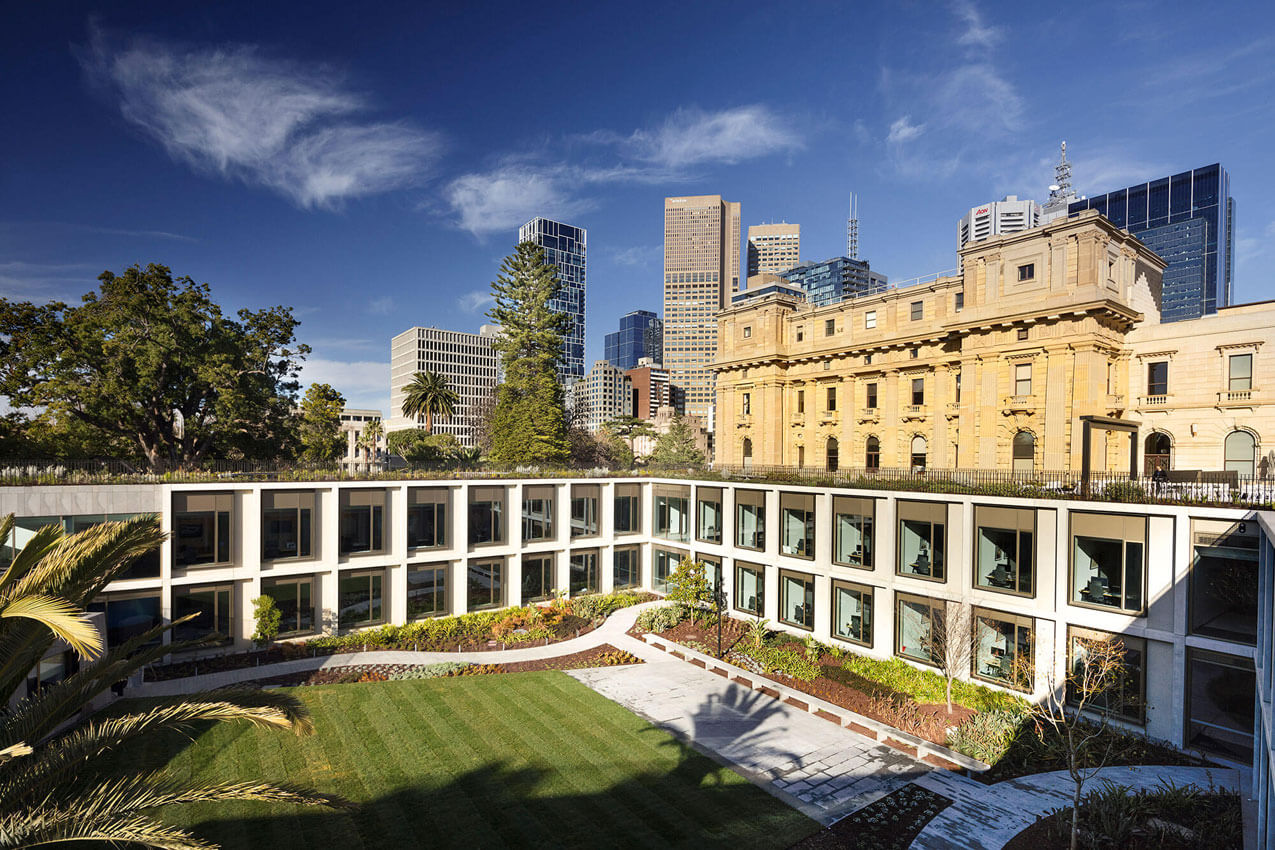
Project description
The new annex building provides much-needed office accommodation for 102 members of parliament and their support staff. After a century and a half of makeshift and inadequate member’s offices and numerous failed schemes to extend Parliament House, the new building finally solves a long standing accommodation problem. The annex has been constructed as a separate free-standing building within the eastern gardens of the Parliamentary precinct but is linked back into Parliament House via a bridge, tunnel and laneway connections. The new annex has been conceived as a companion building set in a garden where one hundred percent of the footprint has been replaced with landscape on the roof and within a large central courtyard. The office annex has been planned as a perimeter courtyard scheme of four unequal wings that have been partly sunken into the ground to protect views and integrate it topographically within the eastern garden.
Jury citation
The new Members’ Annexe for Parliament House is an impressive benchmark for sustainability in our public buildings. To fully understand the impact of this building, it is necessary to understand the former Members’ Annexe in the neighbouring heritage building. Inequitable rooms, insufficient access to natural light and poor thermal and acoustic performance all combined to create stressful working environments for our democratically elected representatives and their staff.
In dramatic contrast, Peter Elliott Architecture and Urban Design has delivered a project that, through skilful planning, provides equity in room allocation as well as generous and universal access to light and views. It maintains thermal comfort through the use of a progressive geothermal energy exchange system, eliminating the need for conventional chillers.
A masterful design strategy repurposes the building’s entire footprint as trafficable landscape by excavating the structure into the site so that it morphs with the surrounding gardens. The result is a low-level building that has minimal impact upon the broader precinct yet creates a striking two-storey elevation nestled within a sun-drenched courtyard. Passive solar principles configure the majority of rooms towards this north-facing courtyard, allowing unhindered views to the heritage buildings, garden and broader city fabric beyond.
Internally, local stone and timber has been used, helping to sustain local economies and reduce the project’s carbon footprint. These robust and carefully selected materials combine to create a series of calm and light-filled circulation spaces that connect seamlessly back to Parliament House.
This project shows what is possible when a truly skilled architect works respectfully with a client and has the capacity to embed sustainability credentials into every aspect of the design decision process. The result is an exceptional building that improves the often-hectic working lives of its inhabitants and which will support our democratic system for the next 100 years.
Project description
Our Lady of the Assumption Catholic Primary School is a new K-6 school for 420 students in North Strathfield. The design is a realisation of the school’s vision of creating spaces that invite imagination, innovation and support independent learning and student wellbeing. The project reuses a rundown 1970s brutalist former Telstra training centre and includes the addition of a 4-storey atrium as main entry connecting all learning areas, a new hall, arts space, balconies and roof-top playgrounds in prefabricated mass-timber construction.
Jury citation
Our Lady of the Assumption Catholic Primary School showcases a holistic approach where decisions about sustainability are inseparable from the architecture. The project retains the structure of an existing 1970s concrete building – a former Telstra training centre. The linear plan and favourable orientation of the structure was ideally suited to its repurposing as a school.
A mass timber structure of glulam posts and beams, and cross-laminated timber floors, walls, roofs and a beautiful folding stair, is the dominant visible move and provides a significant carbon store. The architects have worked to preserve the timber structure as a finished surface, cleverly integrating services and managing fire safety. The architecture exploits the benefits of timber to wellbeing, applied to a learning environment for children. The use of timber also signals a heartfelt commitment to sustainability.
The plan layout maximizes passive control, with indoor learning areas connecting to generous north-facing outdoor spaces. A high-performance envelope with operable timber doors and windows allows the building to operate effectively in mixed mode. The design delivers demonstrably flexible learning spaces within an architecture that is calm and controlled.
Every experience is a learning opportunity; at Our Lady of the Assumption Catholic Primary School, the architecture becomes an educator.
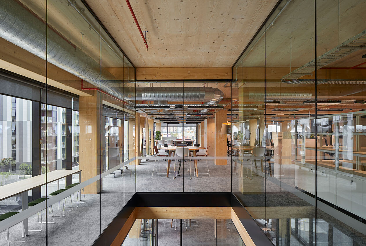
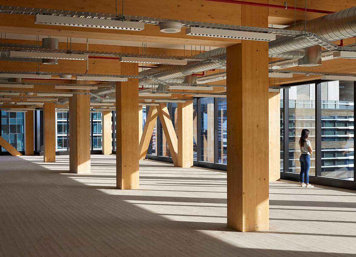
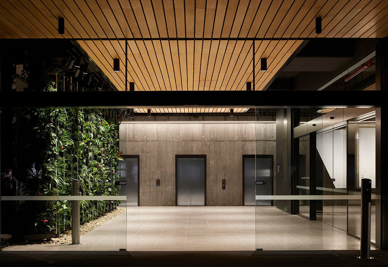
Project description
25 King sets a global precedent for timber building. At 10 storeys tall and 14,965sqm NLA, it is the tallest timber commercial building with the largest floorplate in the world.
The building showcases leading timber engineering and an honest expression of materials that differentiate it from typical concrete and steel mid-scale office developments. A simple, 6×8 metre system of Glulam beams and columns and cross laminated timber (CLT) floor planks and core walls supports a flexible floorplate. Major services reticulate in specially designed zones so that each floor can easily accommodate different tenancies. Architecturally, the building expresses the floorplates and use of timber through its glazed transparency, street level timber colonnade, and interior warmth, created by leaving the wood and other raw materials exposed.
As a singular gesture, 25 King represents a viable return to timber design and construction, pushing architects to think beyond concrete and steel commercial solutions.
Jury citation
Bates Smart’s 25 King, part of the Brisbane Showgrounds redevelopment, sets a new global benchmark as the tallest timber commercial building with the largest floorplate in the world. Glulam and cross-laminated timber (CLT) form an all-timber structural system that significantly reduces the building’s embodied carbon compared with conventional construction methods using concrete and steel. The carefully detailed expressed timber structure is the hero of the interior, encouraging a light touch for subsequent fit-outs. Working within the limitations of CLT, an efficient six-metre by eight-metre structural grid with side core delivers large, unencumbered floorplates for maximum workplace flexibility. 25 King is worthy, particularly as a potential catalyst for positive change in the construction of mid-scale commercial buildings.
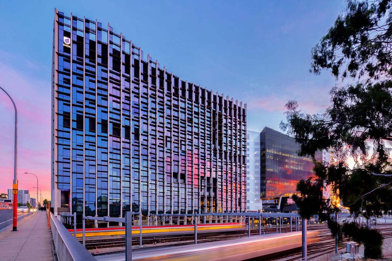
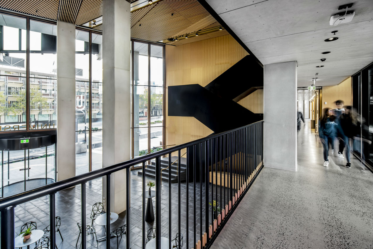
Project description
The University of South Australia’s Cancer Research Institute, based in Adelaide ‘BioMed City’ and designed in collaboration by architects Swanbury Penglase and BVN, is home to a number of research and technology focussed organisations including the globally recognised Centre for Cancer Biology and the University’s School of Pharmacy and Medical Sciences, located across several floors of research and teaching laboratory space.
The University’s new business incubator hub: the Innovation Collaboration Centre and ‘MOD.’, an exciting new future-focussed public gallery and museum are both located around the atrium and lower levels. MOD.’s aim is to facilitate accessible scientific engagement with the public, particularly school students, with permanent and changing exhibitions.
The intent of the overall development is to create a connected and engaged community of inquiry within the building itself, outward to the health sciences BioMed City precinct and just as importantly, to the broader community of Adelaide and beyond.
Jury citation
The University of South Australia Cancer Research Institute is holistic in its approach to sustainability, from construction impacts to ongoing operation, robust building detailing and urban legacy. Notably, this project employs planning and services strategies that significantly curtail energy use in a typology that is customarily energy-intensive. Manifold laboratory exhausts, C02 monitoring and materials selection create a clean-air environment internally. Natural light is carefully modulated and the sectional strategy organizes research communities vertically, with diverse meeting and social spaces making for a healthy and socially sustainable working and learning place.
.
Project description
Maitland Riverlink is a public project that crystallises new value for the regional centre Maitland, both in terms of its identity and its assets. The project will support a revitalisation of the central business precinct, extending it beyond the main street to the river. The space acts as a kind of ‘public living room’ for the community, reactivating an unused part of town and drawing locals back to the river that is a fundamental part of Maitland’s heritage, whilst bringing tourists and visitors to the town.
Jury citation
A community newsletter pinned to a noticeboard in a new riverside cafe in Maitland proudly proclaims the area’s economic and urban renewal. At its centre is an image of a monolithic brick portal that frames a canopy of river red Gums, bringing the trees and the river into the Maitland streetscape. Clearly a remarkable urban proposition has been realised here.
For decades following a devastating flood, the connection between Maitland’s main street and the Hunter River was lost. Originally engaged to design public ablutions, CHROFI, working in collaboration with McGregor Coxall and the Maitland City Council, saw an opportunity to recalibrate the aspiration of the initial brief. What has followed is a masterstroke in urban intervention.
Beyond the original prosaic requirements of the project, the architects convinced the client to acquire a larger share of underused street front. Recalling the traditions of Renaissance urbanism – of civic rooms and gateways – they conceived a monumental gateway between the main street and the river, scaled to act as a public living room.
A quality of considered architectural engagement is evident at every scale. The oblique figure of the plan offers mass and depth to the sense of threshold. It creates tapering width to accommodate amenity and additional commercial functions, which orient to the river, while also setting the rich texture of handmade brick into the surface of the street. This geometry creates an exaggerated perspective that magnifies the proximity of the riverine landscape. The subtle curvature of the brick edge resolves the main gesture of the plan and creates a sharp but wholly tactile resolution to the work.
This is a consummate and inspired intervention, an armature for urban amenity and civic pride. Through careful and generous processes, the architecture has made promises of a larger future, and reestablished a community’s relationship with its’ river.
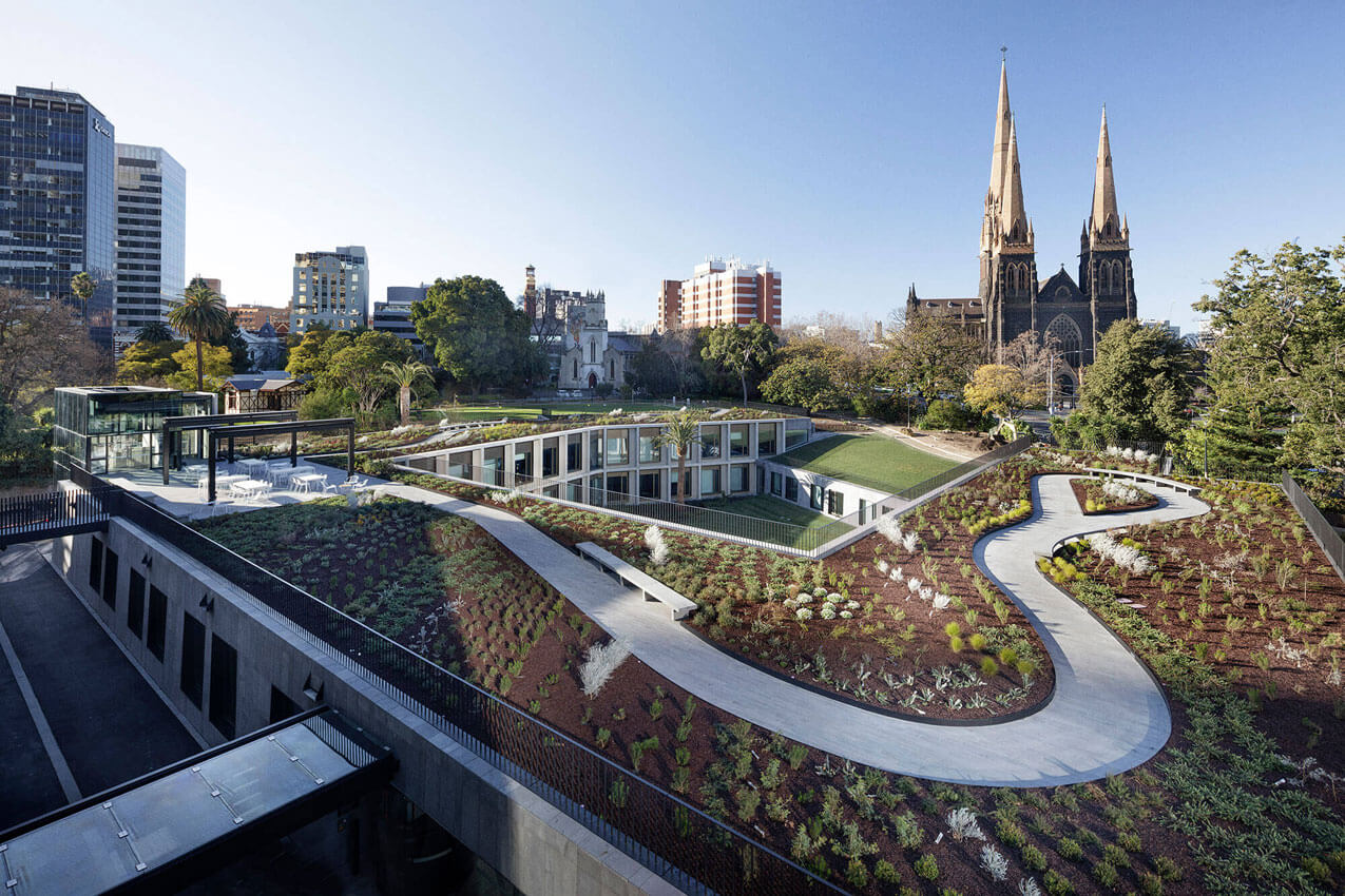
Project description
The new annex building provides much-needed office accommodation for 102 members of parliament and their support staff. After a century and a half of makeshift and inadequate member’s offices and numerous failed schemes to extend Parliament House, the new building finally solves a long standing accommodation problem. The annex has been constructed as a separate free-standing building within the eastern gardens of the Parliamentary precinct but is linked back into Parliament House via a bridge, tunnel and laneway connections. The new annex has been conceived as a companion building set in a garden where one hundred percent of the footprint has been replaced with landscape on the roof and within a large central courtyard. The office annex has been planned as a perimeter courtyard scheme of four unequal wings that have been partly sunken into the ground to protect views and integrate it topographically within the eastern garden.
Jury citation
The Parliament of Victoria Members’ Annexe is an ambitious yet restrained contribution to Melbourne’s parliamentary precinct. It gives clarity and coherence to an assemblage of government buildings that, over many years, had devolved into a rabbit warren of additions, subdivisions and haphazard enclosures. What has been accomplished is not only of high architectural merit; it is transformative to the practice of government for the state of Victoria.
In contrast to the previous cramped and inadequate spaces, all new parliamentary offices have natural light and external views. Where inequitable space and amenity reinforced hierarchy and temporal political power, all members of parliament now enjoy equal facilities.
The design is as much a piece of landscape as it is a building. It is a “building-scape”, where a new cloister courtyard, sunken and yet full of light and vegetation, makes every office a special one; where corridors provide opportunities for informal meetings and consultation as much as they enable circulation and movement. The act of recessing the building into the grounds of the Parliament Precinct reduces its outward visibility but heightens its social relevance to the mechanics of government. This is a humble project with powerful urban effects and consequences.
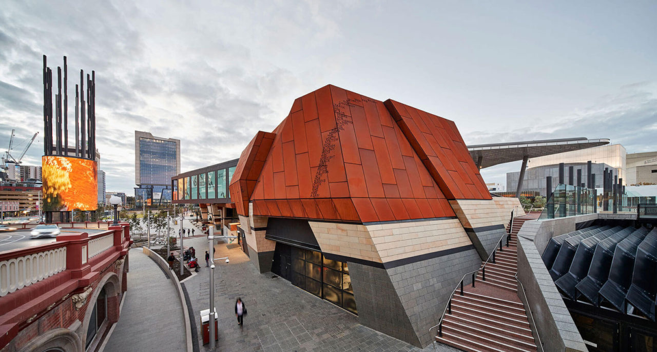
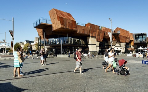
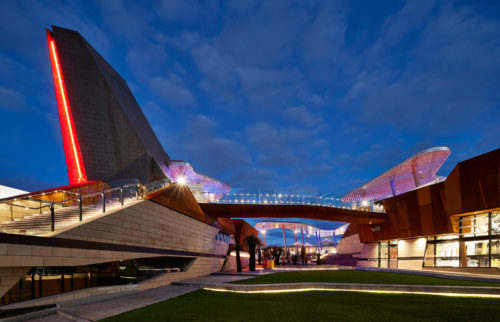
Project description
Named after the Noongar warrior, Yagan Square is a project of local and state significance for the city of Perth and Western Australia. Located on the former wetlands, a place of hunting and gathering, ceremony and cultural gathering, Yagan Square has been conceived as a natural meeting place and point of convergence for Perth CBD, Northbridge and the new Perth City Link development and seeks to physically reconnect the entertainment/cultural precinct of Northbridge with Perth’s CBD.
The design concept imagines Yagan Square as an integral and active part of the city, knitted into, and extending the existing circulation systems and street fabric of its surrounds, while forming new relationships and ways of experiencing the city.
Designed to work at an intimate scale as well as for large organised festival events, the city square’s hard and soft landscape provides a welcome respite from the day to day workings of the city.
Jury citation
Yagan Square is a critical project that sets a new standard for the potential impacts of genuine collaboration and informed consultation in the design of urban spaces. By layering existing and historical circulation, Yagan Square physically reconnects the entertainment and cultural precinct of Northbridge with Perth’s CBD, re-establishing the site as a natural meeting place for people.
The design turns the combined challenges of access and substantial changes in site levels into opportunities for compelling and previously unrealized views of the city and surrounds.
The dense and cleverly crafted landscape is both engaging and robust as it weaves across the topography, moving pedestrians effortlessly from upper to lower ground levels. Multiple spaces are formed by these topographical shifts, allowing the public domain to be used by large groups or by individuals at any time of the day or night.
A rich and dynamic experience has been created through the layered referencing of Indigenous and colonial history, geography, local materiality and flora. As Perth continues to densify around Yagan Square, this space that celebrates and acknowledges our cultural and colonial past, while offering a glimpse of a positive future, will become an increasingly important part of the city’s urban fabric.
Entry is through a deep threshold created by the mass of a recycled rammed-concrete wall. An eidetic move of enclosure and void establishes the primary parti of the plan. The house is zoned to accommodate compact living but readily expands for guests and family, with subtle differentiation by deep concrete ceiling beams that partition the main volume. The interiors are enveloping and harbouring.
Externally, a series of deep rammed-concrete surfaces softly redirects natural light into the depth of the plan, reducing glare and focusing the interior towards the verdant green of the courtyard, which is dominated by an enormous Colocasia.
The quality of the house stems from the deliberate and accomplished pursuit of a subtle monolithic materiality. Atmospherically, it recalls the traditional Moroccan riad and is similarly attuned to its locality, where the sun can be harsh. The resolution and economy of detail and unadorned surface is rigorous and poetic, creating a quality of complete embodiment and immersion.
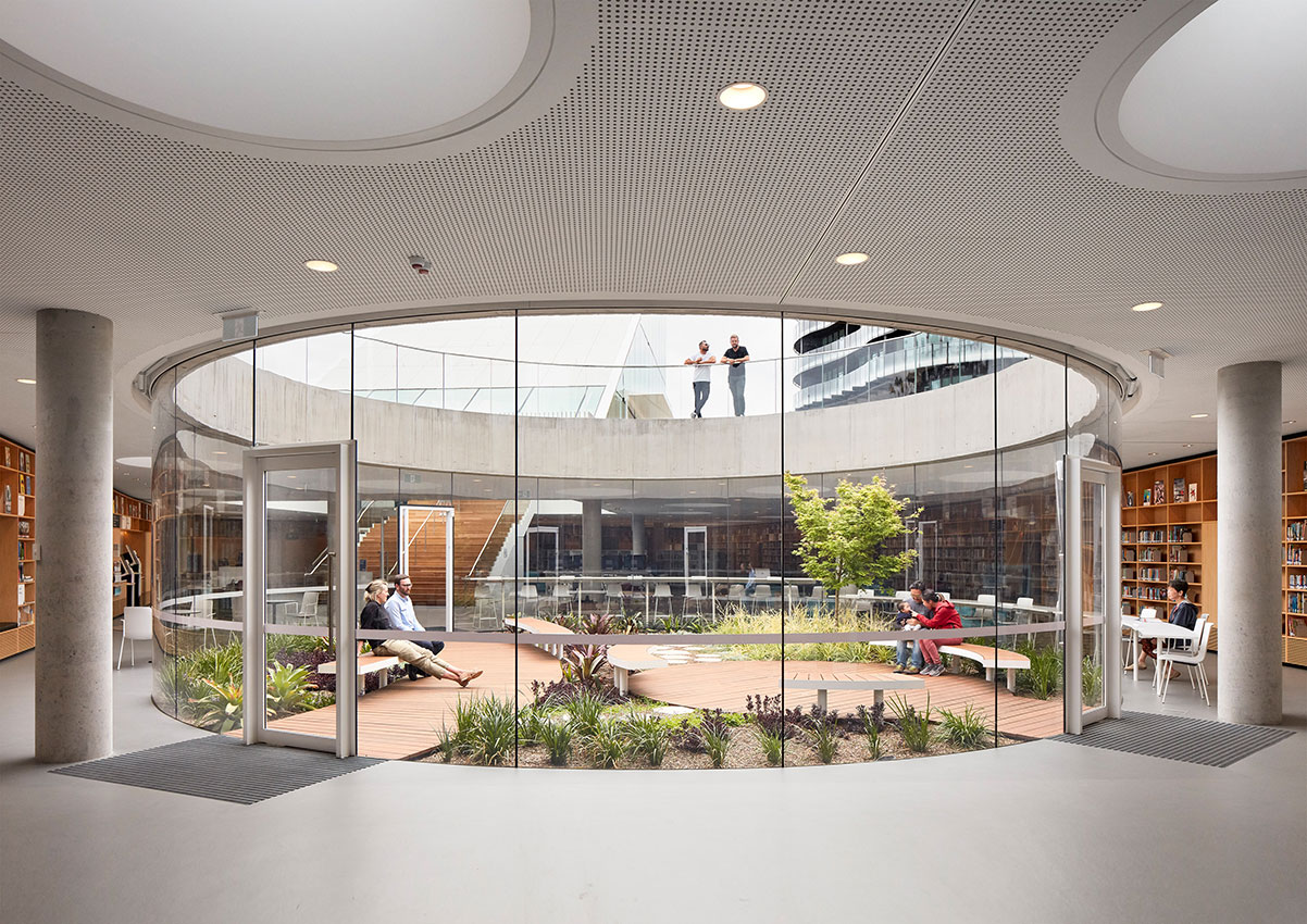
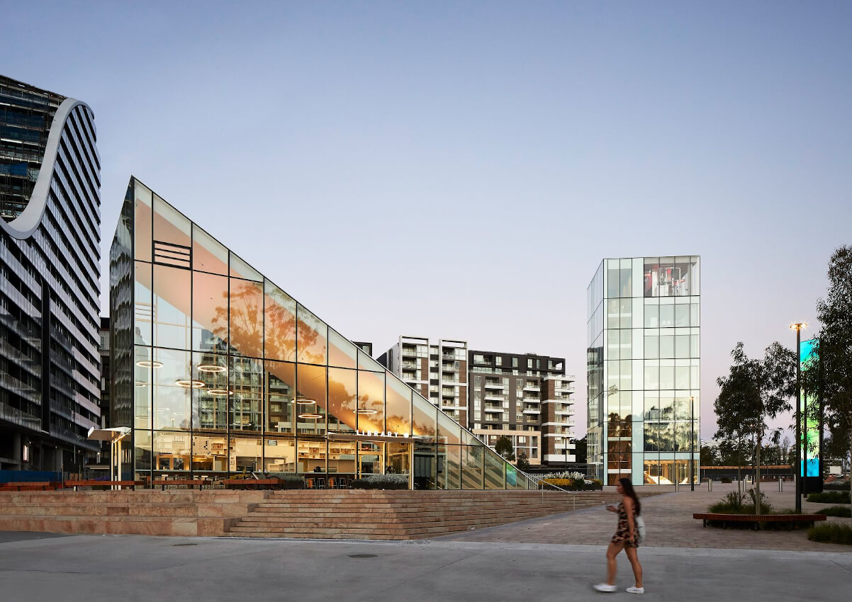
Project description
The Green Square Library and Plaza, design by Stewart Hollenstein in association with Stewart Architecture and delivered for the City of Sydney Council opened in September 2018. Won through an anonymous global design competition, the design was unanimously selected by a jury including Pritzker Prize-winning architect Glenn Murcutt. The brief called for two distinct components – a public plaza and a library. By placing the library underground and freeing the ground plane for public activities, the design fuses these requirements together into one cohesive architectural experience.
The form of the library emerges from the ground plane as a series of legible forms – an entry triangle, circular garden, rectangular tower and trapezoidal amphitheatre – which animate the plaza and generate unique spaces for indoor and outdoor community activities. The design is informal and flexible to accommodate the evolving role of the library and demands of a growing population well into the future.
Jury citation
Green Square Library and Plaza was awarded through international competition as a standout for its key design move: to locate the bulk of the library program underground in anticipation of a tall and dense urban future all around it. The built outcome is testament to the generosity of this strategy. It opens up a major portion of the site as accessible public space and ensures that sunlight will reach future southside retail and cafes, undoubtedly enhancing their viability and the vibrancy of the place as a whole.
The four ensemble elements – the entry wedge, the sunken circular garden, the tower and the tiered seating – bring light into the library and cleverly provide different opportunities for access. They are skilfully scaled and placed, giving order to the plaza without dominating it. An array of circular skylights is seamlessly integrated with the pavement; at night they become beacons, illuminating and bringing life to the plaza. The design manages difficult site constraints with apparent ease. It successfully integrates public art both in the plaza itself and within the library, visible from the plaza.
Green Square Library and Plaza is emerging as the urban and community heart of Green Square. This is place-making led by investment in high-quality public space.
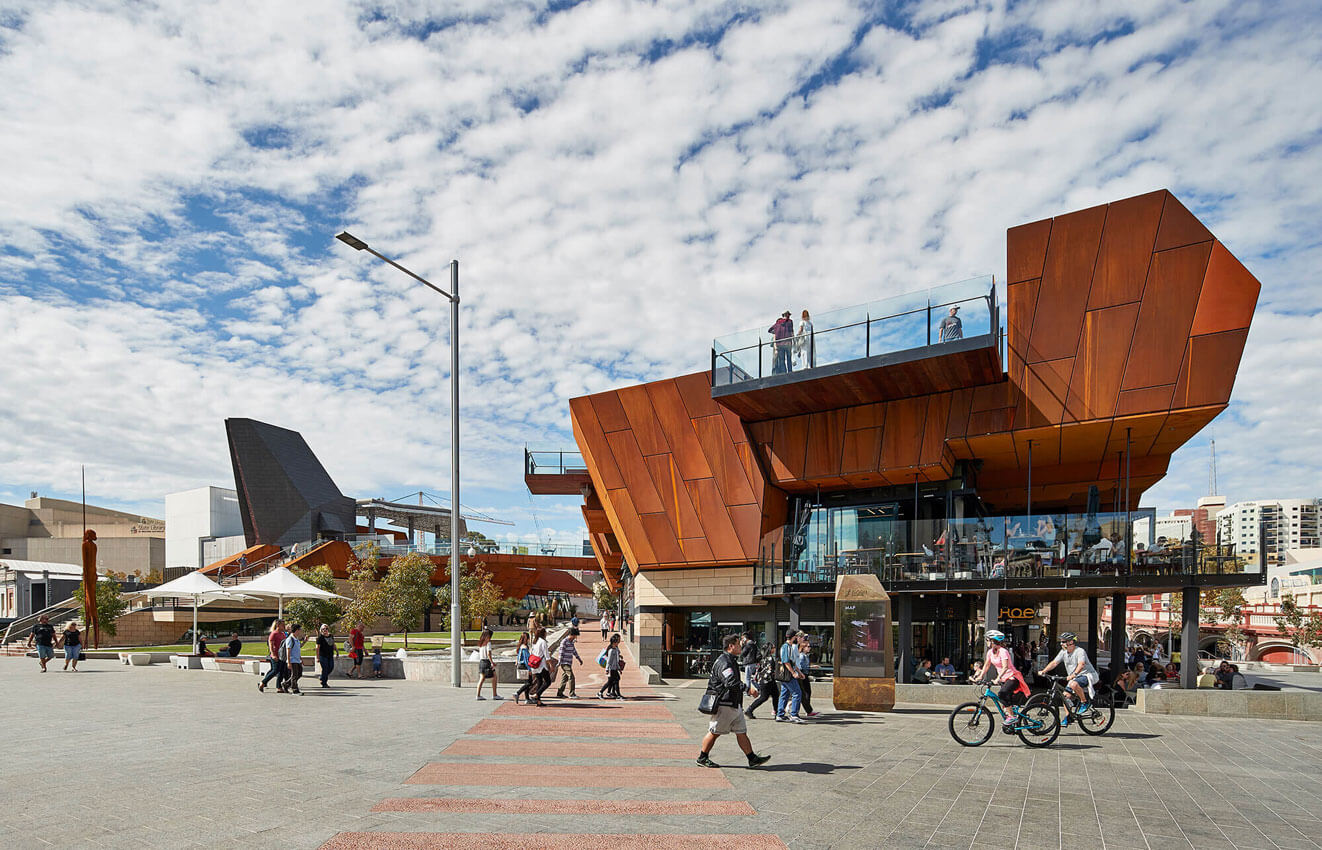
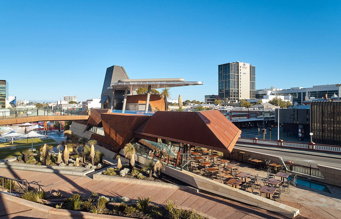

Project description
Named after the Noongar warrior, Yagan Square is a project of local and state significance for the city of Perth and Western Australia. Located on the former wetlands, a place of hunting and gathering, ceremony and cultural gathering, Yagan Square has been conceived as a natural meeting place and point of convergence for Perth CBD, Northbridge and the new Perth City Link development and seeks to physically reconnect the entertainment/cultural precinct of Northbridge with Perth’s CBD.
The design concept imagines Yagan Square as an integral and active part of the city, knitted into, and extending the existing circulation systems and street fabric of its surrounds, while forming new relationships and ways of experiencing the city.
Designed to work at an intimate scale as well as for large organised festival events, the city square’s hard and soft landscape provides a welcome respite from the day to day workings of the city.
Jury citation
At Yagan Square, steel is celebrated as both a robust and delicate material, oscillating between background and foreground to a narrative that celebrates our past and offers a contemporary public space for the future. Yagan Square is a place created from a rich and dense overlay of stories, ideas, culture and community. Its carefully considered material palette is at the centre of its public expression and the articulation of a significant cultural landscape.
Beyond the use of steel as a structural system, perforated, etched and meticulously crafted Corten steel is deployed as a storytelling device in its own right. Its weathered surface absorbs the harsh Western Australian sun, conjuring up images of the state’s mining and infrastructural heritage as well as the ferrous stone gorges and vast deserts that characterize its unique landscape.
In striking contrast, steel is also used in a delicate and ephemeral digital tower in which fourteen slender steel columns sway gently in the wind, inspired by the reeds that originally grew in the wetlands that once occupied the site and representing the fourteen Nyoongar language groups. This landmark steel structure synthesizes the relationships, conversations and collaborative efforts of the architects, client, Indigenous working group and consultant engineers in creating this memorable and timeless urban public space.